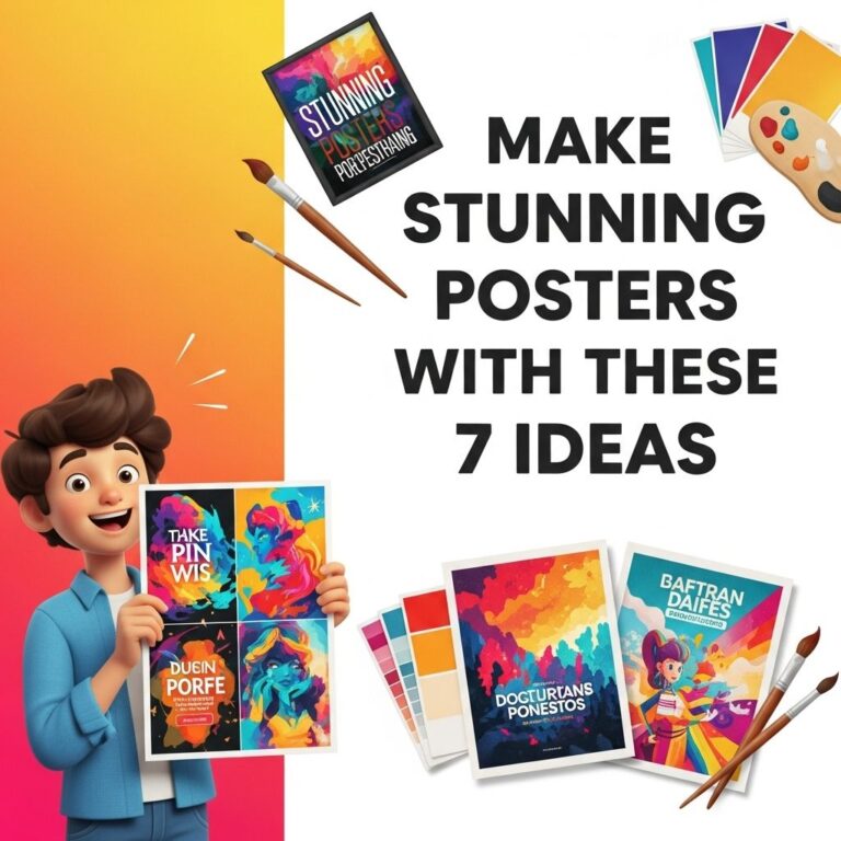
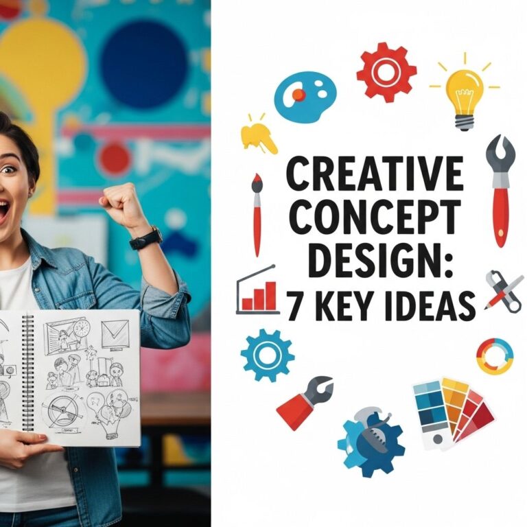
In the world of visual communication, the art of poster design plays a crucial role in conveying messages effectively and attractively. Whether for events, marketing, or educational purposes, a well-designed poster can capture attention and engage audiences. However, crafting a unique and creative poster layout can be a daunting task. In this article, we will explore ten innovative poster layout ideas that can help you break away from conventional designs and create eye-catching visuals that resonate with your audience.
Exploring innovative poster layouts can elevate your design projects and captivate your audience. Here are 10 creative ideas that can inspire your next poster design, ensuring your message stands out. For additional resources, check out these free poster templates.
Table of Contents
1. The Grid System: A Classic Reimagined
The grid system is a staple in design, providing a structured framework that ensures harmony and balance. However, by experimenting with the traditional grid layout, you can create a dynamic composition. Consider using:
- Asymmetrical grids to create unexpected focal points.
- Variable column widths for added visual interest.
- Overlaying images and text to break the rigidity of the grid.
Example of an Asymmetrical Grid
Imagine a poster with a large image on one side and smaller text blocks on the other, creating an imbalance that draws the eye to the focal point.
2. Minimalist Approach: Less is More
Embracing minimalism in your poster design can lead to powerful results. Focus on:
- Using a limited color palette to evoke emotions.
- Incorporating whitespace effectively to avoid clutter.
- Highlighting a single, strong message with bold typography.
Using Typography as Visual Elements
By making typography the main visual element, you can create a striking poster that communicates efficiently through words alone.
3. Layering Techniques: Depth and Dimension
Adding layers to your poster can create a sense of depth and intrigue. Consider using:
- Transparent overlays to blend images and texts.
- Shadow effects to give a three-dimensional look.
- Multiple images layered together to create a collage effect.
Creating a Layered Effect
For example, a poster featuring a faded background image with bold text in the foreground can create an engaging visual hierarchy.
4. Interactive Elements: Engage Your Audience
Incorporating interactive elements into your poster can enhance engagement. Think about:
- QR codes that link to additional content or websites.
- Augmented reality features that bring the poster to life.
- Removable or repositionable elements for hands-on interaction.
Augmented Reality Poster
Imagine a poster where scanning it with a smartphone reveals animations or additional information, captivating the audience’s attention.
5. Typographic Contrast: Play with Fonts
Using contrasting fonts can add visual interest and hierarchy to your poster. Here are some tips:
- Combine serif and sans-serif fonts for a balanced look.
- Use script fonts for emphasis in contrast with bold, sans-serif body text.
- Vary font sizes to distinguish between headings, subheadings, and body text.
Font Pairing Examples
| Font Pair | Usage |
|---|---|
| Montserrat & Merriweather | Headings and body text |
| Raleway & Lora | Quotes and descriptions |
| Oswald & Open Sans | Event titles and details |
6. Color Blocking: Bold and Vibrant
Color blocking can create an energetic and vibrant poster. To achieve this effect, consider:
- Using large swaths of color to define sections of your poster.
- Complementary colors to create striking contrasts.
- Contrasting dark and light shades for visual impact.
Effective Use of Color Blocking
A poster featuring bold blocks of color can effectively segment information, making it easy for viewers to digest.
7. Photography Focus: Visual Storytelling
High-quality photography can be the star of your poster design. Consider the following:
- Choosing powerful images that convey messages at a glance.
- Using full-bleed images for a dramatic effect.
- Applying filters or overlays to unify the aesthetic.
Creating a Photographic Narrative
A poster that tells a story through a series of images can create an emotional connection with the audience.
8. Hand-Drawn Elements: Personal Touch
Incorporating hand-drawn elements can add a unique and personal touch to your poster. Consider:
- Sketches that complement your design theme.
- Custom typography for a one-of-a-kind look.
- Illustrative borders or accents to frame your content.
Using Hand-Drawn Accents
A poster featuring hand-lettered titles paired with digital elements can create a delightful contrast that feels unique and personal.
9. Thematic Consistency: Unified Aesthetic
Ensure that all design elements create a cohesive visual story. Focus on:
- Defining a theme that connects imagery, colors, and typography.
- Maintaining consistent style across graphics and text.
- Choosing a focal point that embodies your theme.
Maintaining Thematic Unity
For instance, a poster for a music festival should reflect the vibrancy of the event through bright colors, lively illustrations, and rhythmic typography.
10. Environmental Context: Enhance Relevance
Finally, consider the environmental context in which your poster will be displayed. Tailor your design for:
- Outdoor settings by using weather-resistant materials.
- Digital displays by optimizing for screen resolutions.
- Specific locations to align with cultural or local aesthetics.
Designing for Context
A poster designed for an art exhibition can reflect the local artistic culture, using colors and styles that resonate with the community.
In conclusion, experimenting with these ten creative poster layout ideas can elevate your design skills and help you communicate more effectively. By incorporating varied designs, colors, and interactive elements, you can create compelling posters that capture attention and resonate with your target audience. The key is to push boundaries, think outside the box, and let creativity lead the way.
FAQ
What are some unique poster layout ideas?
Consider using asymmetrical designs, grid layouts, or circular arrangements to create visually appealing posters.
How can color choices affect a poster’s layout?
Color choices can enhance the visual hierarchy and draw attention to key elements, making the poster more engaging.
What fonts work best for poster designs?
Bold, sans-serif fonts generally work well for headlines, while serif fonts can be effective for body text, depending on the theme.
How do I balance text and images in a poster?
Aim for a harmonious mix by ensuring that images complement the text and leave enough white space for clarity.
What tools can I use for designing posters?
Design software like Adobe Illustrator, Canva, or even PowerPoint can be great for creating eye-catching posters.
What are some tips for creating a poster for an event?
Include essential details like the event name, date, time, and location, and use visuals that resonate with the theme.