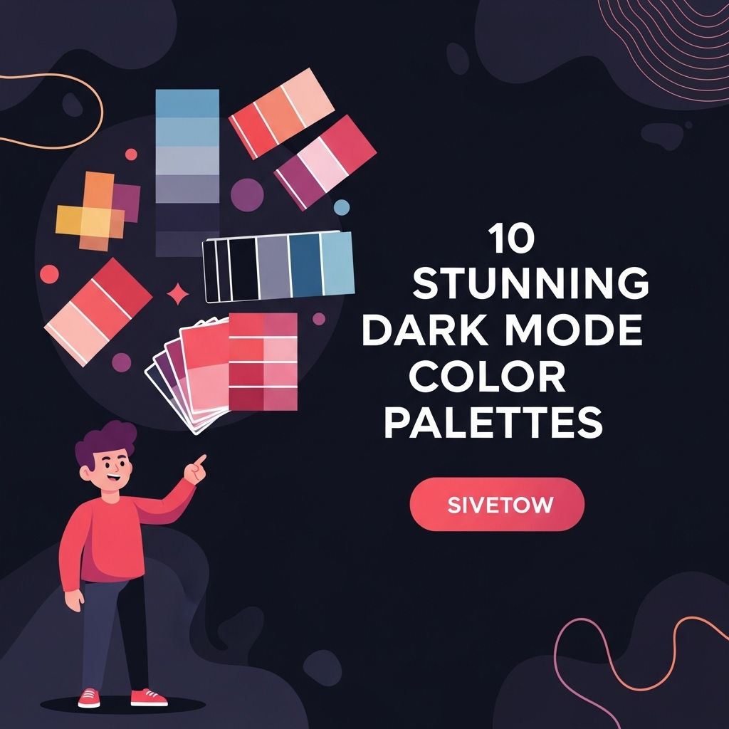
Dark mode has gained immense popularity among users and developers alike, offering not just a sleek aesthetic but also reducing eye strain and saving battery life on OLED screens. As more applications and operating systems introduce dark themes, the importance of choosing the right color palette cannot be overstated. In this article, we will explore ten stunning dark mode color palettes that can enhance your user interface design and improve the user experience.
As designers increasingly embrace dark mode interfaces, selecting the right color palette becomes essential for creating striking visuals. This article explores 10 stunning dark mode color palettes that can elevate your designs and enhance user experience. For those looking to capture attention in the beverage industry, consider checking out some downloadable beer artwork that complements these palettes.
Table of Contents
Why Dark Mode?
Before diving into specific color palettes, it’s essential to understand the benefits of dark mode:
- Reduced Eye Strain: Dark mode makes reading easier in low-light environments.
- Battery Saving: On OLED screens, black pixels are turned off, conserving battery life.
- Modern Aesthetic: Dark themes are often perceived as sleek and contemporary.
- Focus Enhancement: A darker background can help users concentrate on content.
Understanding Color Theory in Dark Mode
When designing for dark mode, it’s essential to consider how colors interact with a dark background. The following principles can guide your color selection:
Contrast is Key
High contrast between text and background colors improves readability. Aim for a contrast ratio of at least 4.5:1 for normal text.
Accent Colors
Use bright, vibrant colors for accents to create visual interest and guide the user’s attention.
Top 10 Dark Mode Color Palettes
Here are ten color palettes that are not only visually appealing but also functional for dark mode applications.
1. Midnight Blue
This palette combines deep blues with soft accent colors.
| Color | Hex Code |
|---|---|
| Midnight Blue | #001f3f |
| Slate Gray | #708090 |
| Light Blue | #00bfff |
| Coral | #ff7f50 |
2. Forest Night
Inspired by nature, this palette uses dark greens and earth tones.
- Forest Green: #2e8b57
- Charcoal: #36454f
- Olive Drab: #6b8e23
- Sand: #f4a460
3. Electric Neon
This vibrant palette is perfect for tech applications that want to stand out.
- Electric Blue: #00ffff
- Hot Pink: #ff69b4
- Lime Green: #32cd32
- Bright Yellow: #ffff00
4. Elegant Grayscale
An understated approach, this palette focuses on various shades of gray.
| Color | Hex Code |
|---|---|
| Dark Charcoal | #1c1c1c |
| Gray | #808080 |
| Light Gray | #d3d3d3 |
| White Smoke | #f5f5f5 |
5. Warm Earth Tones
This palette features warm colors that create a cozy atmosphere.
- Brown: #8b4513
- Burnt Sienna: #e97451
- Dark Olive Green: #556b2f
- Light Salmon: #ffa07a
6. Futuristic Tech
With a sleek, modern look, this palette is ideal for futuristic designs.
- Cyber Yellow: #f3e03b
- Neon Purple: #a020f0
- Electric Blue: #00bfff
- Bright Magenta: #ff00ff
7. Pastel Dark
Soften the dark theme with pastel shades that are easy on the eyes.
| Color | Hex Code |
|---|---|
| Pale Pink | #ffb6c1 |
| Pale Turquoise | #afeeee |
| Pale Goldenrod | #eee8aa |
| Lavender | #e6e6fa |
8. Monochrome Neon
Utilize black and white with bright neon accents for a striking look.
- Black: #000000
- White: #ffffff
- Neon Green: #39ff14
- Neon Orange: #ff5e00
9. Deep Sea
This palette captures the mood of the ocean depths with deep blues and greens.
- Deep Sea Blue: #1e3a5f
- Aquamarine: #7fffd4
- Dark Cyan: #008b8b
- Seaweed Green: #4b9cd3
10. Classic Dark Mode
A timeless palette that incorporates the classic dark background with light text.
| Color | Hex Code |
|---|---|
| Rich Black | #0a0a0a |
| White: #ffffff | |
| Gray: #b0b0b0 | |
| Blue: #007acc |
Implementing Dark Mode Color Palettes
When implementing these color palettes, consider the following:
Accessibility
Ensure your design is accessible to all users, including those with visual impairments. Tools like the WebAIM Contrast Checker can help you assess the readability of your color combinations.
Testing
Conduct usability tests to gather feedback on how users interact with your dark mode designs. A/B testing can provide insights into preferences for different color palettes.
Consistency
Maintain consistency across your app or website for a seamless user experience. Use the same color palette across different sections for a cohesive design.
Conclusion
Choosing the right color palette for dark mode is crucial in creating an engaging and user-friendly interface. The ten palettes discussed in this article offer a range of styles, from vibrant neon to soft pastels, catering to diverse design needs. By understanding the principles of color theory and considering accessibility, you can create a stunning dark mode experience that resonates with your audience.
FAQ
What is Dark Mode?
Dark Mode is a user interface option that uses a dark color scheme, providing a visually appealing alternative to the traditional light mode.
Why should I use Dark Mode?
Using Dark Mode can reduce eye strain in low-light environments, save battery life on OLED screens, and enhance the overall aesthetic of your device.
What are some popular color palettes for Dark Mode?
Popular color palettes for Dark Mode include combinations of dark grays, deep blues, and accents of vibrant colors like teal, orange, or purple.
How can I create my own Dark Mode color palette?
To create your own Dark Mode color palette, start with a dark background color, choose complementary accent colors, and ensure there is enough contrast for readability.
Is Dark Mode suitable for all types of applications?
While Dark Mode can enhance user experience for many applications, it may not be suitable for all types, especially those requiring high visibility and clarity.
Can Dark Mode improve battery life?
Yes, Dark Mode can improve battery life on devices with OLED screens because darker pixels consume less power compared to lighter ones.