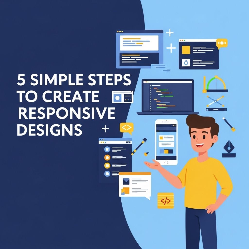
In the world of web design, responsiveness is a critical factor that determines user experience. As devices become increasingly diverse in size and type, creating designs that adapt seamlessly to various screen resolutions has become essential. This article outlines five straightforward steps to create responsive designs that cater to every user, regardless of their device.
Creating stunning responsive designs doesn’t have to be complex. In just five simple steps, you can ensure your website looks great on any device. For inspiration, check out some great resources like craft beer downloads.
Table of Contents
Understanding Responsive Design
Responsive design is an approach that ensures web pages render well across a variety of devices. The key principles include:
- Fluid Grids: Using relative units like percentages instead of fixed pixels.
- Flexible Images: Images that scale within their containing elements.
- Media Queries: CSS techniques that apply styles depending on device characteristics.
Step 1: Utilize a Fluid Grid System
A fluid grid system is the foundation of responsive design. Unlike fixed grids, which are based on a set number of pixels, fluid grids use relative units, allowing the layout to adapt to the screen size. Here’s how to implement it:
Creating a Fluid Grid
- Define the overall layout structure using percentage-based widths.
- Set the maximum width for your containers to prevent them from exceeding the viewport size.
- Use media queries to adjust the layout at different breakpoints.
For example, a simple grid can be defined using CSS as follows:
container { width: 100%; max-width: 1200px; margin: 0 auto; }
.column { float: left; width: 50%; }
Step 2: Implement Media Queries
Media queries are essential in responsive design as they allow you to apply different styles based on the characteristics of the device. Here’s how to effectively use media queries:
Setting Breakpoints
Breakpoints determine when your design should adapt to new styles. Common breakpoints include:
| Device Type | Breakpoint |
|---|---|
| Mobile | 480px |
| Tablet | 768px |
| Desktop | 1024px |
Example of Media Query Usage
@media only screen and (max-width: 768px) {
  .column { width: 100%; }
}
Step 3: Optimize Images for Different Screens
Images are often the largest asset in any web design, making them a prime candidate for optimization. Here are some tips:
Responsive Image Techniques
- Use the
srcsetattribute to serve different image resolutions based on the user’s device. - Employ CSS techniques, such as
max-width: 100%, to ensure images scale appropriately within their containers. - Consider using SVGs for logos and icons, as they are resolution-independent.
Step 4: Mobile-First Approach
Adopting a mobile-first approach means designing for the smallest screen first and then progressively enhancing the design for larger screens. This method ensures that critical content is prioritized. Here’s how you can implement this:
Developing with Mobile in Mind
- Start by writing styles that cater to mobile devices.
- Use media queries to add styles for larger devices.
- Test your design on various mobile devices to ensure usability.
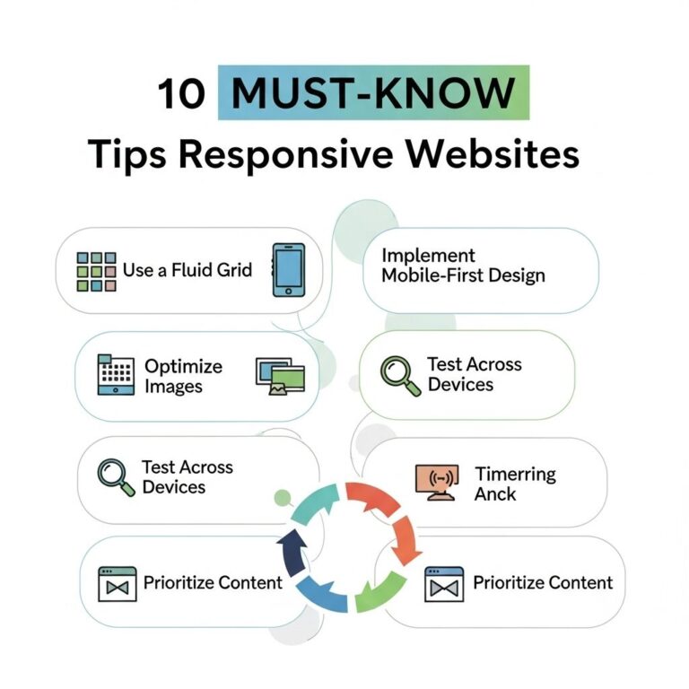
Step 5: Test Responsiveness Across Devices
The final step in creating responsive designs is thorough testing. This ensures that your design functions perfectly across all devices and browsers. Consider the following testing methods:
Responsive Testing Tools
- Google Chrome Developer Tools: Utilize the device toolbar to simulate various devices.
- BrowserStack: A cross-browser testing tool that allows you to check responsiveness on real devices.
- Responsinator: A simple tool to view how your site appears on popular devices.
Additionally, perform usability tests to gauge user interaction on different devices. Consider running A/B tests to see what works best in terms of layout and navigation on various screen sizes.
Conclusion
Creating responsive designs doesn’t have to be a daunting task. By following these five steps, from implementing fluid grids to thorough testing, you can enhance the effectiveness of your web designs and ensure a seamless user experience across all devices. As technology continues to evolve, staying ahead with responsive design practices will be crucial for any web designer.
FAQ
What are responsive designs?
Responsive designs are web design approaches that allow websites to adapt to different screen sizes and devices, ensuring an optimal viewing experience.
Why is responsive design important for websites?
Responsive design is crucial because it enhances user experience, improves SEO rankings, and reduces the need for multiple versions of a website.
What are the key principles of responsive design?
The key principles of responsive design include fluid grids, flexible images, media queries, and a mobile-first approach.
How can I test if my design is responsive?
You can test your design’s responsiveness using browser developer tools, various screen size simulators, and real devices.
What tools can help me create responsive designs?
Popular tools for creating responsive designs include Bootstrap, Foundation, and CSS Grid, as well as design software like Adobe XD and Figma.


