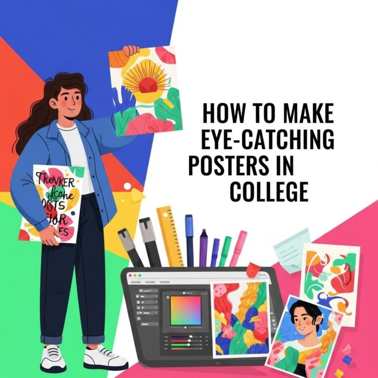
Creating eye-catching thumbnails is critical for anyone looking to attract views and engagement online. Thumbnails serve as the first impression of your content, and they must be designed with intent and strategy. In this article, we will delve into the essential elements of creating thumbnails that not only capture attention but also encourage clicks. Let’s explore the techniques and tips to make your thumbnails stand out in a crowded digital landscape.
Table of Contents
Understanding the Importance of Thumbnails
Thumbnails function as visual shortcuts to your content, especially on platforms like YouTube, social media, and blogs. A well-designed thumbnail can significantly influence the viewer’s decision to engage with your content. Here are some reasons why thumbnails are crucial:
- First Impressions: Thumbnails are the first thing users see; they can make or break the likelihood of engagement.
- Brand Representation: A consistent thumbnail style can enhance brand recognition.
- Visual Communication: Thumbnails should communicate the essence of your content at a glance.
Key Elements of a Compelling Thumbnail
To design a thumbnail that stops thumbs, it’s essential to incorporate several key elements:
1. Imagery
Imagery is the cornerstone of any thumbnail design. Here are some tips:
- Use high-resolution images that are clear and visually appealing.
- Choose images that relate directly to your content topic.
- Incorporate a focal point that draws the viewer’s eye.
2. Color Schemes
Colors evoke emotions and can impact click-through rates. Consider the following:
- Use contrasting colors to make text and images pop.
- Stick to a cohesive color palette that aligns with your branding.
- Avoid overly busy backgrounds that can distract from the main content.
3. Typography
The text on your thumbnail should be legible and engaging. Here are some considerations:
- Use bold, easy-to-read fonts.
- Limit the amount of text to a few impactful words.
- Ensure that the text color contrasts with the background for readability.
Best Practices for Thumbnail Design
Now that we’ve covered the key elements, let’s discuss some best practices for thumbnail design.
1. Maintain Consistency
Consistency in style helps create a recognizable brand. Keep these tips in mind:
- Develop a template for your thumbnails.
- Use similar fonts and color schemes for branding.
- Ensure that the overall feel matches your content style.
2. Test Different Designs
Experimentation can lead to discovering what works best for your audience:
- Create multiple thumbnail variations for the same content.
- Analyze performance metrics to identify which designs drive more engagement.
- Iterate based on audience feedback.
3. Analyze Competitors
Look at what successful creators in your niche are doing:
- Identify patterns in their thumbnail styles.
- Analyze which thumbnails get the most clicks.
- Adapt their successful strategies to fit your brand.
Tools for Thumbnail Creation
There are numerous tools available that can help you create stunning thumbnails:
1. Canva
Canva is a user-friendly graphic design tool with numerous templates specifically for thumbnails.
2. Adobe Spark
Adobe Spark offers advanced design capabilities, allowing for more customization and branding opportunities.
3. Snappa
Snappa provides easy drag-and-drop functionality and access to a vast library of stock photos.
Examples of Effective Thumbnails
| Thumbnail Description | Effectiveness |
|---|---|
| Bright colors with bold text | High engagement, grabs attention quickly |
| Personalized image of host with facial expressions | Creates relatability and connection with viewers |
| Minimalist design with strong focal point | Effective in communicating the message succinctly |
Common Mistakes to Avoid
While designing your thumbnails, watch out for these common pitfalls:
- Cluttered Designs: Too many elements can overwhelm viewers.
- Poor Quality Images: Low-resolution images can harm your brand’s credibility.
- Ineffective Text: Overly complex fonts or excessive text can detract from your message.
Conclusion
Creating thumbnails that are not only thumb-stopping but also convey your message effectively is both an art and a science. By understanding the critical elements of design, following best practices, and leveraging the right tools, you can enhance the attractiveness of your content. Remember, the goal is to create a thumbnail that not only attracts clicks but also accurately represents what viewers can expect from your content. With time and experimentation, you’ll develop a thumbnail style that resonates with your audience and boosts your engagement significantly.
FAQ
What makes a thumbnail eye-catching?
A thumbnail becomes eye-catching by using bold colors, clear images, and engaging text that accurately represents the content.
How important are thumbnails for video content?
Thumbnails are crucial for video content as they serve as the first impression, helping to attract viewers and increase click-through rates.
What are some tips for designing effective thumbnails?
Effective thumbnails should be simple, include high-contrast colors, feature readable typography, and convey a sense of curiosity or excitement.
Should I include text on my thumbnails?
Yes, including brief and compelling text on your thumbnails can provide context and entice viewers to click on your video.
How can I test which thumbnail works best?
You can test different thumbnails by using A/B testing to compare click-through rates and audience engagement on various designs.
What dimensions should my thumbnails be?
Thumbnails should typically be 1280 x 720 pixels, with a minimum width of 640 pixels, to ensure they look great across all devices.