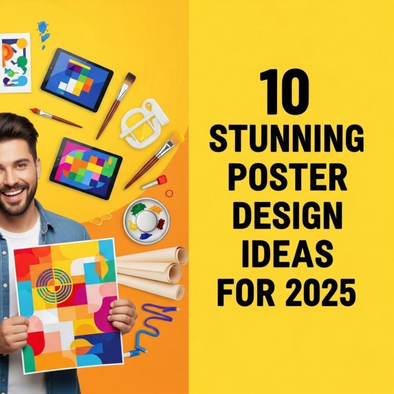
In the world of graphic design, a poster is not just a piece of art; it is a powerful tool for communication and expression. Whether for an event, a brand, or an artistic endeavor, the layout of a poster can significantly impact its effectiveness. The right design can grab attention, convey a message, and inspire action. In this article, we’ll explore ten amazing poster design layout ideas that will help you create eye-catching and effective posters.
Table of Contents
Understanding the Basics of Poster Design
Before diving into the specific layout ideas, it’s essential to understand some foundational principles of poster design:
- Hierarchy: Establish a clear visual hierarchy that guides the viewer’s eye through the poster.
- Contrast: Use contrast effectively to make key elements stand out.
- Typography: Choose fonts that complement the message and maintain readability.
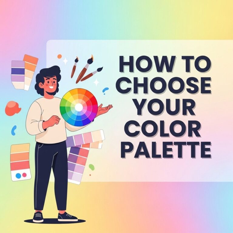
- Color Scheme: A coherent color scheme enhances aesthetics and mood.
1. The Grid Layout
A grid layout is a classic design technique that organizes content into rows and columns, bringing a sense of order and clarity to your poster. It’s particularly effective for:
- Displaying multiple images
- Creating a structured flow of information
- Ensuring alignment and consistency
Example:
| Column 1 | Column 2 | Column 3 |
|---|---|---|
| Image 1 | Image 2 | Image 3 |
| Description 1 | Description 2 | Description 3 |
2. The Asymmetrical Layout
An asymmetrical layout breaks the traditional grid structure, allowing for a more dynamic and contemporary look. This layout encourages creative freedom and can emphasize particular elements over others.
Benefits:
- Creates visual interest
- Highlights specific content
- Conveys a modern aesthetic
3. The Typographic Poster
Typography can be a compelling focal point in poster design. Using type as the main visual element can create striking images that draw the audience’s attention.
Key Points:
- Experiment with font sizes and weights.
- Incorporate quotes or impactful phrases.
- Explore negative space for emphasis.
4. The Minimalist Approach
Less can indeed be more in poster design. A minimalist approach focuses on essential elements, allowing the message to resonate without distraction.
Characteristics:
- Simple color palette
- Ample white space
- Concise messaging
5. The Collage Layout
A collage layout combines various elements, such as photographs, illustrations, and textures, for a rich and layered visual experience. This style works well for artistic posters or events.
Tips for Collage Design:
- Mix different textures and patterns.
- Use varying opacity for depth.
- Ensure a cohesive color scheme.
6. The Infographic Poster
Infographic posters effectively communicate complex information in a visually digestible format, making them ideal for educational purposes or data representation.
Elements to Include:
- Charts and graphs
- Icons and illustrations
- Clear headings and subheadings
7. The Photo-Centric Layout
In a photo-centric layout, photographs take center stage, making them the primary focus of the poster. This layout is perfect for advertisements, events, or promotions where visuals are crucial.
Tips for Photo Selection:
- Choose high-resolution images.
- Ensure images align with the brand’s message.
- Consider the emotional impact of the photos.
8. The Vintage Style
Vintage posters have a timeless appeal, often characterized by retro typography, muted color palettes, and classic layouts. This style can evoke nostalgia and draw attention.
Key Features:
- Classic fonts
- Grainy textures
- Warm color schemes
9. The Layered Design
A layered design creates depth by stacking elements on top of each other, allowing for a three-dimensional effect. This technique can make a poster visually engaging.
Implementation:
- Use shadows to create depth.
- Vary the scale of elements.
- Incorporate transparent layers.
10. The Interactive Layout
Lastly, consider an interactive layout that encourages viewer engagement, especially in digital formats. This could include QR codes, augmented reality elements, or embedded links.
Engagement Strategies:
- Incorporate clickable elements.
- Utilize motion graphics.
- Encourage social media sharing.
Conclusion
Choosing the right poster design layout can make a substantial difference in conveying your message effectively. Whether you opt for a grid layout for structure, an asymmetrical layout for modern flair, or any of the other styles discussed, remember to maintain clarity and ensure your design serves its purpose. With these ten layout ideas, you are equipped to create stunning posters that captivate and inspire your audience.
FAQ
What are some popular poster design layout ideas?
Some popular poster design layout ideas include asymmetrical layouts, grid-based designs, typographic posters, minimalistic styles, and collage effects.
How can I create an eye-catching poster layout?
To create an eye-catching poster layout, use bold colors, engaging typography, and high-quality images. Ensure there’s a strong focal point and utilize white space effectively.
What design software can I use for poster creation?
You can use software like Adobe Photoshop, Illustrator, Canva, or even free tools like GIMP and Inkscape for creating stunning poster designs.
What is the importance of color in poster design?
Color plays a crucial role in poster design as it evokes emotions, attracts attention, and conveys the message effectively. Choosing the right color palette is essential for visual impact.
How do I choose the right typography for my poster?
Choose typography that complements your theme and message. Consider readability, font pairing, and the overall tone of your design to ensure it resonates with your audience.
What are common mistakes to avoid in poster design?
Common mistakes to avoid in poster design include overcrowding elements, using too many fonts, neglecting hierarchy, and poor image quality. Keep it simple and focused.