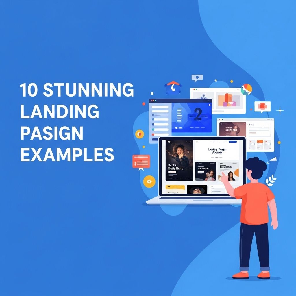
In the ever-evolving world of digital marketing, landing pages play a crucial role in converting visitors into leads or customers. A well-designed landing page not only attracts the audience’s attention but also guides them towards taking a specific action, such as signing up for a newsletter or making a purchase. In this article, we’ll explore ten stunning landing page design examples that exemplify the principles of effective web design, showcasing how creativity and functionality can come together to drive conversions.
Table of Contents
1. The Minimalist Approach
One of the most effective trends in landing page design is minimalism. By stripping away unnecessary elements, the focus remains on the core message and call-to-action (CTA). A great example of this is:
Example: Apple iPhone Product Page
Apple’s product pages are renowned for their clean layouts and stunning visuals. The iPhone landing page showcases:
- High-resolution images of the product
- A simple yet bold call-to-action button
- Clear navigation to explore further details
2. Interactive Elements
Interactive elements can enhance user engagement and encourage visitors to explore more. Here’s an example:
Example: Spotify Wrapped
Spotify’s annual Wrapped page allows users to engage with their personalized listening statistics. Features include:
- Interactive animations
- Visually appealing graphics
- Shareable content to social media
3. Bold Typography
Typography can greatly affect the readability and impact of a landing page. Bold, unique fonts can create a memorable impression.
Example: Airbnb
Airbnb effectively uses bold typography on its landing pages to communicate key messages quickly. Its approach includes:
| Element | Feature |
|---|---|
| Headlines | Large, eye-catching fonts |
| Subheaders | Concise and informative |
4. High-Quality Visuals
Eye-catching visuals can communicate your message better than words. High-quality images or videos can captivate your audience instantly.
Example: Dropbox
Dropbox’s landing page makes effective use of visuals to demonstrate its product. Key elements include:
- Illustrations that explain features
- Video testimonials from satisfied users
- Consistent color scheme that aligns with branding
5. Social Proof
Incorporating testimonials, user reviews, or case studies can build trust and encourage conversions. Consider this example:
Example: Slack
Slack uses social proof on its landing page by showcasing:
- Prominent company logos of users
- User testimonials highlighting satisfaction
- Statistics showing effectiveness
6. Strong Call-to-Action
A strong and clear call-to-action can significantly improve conversion rates. The design should make it impossible for visitors to miss it.
Example: HubSpot
HubSpot’s landing page excels in having a prominent call-to-action:
- Contrasting colors that stand out
- Simple, action-oriented text
- A sense of urgency through limited-time offers
7. Custom Illustrations
Custom illustrations can provide a unique feel and reinforce branding on a landing page. A perfect case is:
Example: Mailchimp
Mailchimp’s landing pages feature playful, custom illustrations that add personality. This approach includes:
- Brand-reinforcing visual styles
- Clear narrative elements that explain services
- Fun animations that enhance user engagement
8. Responsive Design
With the increasing use of mobile devices, responsive design is essential. A great example of responsive design is:
Example: Shopify
Shopify’s landing page is designed to look great on all devices. Key features include:
- Fluid layouts that adjust to screen sizes
- Fast loading speeds across devices
- Touch-friendly navigation
9. Utilizing White Space
White space can enhance readability and focus. A great example is:
Example: Asana
Asana’s landing page effectively uses white space to guide users. Features include:
- Ample space around text and images
- Clean sections that guide scrolling
- A distraction-free environment
10. Personalized Content
Personalization can make a landing page feel tailored to the individual user. Consider this example:
Example: Netflix
Netflix employs personalized recommendations right from the landing page:
- Dynamic content that changes based on user behavior
- Tailored suggestions based on viewing history
- Engaging banners that reflect user interests
Conclusion
Landing pages are a vital component of successful online marketing strategies. The examples discussed above demonstrate that stunning design can effectively attract, engage, and convert visitors. By incorporating elements such as minimalism, interactivity, bold typography, high-quality visuals, and social proof, brands can create compelling landing pages that drive results. Take inspiration from these examples and consider how you can implement similar strategies in your own landing page designs to optimize for conversions and enhance user experience.
FAQ
What are the key elements of an effective landing page design?
An effective landing page design typically includes a clear and compelling headline, engaging visuals, a concise value proposition, a strong call-to-action, and user-friendly navigation.
How can I improve the conversion rate of my landing page?
To improve your landing page conversion rate, focus on optimizing your copy for clarity, enhancing the visual appeal, using persuasive calls-to-action, and conducting A/B testing to determine what works best.
Why is mobile responsiveness important in landing page design?
Mobile responsiveness is crucial because a significant portion of web traffic comes from mobile devices. A responsive design ensures a seamless user experience across all devices, which can lead to higher conversions.
What role does color play in landing page design?
Color plays a vital role in landing page design as it influences user emotions and behaviors. Choosing the right colors can enhance brand recognition, evoke desired feelings, and guide users toward the call-to-action.
How do visuals impact the effectiveness of a landing page?
Visuals can significantly impact the effectiveness of a landing page by capturing attention, conveying messages quickly, and illustrating product benefits, which can lead to increased engagement and conversions.
What are common mistakes to avoid in landing page design?
Common mistakes to avoid in landing page design include cluttered layouts, vague messaging, excessive form fields, slow loading times, and neglecting mobile optimization.