In the realm of web and mobile application design, the login page serves as the gateway for users to access the features and functionalities of your application. A well-designed login page not only enhances user experience but also establishes the brand’s identity. With Figma, a collaborative interface design tool, creating a stunning login page becomes a seamless process. In this article, we will explore the steps to design an impressive login page using Figma, along with design tips, best practices, and useful resources.
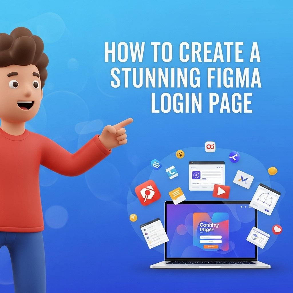
Creating a stunning Figma login page doesn’t have to be time-consuming. With a few simple steps, you can design a professional and eye-catching interface in just minutes. For those looking to enhance their designs, consider exploring varieties of bag mockups to add a unique touch.
Table of Contents
Understanding the Basics of Figma
Before diving into the design process, it’s essential to familiarize yourself with Figma’s interface and tools. Figma is a cloud-based design tool that allows real-time collaboration, making it an excellent choice for teams.
Key Features of Figma
- Cloud-Based Collaboration: Work with multiple team members simultaneously.
- Vector Graphics: Create scalable designs without losing quality.
- Prototyping: Link design screens to showcase user flow.
- Plugins: Enhance functionality with various plugins available in the Figma community.
Defining Your Login Page Structure
Before you start designing, it’s crucial to outline the elements that your login page will include. A standard login page typically consists of:
- Brand Logo
- Input Fields (Username, Password)
- Login Button
- Forgot Password Link
- Signup or Create Account Link
Understanding these elements will help you create a clean and functional layout.
Choosing the Right Layout
Layouts can significantly influence user experience. Here are some common layout styles for login pages:
| Layout Type | Description |
|---|---|
| Centered Layout | Elements are centered both horizontally and vertically, providing a balanced look. |
| Split Layout | Divides the page into two sections, often with visuals on one side and form elements on the other. |
| Full-Screen Background | Utilizes a full-screen image or video to create an impactful visual while keeping form elements minimal. |
Designing Your Login Page in Figma
Now that you have a clear structure in mind, it’s time to jump into Figma and start designing. Follow these steps for an effective design process.
Step 1: Create a New Frame
Open Figma and create a new frame. Set the dimensions according to your target device (e.g., 375 x 812 for mobile, 1440 x 1024 for desktop).
Step 2: Add Your Brand Logo
Import your logo into Figma and place it at the top of your frame. Ensure it’s adequately sized to maintain brand visibility without overpowering other elements.
Step 3: Design Input Fields
Use the rectangle tool to create input fields for your username and password. Consider the following design aspects:
- Border Radius: Rounded corners can make your inputs feel more approachable.
- Placeholder Text: Use light gray text for placeholders, indicating where to type.
- Error States: Design a visual cue (like a red border) for incorrect inputs.
Step 4: Add the Login Button
Create a prominent button beneath the input fields. Use contrasting colors to make it stand out. Consider adding shadow effects to give depth.
Step 5: Implement Links
Below the login button, add links for ‘Forgot Password?’ and ‘Create Account’. Ensure these are less prominent than the login button to maintain focus.
Step 6: Choose a Color Palette
Select a color palette that aligns with your brand. Tools like Coolors can help you generate harmonious color schemes. Consider using:
- Primary Color for buttons and highlights
- Secondary Color for backgrounds
- Neutral Colors for text
Typography and Iconography
Typography plays a crucial role in your design’s overall aesthetic. Choose fonts that are readable and align with your brand identity. Consider these tips:
Font Selection
- Size: Ensure your font sizes create a clear hierarchy.
- Weight: Use bold weights for headlines and regular for body text.
- Style: Limit your design to 2-3 different font styles to maintain consistency.
Icon Usage
Icons can enhance user understanding and interaction. Use relevant icons for:
- Input fields (e.g., eye icon for showing/hiding the password)
- Action buttons
- Links
Prototyping and User Testing
Once your design is complete, it’s essential to prototype the user experience. Figma allows you to create interactive prototypes, enabling you to link screens and simulate user interactions.
Conducting User Testing
Gather feedback from potential users to identify any pain points. During testing, pay attention to:
- Overall usability
- Accessibility
- Visual appeal
Finalizing Your Design
After incorporating feedback, finalize your design. Ensure that all elements are aligned, and colors are consistent. Export your design assets directly from Figma for development.
Export Options
Figma provides several export formats, including PNG, JPG, SVG, and PDF. Choose the format that best suits your development needs.
Conclusion
Designing a stunning login page in Figma is an essential skill for any designer looking to create engaging user experiences. By following these steps and keeping best practices in mind, you can build a login page that not only looks great but also serves its functional purpose effectively. Remember to stay updated with design trends and continually iterate based on user feedback for the best results.
FAQ
What are the key components of a stunning Figma login page?
A stunning Figma login page should include a clean layout, a prominent logo, user-friendly input fields, a strong call-to-action button, and visually appealing colors and typography.
How do I choose the right color scheme for my Figma login page?
Choose a color scheme that reflects your brand identity while ensuring good contrast for text readability. You can use tools like Adobe Color or Coolors to help you find complementary colors.
What dimensions should I use for a Figma login page?
Typically, a login page can be designed in a standard desktop size of 1440×1024 pixels, but it’s essential to also consider responsive design for mobile and tablet screens.
How can I improve the user experience on my Figma login page?
Improve user experience by minimizing the number of required fields, offering social login options, adding placeholder text, and ensuring fast loading times.
What typography works best for a login page design in Figma?
Choose clean, sans-serif fonts for a modern look, ensuring that the text is legible. Use a larger font size for headings and a smaller size for input fields to create a clear hierarchy.
Can I use icons in my Figma login page design?
Yes, using icons can enhance the user experience by providing visual cues. Ensure that the icons are simple and match the overall design style of your login page.