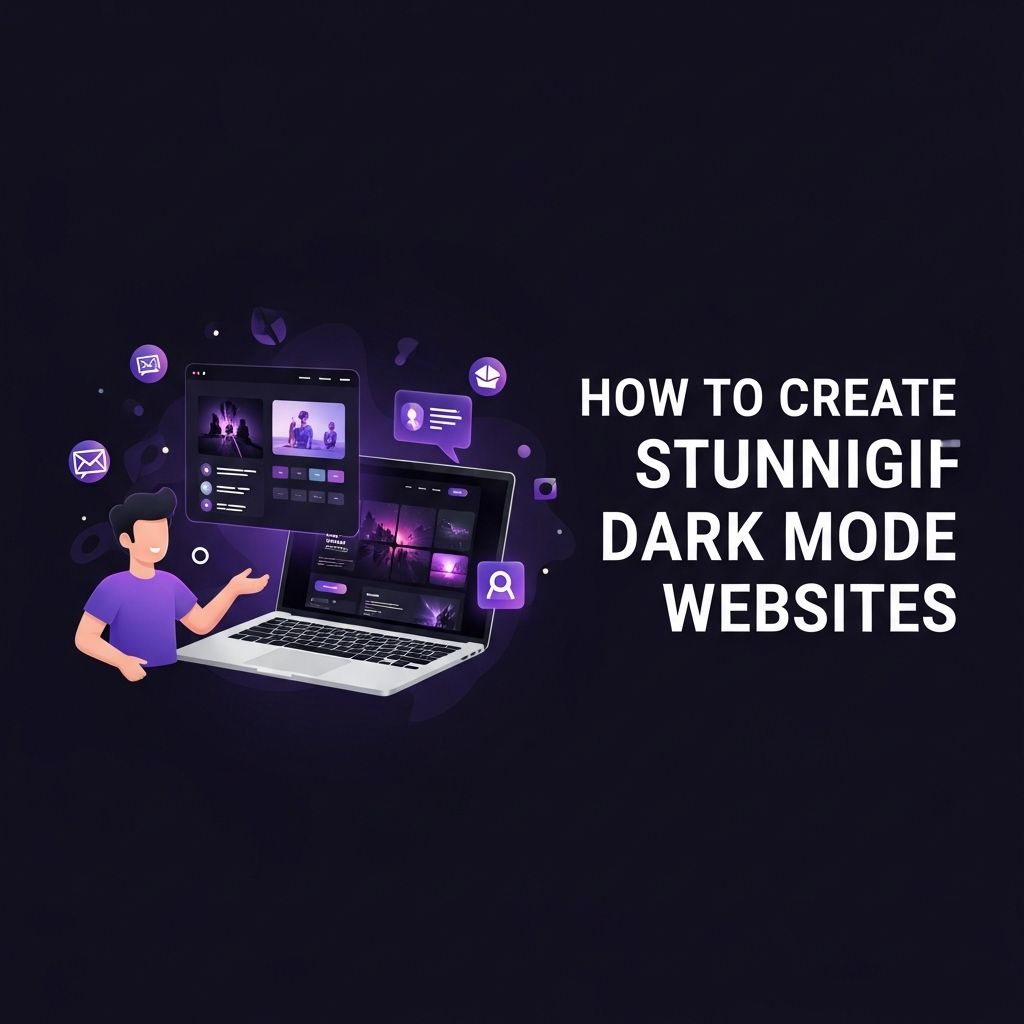
In the era of digital design, dark mode has emerged as a popular trend, captivating users with its sleek aesthetic and reduced eye strain. As more applications and websites adopt this feature, designers and developers are tasked with creating stunning dark mode websites that not only look great but also provide a superior user experience. In this article, we will explore the essential principles, design strategies, and technical implementations necessary to craft an attractive dark mode website.
Dark mode websites have rapidly gained popularity, offering users a sleek and modern aesthetic that reduces eye strain. To elevate your designs, utilizing high-quality visuals is essential. Consider exploring best bag mockup designs to enhance your dark mode creations.
Table of Contents
Understanding Dark Mode
Dark mode, also known as night mode, is an interface design that utilizes a dark color palette. It is not just a visual preference but also offers several benefits:
- Reduces eye strain in low-light conditions.
- Improves battery life on OLED screens.
- Enhances content focus by reducing distractions.
However, transitioning to dark mode requires careful planning to ensure accessibility and usability. Let’s delve into the best practices for creating a dark mode website.
Design Principles for Dark Mode
1. Color Palette
The right color palette is crucial when designing for dark mode. Here are some key points to consider:
- Use darker shades for backgrounds, typically ranging from #121212 to #1E1E1E.
- Choose lighter colors for text, ideally white or very light grays (e.g., #E0E0E0).
- Incorporate accent colors that stand out against the dark background, such as bright blues, greens, or yellows.
2. Contrast and Readability
Contrast is vital for ensuring text and interface elements are legible:
- Maintain a contrast ratio of at least 4.5:1 for normal text and 3:1 for large text.
- Avoid overly bright colors for text, which can be harsh on the eyes.
3. Visual Hierarchy
In dark mode, establishing a clear visual hierarchy helps users navigate your site:
- Utilize different font weights and sizes to distinguish headings, subheadings, and body text.
- Incorporate spacing and alignment to guide the user’s eye.
Implementing Dark Mode in Your Website
1. Using CSS Variables
One effective way to implement dark mode is through the use of CSS variables. This approach allows for easy customization and toggling between themes:
:root {
    --background-color: #FFFFFF;
    --text-color: #000000;
}

[data-theme='dark'] {
    --background-color: #121212;
    --text-color: #E0E0E0;
}

body {
    background-color: var(--background-color);
    color: var(--text-color);
}
2. JavaScript for Theme Toggling
Implementing a toggle for users to switch between light and dark modes can enhance user experience:
document.querySelector('#theme-toggle').addEventListener('click', () => {
    document.body.dataset.theme = document.body.dataset.theme === 'dark' ? 'light' : 'dark';
});
3. Media Queries
Leverage media queries to automatically detect user preferences:
@media (prefers-color-scheme: dark) {
    body {
        background-color: #121212;
        color: #E0E0E0;
    }
}
Best Practices for Dark Mode Design
1. Testing for Accessibility
Accessibility is paramount. Ensure your dark mode design is usable for all individuals, including those with visual impairments:
- Utilize tools like color contrast checkers to verify compliance.
- Incorporate ARIA roles and labels to assist screen readers.
2. Consistency Across Platforms
If your website has mobile and desktop versions, ensure consistent dark mode experiences:
- Test across various devices and browsers to ensure uniformity.
- Maintain similar design elements for brand consistency.
3. User Preferences and Persistence
Respect user preferences by saving their theme choice using local storage:
localStorage.setItem('theme', 'dark'); // To save preference
let theme = localStorage.getItem('theme'); // To retrieve preference
Examples of Stunning Dark Mode Websites
| Website | Features |
|---|---|
| Medium | Focused content layout with subtle dark tones. |
| GitHub | Code syntax highlighting in dark mode enhances readability. |
| Slack | Consistent dark themes across all platforms improve user experience. |
Conclusion
Creating stunning dark mode websites is a rewarding challenge that merges aesthetic appeal with user-centric design. By adhering to the principles discussed, employing modern CSS and JavaScript techniques, and prioritizing accessibility, you can design a dark mode experience that captivates and retains users. As you embark on your dark mode journey, remember to continually test and refine your designs based on user feedback and emerging trends in web design. Embrace the dark side, and transform your website into a visually striking and user-friendly digital space.
FAQ
What is dark mode and why should I use it for my website?
Dark mode is a color scheme that uses light text on a dark background. It can reduce eye strain, save battery life on OLED screens, and enhance user experience, making it a popular choice for modern websites.
How do I implement dark mode on my website?
You can implement dark mode by using CSS media queries to detect user preferences, allowing you to switch between light and dark themes based on the user’s system settings.
What design principles should I follow for dark mode websites?
When designing for dark mode, ensure sufficient contrast between text and background, use colors that don’t strain the eyes, and maintain consistency in UI elements for a seamless experience.
Are there any tools or libraries to help create dark mode websites?
Yes, there are several tools and libraries like Tailwind CSS, Bootstrap, and CSS variables that simplify the creation of dark mode themes by providing pre-built styles and components.
How can I test my dark mode website for accessibility?
You can test accessibility by using tools like WAVE or Lighthouse, ensuring that color contrast meets WCAG standards and that your content is readable in both light and dark themes.