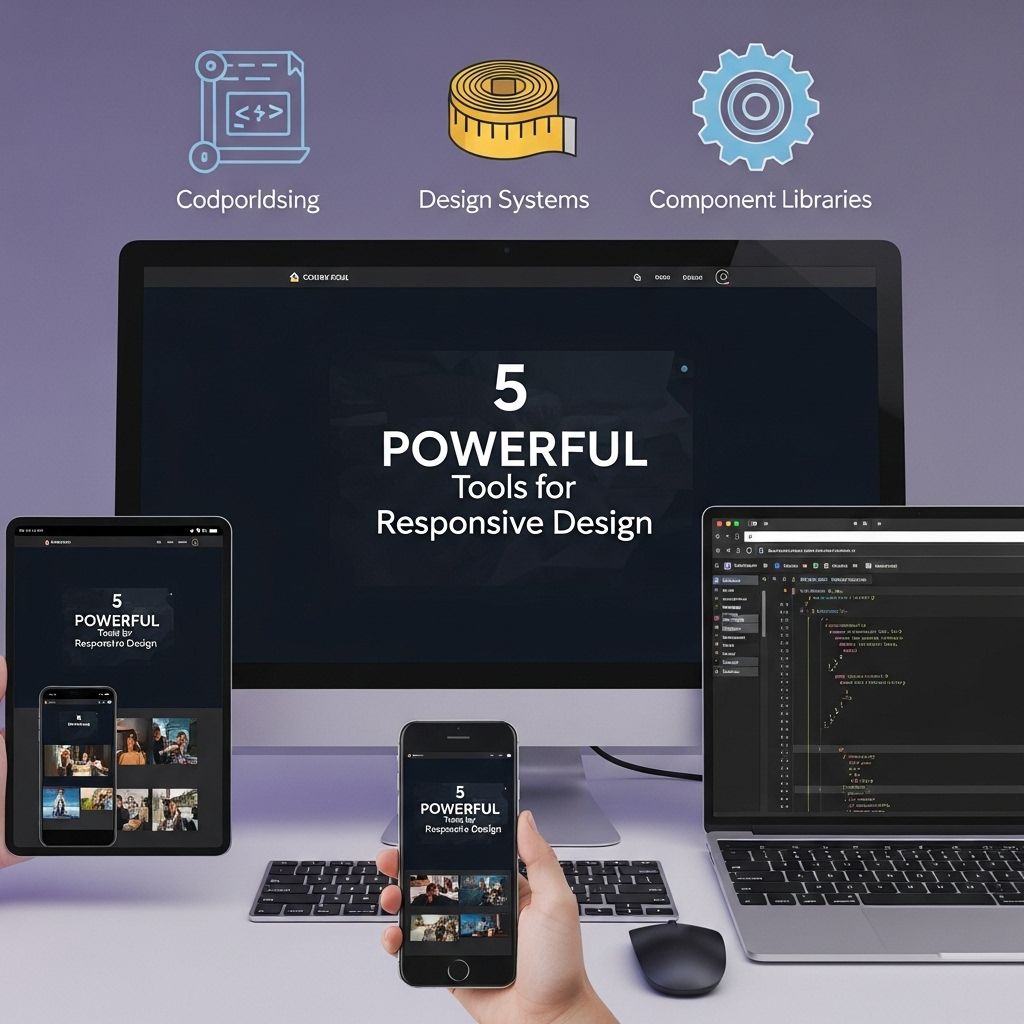
In today’s digital landscape, ensuring that websites are responsive is more critical than ever. With an increasing number of users accessing the web through a variety of devices, it is essential to create designs that look great and function seamlessly on screens of all sizes. This article explores five powerful tools that can help developers and designers create responsive web designs efficiently and effectively.
Table of Contents
1. Bootstrap
Bootstrap is a popular front-end framework that simplifies the development of responsive websites. It offers a grid system, prebuilt components, and powerful JavaScript plugins, making it a go-to choice for many developers.
Features of Bootstrap:
- Mobile-first approach: Bootstrap is designed to prioritize mobile devices, making it easier to create responsive layouts.
- Customizable components: The framework includes a wide variety of UI components that can be easily customized to fit the design.
- Extensive documentation: Bootstrap provides comprehensive documentation, including examples and best practices.
Getting Started with Bootstrap:
- Download the Bootstrap files from the official website.
- Include the CSS and JavaScript files in your project.
- Utilize the grid system and prebuilt components to create responsive layouts.
2. Adobe XD
Adobe XD is a powerful design tool that allows designers to create wireframes and prototypes for responsive web designs. It offers a user-friendly interface and a range of features that facilitate collaboration and feedback.
Key Features of Adobe XD:
- Artboards: Create multiple artboards for different screen sizes, allowing you to design and test responsive layouts easily.
- Responsive Resize: This feature automatically adjusts the elements on your artboard as you change the dimensions, ensuring a fluid design.
- Sharing and Collaboration: Easily share your prototypes for feedback and collaborate with team members in real-time.
Best Practices in Adobe XD:
- Utilize the grid layout to align elements consistently.
- Use symbols and components to maintain design consistency across different artboards.
- Test prototypes on actual devices for real-world feedback.
3. Flexbox
Flexbox, or the Flexible Box Layout, is a CSS3 layout model that provides an efficient way to layout, align, and distribute space among items in a container, even when their size is unknown.
Advantages of Using Flexbox:
- Simple alignment: Easily align items vertically and horizontally, making it easier to create complex layouts.
- Responsive: Flexbox is inherently responsive, adjusting elements based on the available space.
- Order control: Change the visual order of items without altering the HTML structure.
Example of Flexbox Usage:
.container { display: flex; justify-content: center; align-items: center; }4. Media Queries
Media queries are a cornerstone of responsive design, allowing developers to apply different styles based on the characteristics of the device being used, such as its width, height, resolution, and orientation.
How to Implement Media Queries:
- Define breakpoints in your CSS file based on different screen sizes.
- Use the @media rule to apply styles conditionally:
@media (max-width: 768px) { .container { flex-direction: column; } }Common Breakpoints:
| Device Type | Breakpoint |
|---|---|
| Mobile | max-width: 767px |
| Tablet | min-width: 768px and max-width: 1024px |
| Desktop | min-width: 1025px |
5. Responsive Design Mode in Browsers
Modern web browsers come equipped with responsive design tools that allow developers to test their designs across various device sizes and orientations without needing physical devices.
Using Responsive Design Mode:
- Open your website in a modern browser (e.g., Chrome, Firefox).
- Activate the Developer Tools (usually F12 or right-click and select ‘Inspect’).
- Click the ‘Toggle Device Toolbar’ button to enable responsive design mode.
Benefits of Using Responsive Design Mode:
- Real-time testing: Instantly see changes as you adjust the viewport size.
- Device simulations: Test different devices and orientations easily.
- Performance checks: Assess how your design performs under various conditions.
Conclusion
Responsive web design is no longer an option but a necessity in today’s mobile-first world. Utilizing tools like Bootstrap, Adobe XD, Flexbox, media queries, and browser design modes can streamline the process of creating responsive and user-friendly websites. By embracing these tools, developers can ensure their designs meet the demands of diverse devices and provide an optimal experience for all users.
FAQ
What are the best tools for responsive web design?
Some of the best tools for responsive web design include Adobe XD, Figma, Bootstrap, Foundation, and Google Chrome DevTools.
How does Adobe XD help in responsive design?
Adobe XD allows designers to create responsive layouts with its artboard features, enabling easy adjustments for different screen sizes.
What is Bootstrap and why is it recommended for responsive design?
Bootstrap is a popular front-end framework that provides a responsive grid system, pre-designed components, and JavaScript plugins to simplify responsive web design.
Can Figma be used for collaborative responsive design projects?
Yes, Figma is a cloud-based design tool that allows multiple users to collaborate in real time, making it ideal for responsive design projects.
How do Google Chrome DevTools assist in testing responsive designs?
Google Chrome DevTools includes a device mode feature that lets you simulate different screen sizes and resolutions, making it easier to test and debug responsive designs.
What is the importance of responsive design in web development?
Responsive design is crucial because it ensures that websites provide an optimal viewing experience across a wide range of devices, improving user engagement and SEO.