
Table of Contents
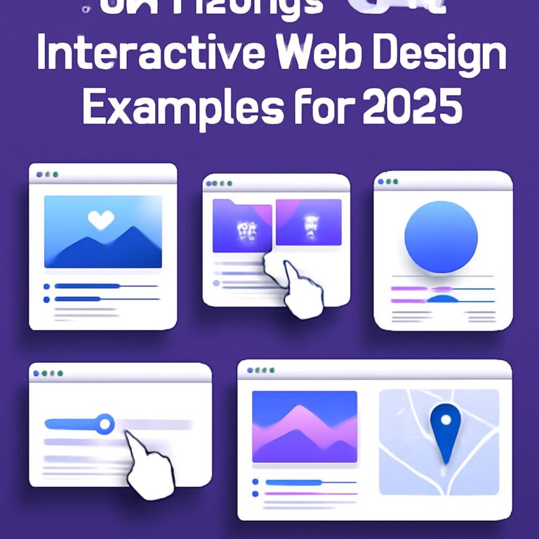
Designing a Perfect Responsive Layout: Top 10 Tips
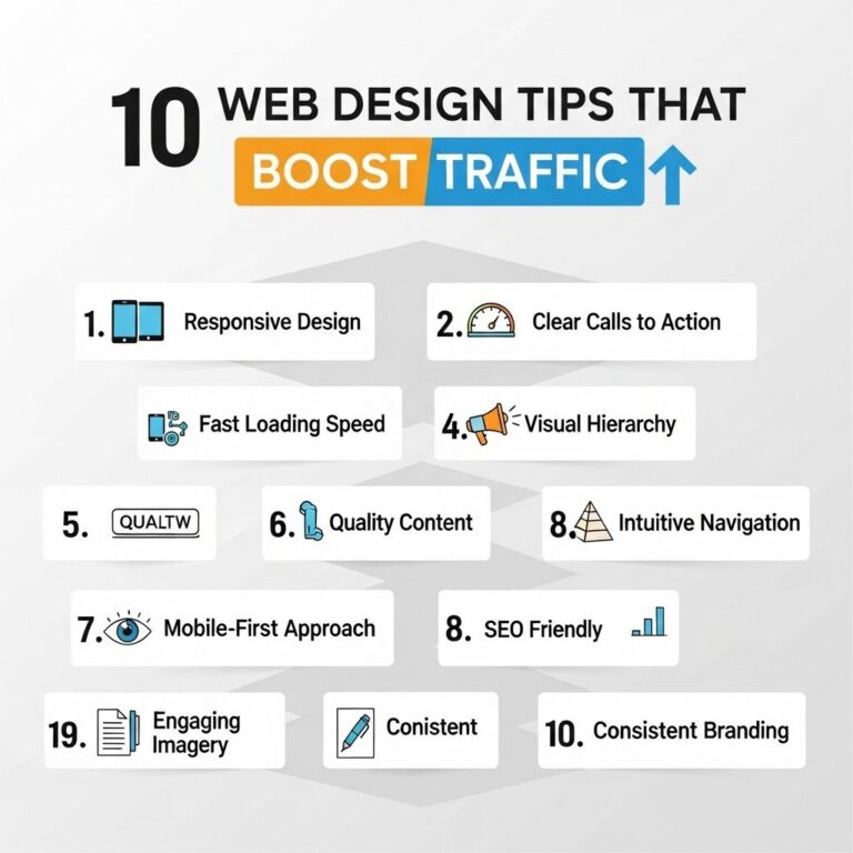
In today’s digital age, creating a responsive layout is critical to the success of any website. A responsive layout ensures that your site looks good on all devices, be it a desktop, tablet, or smartphone. With an increasing number of users accessing websites via mobile devices, it has become imperative for web designers to create layouts that are both flexible and adaptable. Here are the top 10 tips to help you design the perfect responsive layout:
1. Mobile-First Design Approach
The mobile-first design approach involves designing your website for mobile devices first, then scaling up for larger screens. This approach ensures that the essential components of your site are accessible on smaller screens, which tend to have more constraints than larger ones. By focusing on mobile first, you’re forced to prioritize content and features, resulting in a more streamlined and user-friendly experience.
2. Use a Flexible Grid Layout
Grids are the backbone of any responsive design. By using a flexible grid system, you ensure that the layout can adapt to various screen sizes. Grid systems, such as CSS Grid and Flexbox, provide a framework that automatically adjusts to the screen’s width, allowing for seamless transitions between various device sizes.
3. Utilize Responsive Images
Images play a crucial role in web design, but they can also significantly impact your site’s loading time and performance if not handled correctly. Using responsive images means serving different image files based on the device’s screen size, ensuring optimal loading speed and image resolution.
| Device | Image Size |
|---|---|
| Desktop | 1200px |
| Tablet | 800px |
| Mobile | 480px |
4. Fluid Typography
Typography should be as adaptable as the layout itself. Fluid typography scales according to the viewport size, ensuring readability on all devices. This can be achieved using relative units like ’em’ or ‘rem’ for font sizes instead of fixed units such as ‘px’.
5. Breakpoints and Media Queries
Breakpoints are a crucial element in responsive design, defining where the layout needs to change to accommodate different device widths. Media queries in CSS allow you to apply specific styles at breakpoints, ensuring that your design looks great on every device size. Common breakpoints are as follows:
- 320px – 480px: Mobile devices
- 481px – 768px: Tablets
- 769px – 1024px: Small screens, laptops
- 1025px – 1200px: Desktops
- 1201px and above: Large screens
6. Simplified Navigation
Navigation is an essential part of any website, and it should be optimized for mobile devices. Mobile users should be able to navigate through your site with ease. Consider implementing hamburger menus or collapsible panels to preserve screen real estate and maintain functionality.
7. Test Across Multiple Devices
Testing is vital for ensuring your responsive design works across various devices. Utilize tools like Google’s Mobile-Friendly Test or BrowserStack to evaluate your design across different screen sizes and browsers. This step ensures a consistent user experience, regardless of the device used.
8. Performance Optimization
Improving the performance of your responsive layout is crucial for maintaining user engagement. Minimize CSS and JavaScript files, optimize images, and use caching techniques to ensure your site loads quickly. Remember, a fast-loading site tends to generate more traffic and engage users longer.
9. Touch-Friendly Elements
As mobile users predominantly use touch interfaces, ensure that all interactive elements are touch-friendly. This includes designing larger buttons and touch targets, providing sufficient spacing between elements, and incorporating gestures for an intuitive user experience.
10. Consistent Design Language
Maintaining a consistent design language across all devices helps in creating a cohesive brand identity. Use consistent colors, typography, and iconography to enhance the user experience and make navigation intuitive and enjoyable.
By implementing these top 10 tips, you can create a responsive layout that not only adapts seamlessly to different devices but also delivers an impressive user experience. Whether you’re designing a new website or updating an existing one, these strategies will help you stay ahead in the evolving digital landscape.
FAQ
What is a responsive layout?
A responsive layout is a web design approach that ensures a website looks and functions well on various devices and screen sizes, from desktops to smartphones.
Why is responsive design important?
Responsive design is crucial because it enhances user experience, improves SEO rankings, and increases the reach to a broader audience by ensuring the website adapts to different devices.
How does flexible grid layout help in responsive design?
Flexible grid layouts help in responsive design by using relative units like percentages instead of fixed units like pixels, allowing the layout to adjust to different screen sizes fluidly.
What role do media queries play in responsive design?
Media queries allow developers to apply different styles based on the device’s characteristics, such as screen size or resolution, enabling a tailored experience for each device.
How can images be made responsive?
Images can be made responsive by using CSS techniques like setting max-width to 100% and using responsive image formats, ensuring they scale correctly across different devices.
What is the importance of mobile-first design in responsive layouts?
Mobile-first design is important as it prioritizes the mobile user experience, ensuring that the website is optimized for smaller screens first, then progressively enhances features for larger screens.