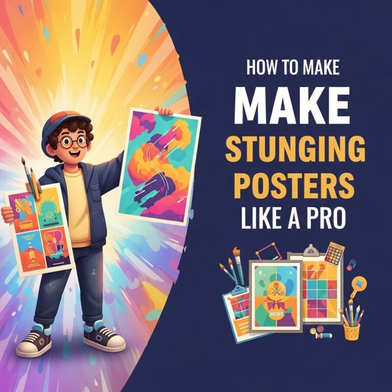
Creating stunning posters is both an art and a science. Whether you are designing for an event, promoting a product, or creating an artistic piece, the right techniques can elevate your poster from ordinary to extraordinary. In this article, we will explore effective strategies to help you craft posters that captivate and convey your message clearly. Let’s dive into the essential tips for creating powerful posters.
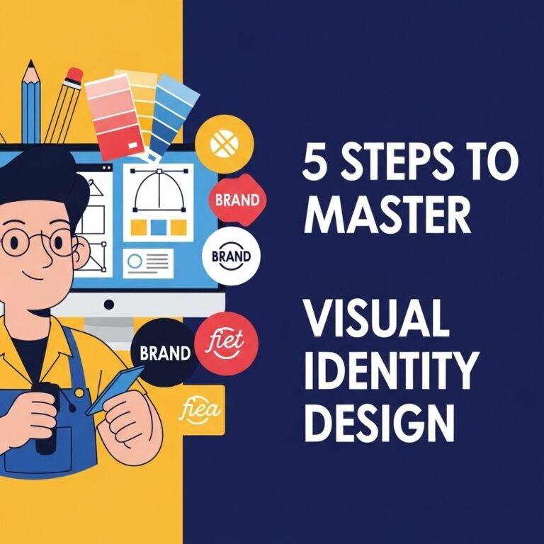
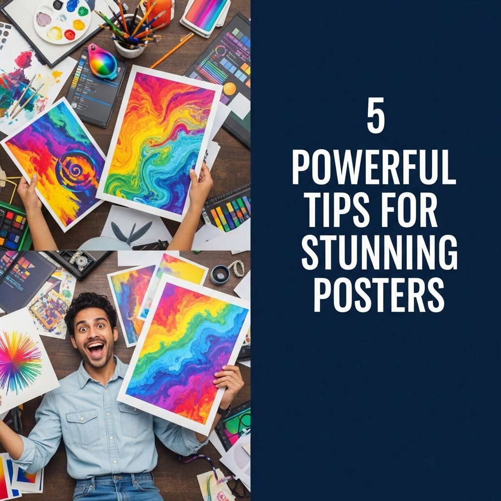
Creating stunning posters requires a thoughtful blend of design principles and creativity. Here are five powerful tips to elevate your poster designs, making them not only visually appealing but also effective in conveying your message. For inspiration and ready-made templates, you can explore these downloadable poster designs.
Table of Contents
Understanding Your Audience
The first step in creating an impactful poster is understanding your target audience. Knowing who will see your poster informs your design choices, including color, typography, and imagery. Here are some strategies to define your audience:
- Conduct Surveys: Gather information on who your potential viewers are.
- Analyze Demographics: Age, gender, and interests can significantly influence design elements.
- Research Competitors: Examine posters from similar events or products to see what resonates.
Effective Use of Colors
Colors play a vital role in poster design. They can evoke emotions, create contrasts, and attract attention. Consider the following when opting for a color palette:
Color Psychology
Different colors can elicit different emotional responses. Here’s a quick guide:
| Color | Emotion | Usage |
|---|---|---|
| Red | Excitement, passion | Sales, promotions |
| Blue | Trust, calmness | Corporate, healthcare |
| Green | Nature, growth | Environment, food |
| Yellow | Optimism, energy | Children’s events, creativity |
| Black | Elegance, sophistication | Luxury brands, formal events |
Complementary Colors
Using complementary colors can help your text or important elements stand out. Tools like Adobe Color can help you find palettes that work well together.
Typography Matters
Choosing the right fonts is crucial in poster design. Typography not only influences readability but also sets the tone for your message.
Font Pairing
Using two different fonts can create visual interest. Here’s a simple approach:
- Choose a Display Font: Use a bold, striking font for your headline.
- Select a Body Font: Choose a simpler, readable font for the rest of the text.
- Limit Font Styles: Use no more than two or three different fonts to maintain consistency.
Hierarchy and Size
Establish a clear hierarchy in your typography by varying the size and weight of fonts. Your main message should be the largest, followed by supporting information.
Imagery and Graphics
The visual elements you choose can make or break your poster. High-quality images and graphics are essential. Here’s how to select the right visuals:
Choosing Images
- High Resolution: Always use high-resolution images to avoid pixelation.
- Relevance: Ensure that images relate closely to your poster’s message.
- Licensing: Use images that are royalty-free or that you have permission to use.
Incorporating Graphics
Graphics such as icons or charts can simplify complex information. Here are some tips:
- Be Consistent: Use a consistent style for all graphics.
- Simplicity: Keep graphics simple and relevant to the content.
- Space: Ensure there is enough white space around graphics to avoid clutter.
Call to Action
Every poster should have a clear call to action (CTA). This tells viewers what to do next. Here are some effective CTA strategies:
Designing the CTA
- Visibility: Make your CTA stand out using contrasting colors and increased size.
- Clarity: Use simple, direct language.
- Placement: Position your CTA where it naturally fits into the flow of the poster.
Examples of Effective CTAs
Consider the following examples for inspiration:
- “Register Now for Early Bird Discounts!”
- “Visit Our Website for More Information!”
- “Call Us Today to Book Your Spot!”
Final Thoughts
Creating a stunning poster involves careful planning and design. By understanding your audience, using effective colors and typography, selecting impactful imagery, and crafting a compelling call to action, you can design posters that not only attract attention but also communicate your message effectively. Remember: less is often more; ensure each element serves a purpose and contributes to the overall design.
Now that you have these powerful tips at your disposal, it’s time to unleash your creativity and start designing your next poster masterpiece!
FAQ
What are the key elements of an effective poster design?
An effective poster design includes a clear message, eye-catching visuals, a balanced layout, appropriate colors, and legible typography.
How can color choice impact poster design?
Color choice can evoke emotions, attract attention, and enhance readability. Using a limited color palette can create a cohesive look.
What type of images work best for posters?
High-resolution images that are relevant to the message and resonate with the target audience work best for posters.
How important is typography in poster design?
Typography is crucial as it affects readability and sets the tone of the poster. Choose fonts that complement the overall design and are easy to read from a distance.
What size should a poster be for optimal visibility?
The size of a poster should be chosen based on where it will be displayed. Common sizes include 24×36 inches for visibility in public spaces.
How can I ensure my poster stands out?
To make your poster stand out, use unique visuals, engaging headlines, effective use of whitespace, and compelling calls to action.