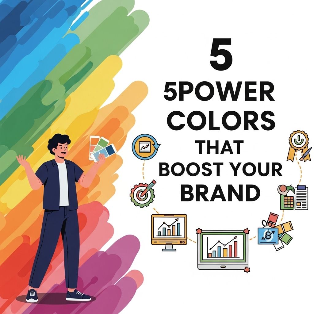
In the world of branding, color plays a pivotal role in shaping perceptions and influencing consumer behavior. It’s no secret that the right color palette can elevate a brand’s identity, drawing in customers and creating a lasting impression. The psychology of color suggests that different hues evoke various emotions and associations, making it essential for businesses to select their colors wisely. In this article, we will delve into five power colors that can boost your brand presence, exploring their meanings, applications, and the best practices for using them effectively.
Choosing the right colors for your brand can significantly impact its perception and effectiveness. Power colors like blue, red, green, yellow, and black can evoke different emotions and responses, making them essential in branding strategies. To see how these colors can be implemented creatively, check out these realistic bag mockup examples.
Table of Contents
The Psychology of Color in Branding
Understanding how colors affect human emotion and behavior is crucial for marketers. Colors can influence perceptions of a brand’s personality, reliability, and even its perceived value. Here are some general associations that various colors share:
- Red: Excitement, passion, urgency
- Blue: Trust, security, professionalism
- Green: Growth, health, tranquility
- Yellow: Optimism, clarity, warmth
- Purple: Luxury, creativity, wisdom
These associations can vary by culture and context, so it’s vital to consider your target audience when choosing your brand colors.
1. Red: The Color of Passion and Action
Red is one of the most powerful colors in the spectrum, often associated with strong emotions such as love and anger. In branding, it can evoke feelings of excitement and urgency, making it an excellent choice for brands looking to stimulate immediate action.
Brands That Use Red Effectively
| Brand | Industry | Notable Use |
|---|---|---|
| Coca-Cola | Beverages | Instant recognition and a sense of joy |
| Netflix | Entertainment | Conveys excitement and urgency to watch |
| Target | Retail | Creates a sense of fun and energy |
Best Practices for Using Red
- Use sparingly to avoid overwhelming your audience.
- Pair with neutral colors like white or black for balance.
- Consider different shades of red for diverse emotional impacts.
2. Blue: The Color of Trust and Dependability
Blue is universally recognized for its calming effect and is often associated with trustworthiness and professionalism. Many financial institutions and tech companies leverage blue in their branding to convey reliability.
Successful Blue Brands
- IBM: Emphasizes reliability and innovation.
- Facebook: Encourages trust and community.
- Wells Fargo: Conveys security in financial services.
Tips for Incorporating Blue
When implementing blue in your branding, consider the following:
- Choose the right shade: Lighter blues are calming, while darker blues can convey authority.
- Combine with contrasting colors like orange for a dynamic look.
- Utilize blue in your website design to enhance user experience.
3. Green: The Color of Growth and Harmony
Green is the color of nature, symbolizing growth, renewal, and health. It resonates well with environmentally-conscious brands and those in the health and wellness industries.
Green in Action
| Brand | Industry | Notable Use |
|---|---|---|
| Starbucks | Coffee | Symbolizes freshness and sustainability |
| Whole Foods | Grocery | Highlights organic and health-focused offerings |
| Spotify | Technology | Represents creativity and innovation |
Effective Use of Green
- Incorporate natural textures and imagery in design.
- Combine with earth tones for an organic feel.
- Utilize green in call-to-action buttons to promote sustainability-focused initiatives.
4. Yellow: The Color of Optimism and Clarity
Yellow is often associated with happiness, positivity, and clarity. It’s an eye-catching color that can grab attention quickly, making it effective in advertising and branding.
Brands That Shine in Yellow
- McDonald’s: Uses yellow to create a fun and inviting atmosphere.
- Best Buy: Conveys vitality and energy through yellow promotions.
- Post-it: Evokes creativity and organization.
Best Practices for Yellow
To make the most of yellow in your branding, keep these tips in mind:
- Use bright yellow for calls to action to draw attention.
- Avoid excessive use, as it can be overwhelming.
- Pair with darker colors like gray for sophistication.
5. Purple: The Color of Luxury and Creativity
Purple has long been associated with royalty, luxury, and creativity. It’s a great choice for brands looking to communicate sophistication and originality.
Purple Brands to Watch
| Brand | Industry | Notable Use |
|---|---|---|
| Yahoo! | Technology | Conveys creativity and innovation |
| Hallmark | Greeting Cards | Represents quality and elegance |
| Barneys New York | Retail | Emphasizes luxury and exclusivity |
Tips for Using Purple in Branding
- Choose the right shade to fit your brand’s personality.
- Combine with metallics like gold for a luxurious feel.
- Utilize in packaging to stand out on shelves.
Conclusion
Understanding the impact of color in branding is essential for creating a memorable identity that resonates with your audience. The five power colors—red, blue, green, yellow, and purple—each bring unique psychological effects that can elevate your brand’s perception. By strategically implementing these colors into your branding, marketing materials, and overall design, you can effectively communicate your brand’s values and connect with consumers on a deeper level. With thoughtful color choices, your brand can not only stand out in a crowded marketplace but also build lasting relationships with your audience.
FAQ
What are power colors and how do they affect branding?
Power colors are specific hues that evoke emotional responses and can influence perceptions of a brand. They help in establishing brand identity and conveying messages effectively.
Which colors are considered ‘power colors’ for branding?
Popular power colors include blue for trust, red for excitement, green for growth, yellow for optimism, and black for sophistication.
How can I choose the right power color for my brand?
Consider your target audience, brand values, and the emotions you want to evoke. Conducting market research can also guide your color choice.
Can using multiple power colors benefit my brand?
Yes, using a combination of power colors can create a dynamic brand identity. However, it’s essential to maintain harmony and clarity in your color palette.
Are there any industries that benefit more from specific power colors?
Yes, different industries may lean towards specific colors. For example, blue is favored in finance for trust, while green is popular in health and wellness for its association with nature.
How do I implement power colors in my branding strategy?
Incorporate power colors in your logo, website design, marketing materials, and social media to create a cohesive brand image that resonates with your audience.