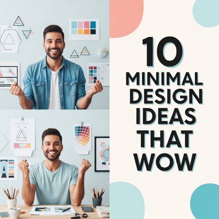
In the realm of visual communication, poster design holds a special place, serving as an effective medium for conveying messages, promoting events, and showcasing art. Whether you are a graphic designer, a marketer, or just someone interested in creating eye-catching posters, understanding the essential design elements can enhance your projects significantly. In this article, we will explore ten must-have poster design ideas that can transform your creative vision into reality.
Creating eye-catching posters is essential for any creative looking to make an impact. Whether for events, promotions, or personal projects, the right design can capture attention and convey messages effectively. Explore these 10 must-have poster design ideas to elevate your creations and spark inspiration: creative poster ideas.
Table of Contents
1. Minimalist Aesthetic
The minimalist design approach emphasizes simplicity by using limited colors, typography, and imagery. This style allows the message of the poster to stand out and resonate with the audience.
Key Characteristics:
- Clean lines
- Ample white space
- Focus on one or two elements
Minimalist designs can be particularly effective for events like art exhibitions or product launches, where the focus should be on the subject rather than excessive details.
2. Bold Typography
Typography is a powerful tool in poster design. Using bold fonts can capture attention and convey messages clearly. Choosing the right typeface can significantly affect the poster’s effectiveness.
Best Practices:
- Select a font that reflects the personality of the event or brand.
- Mix different fonts to create hierarchy and emphasis, but limit to two or three styles.
- Ensure readability from a distance.
Utilizing large letters for the main message while keeping secondary information in smaller text can create a balanced and engaging layout.
3. Eye-Catching Color Palettes
A well-thought-out color scheme can evoke emotions and draw attention. The colors chosen for a poster should align with the brand identity while being visually appealing.
Choosing Colors:
| Color | Emotion |
|---|---|
| Red | Passion, Energy |
| Blue | Trust, Calmness |
| Green | Growth, Serenity |
| Yellow | Optimism, Happiness |
When selecting colors, consider using a combination of contrasting colors to create visual interest without overwhelming the viewer.
4. Creative Imagery
The imagery used in a poster can significantly impact its effectiveness. High-quality images, illustrations, or graphics can enhance the message and attract viewers.
Tips for Imagery:
- Use original photographs or graphics instead of stock images when possible.
- Ensure that images are relevant to the content and message of the poster.
- Consider using overlays or blending techniques to create unique effects.
5. Interactive Elements
Incorporating interactive elements like QR codes can extend the experience beyond the printed poster. Viewers can scan the code with their smartphones to access additional information or digital content.
Benefits of Interactivity:
- Engages the audience on a deeper level.
- Provides an opportunity for feedback or engagement.
- Allows for sharing on social media platforms.
This modern approach encourages viewers to connect with the content in a more dynamic way.
6. Use of Negative Space
Negative space, or the empty space around subjects, can enhance the composition of a poster. Effectively using negative space can improve readability and focus attention on the primary elements.
Strategies for Implementation:
- Balance text and imagery to allow the design to breathe.
- Highlight key messages by isolating them in negative space.
- Avoid clutter to maintain a clean look.
7. Layering Techniques
Layering different design elements adds depth and visual interest to a poster. Utilizing layers can help separate information and guide the viewer’s eye through the composition.
Effective Layering:
- Combine text, images, and colors to create a sense of hierarchy.
- Experiment with transparency levels to add complexity.
- Ensure that the layers work harmoniously together.
8. Incorporating Patterns
Patterns can add dynamism to a poster design. Whether geometric shapes, organic forms, or textures, incorporating patterns can boost visual appeal and create a theme.
Using Patterns Wisely:
- Ensure patterns complement the overall design rather than distract from it.
- Use patterns as backgrounds or accents to enhance key messages.
- Limit the use of busy patterns to avoid overwhelming the viewer.
9. Dynamic Layouts
Exploring unconventional layouts can challenge traditional poster designs. Arranging elements in non-linear ways can create intrigue and attract attention.
Layout Techniques:
- Use diagonal lines to guide the viewer’s eye.
- Experiment with asymmetrical designs for a modern touch.
- Incorporate shapes like circles or triangles for a unique approach.
10. Call-to-Action (CTA)
No poster is complete without a clear call-to-action. Encouraging viewers to take a specific action can significantly enhance the effectiveness of the design.
Crafting a Strong CTA:
- Make it clear and concise.
- Place it prominently within the design.
- Use action verbs to inspire immediate response.
In conclusion, mastering poster design involves understanding the balance between aesthetics and functionality. By integrating these ten must-have ideas, you can create striking posters that effectively communicate your messages and capture the attention of your target audience. Start experimenting with these techniques today to elevate your poster design skills!
FAQ
What are the best poster design ideas for events?
Some popular ideas include using bold typography, incorporating a strong visual element, and creating a themed color palette that resonates with the event’s purpose.
How can I make my poster stand out?
Utilize eye-catching graphics, unique layouts, and contrasting colors to grab attention. Additionally, consider adding interactive elements like QR codes for more engagement.
What are the key elements of an effective poster design?
An effective poster design typically includes a clear message, strong visuals, a balanced layout, and important information such as date, time, and location.
How important is color choice in poster design?
Color choice is crucial as it can evoke emotions, convey messages, and attract the audience’s attention. Use colors that align with your brand and the message you want to communicate.
What fonts work best for poster design?
Choose bold, easy-to-read fonts for headlines and complementary fonts for body text. It’s essential to maintain readability from a distance, especially for large posters.
Can I use images from the internet for my poster design?
While you can use images from the internet, ensure they are royalty-free or properly licensed to avoid copyright issues. Consider using stock image sites for high-quality visuals.