Creating an impactful poster is an art that combines aesthetics with clear communication. Whether it’s for a concert, a conference, or a community event, the layout can make or break your design. In this article, we’ll delve into some powerful grid layout tips that will elevate your poster design and engage your audience effectively.
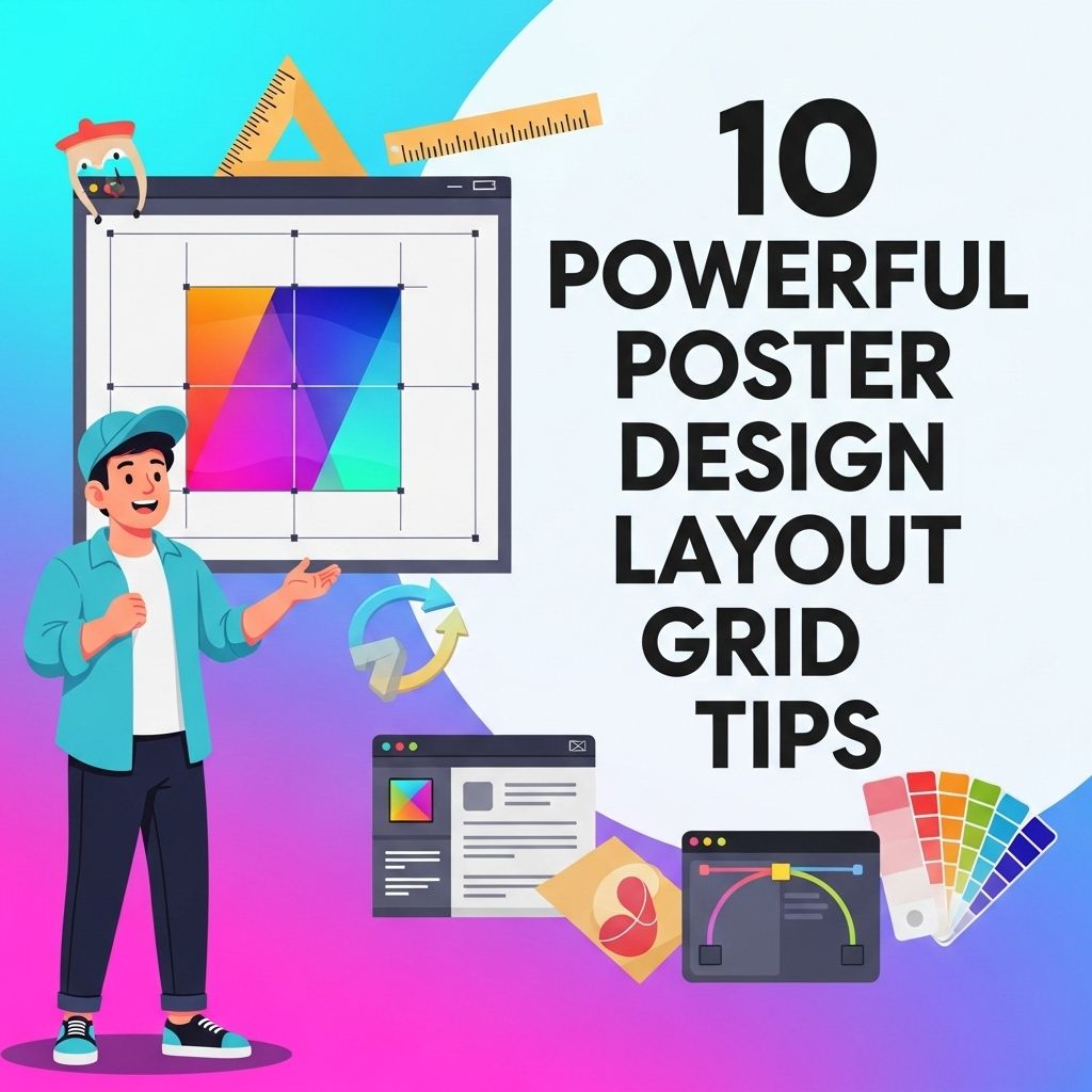
Creating eye-catching posters requires a strong layout, and utilizing a grid system can significantly enhance your design. This approach not only ensures consistency and balance but also helps in organizing visual elements effectively. To dive deeper into the art of poster design, explore these 10 powerful layout grid tips, perfect for every designer working with graphic design posters.
Table of Contents
Understanding the Basics of Layout Grids
A grid layout serves as the backbone of a well-designed poster. It provides structure and organization, allowing the designer to arrange elements efficiently. Before diving into the tips, let’s understand what a layout grid is:
- Definition: A grid is a framework composed of intersecting vertical and horizontal lines that help to align elements on a page.
- Purpose: It helps in maintaining consistency, improves readability, and guides the viewer’s eye through the information.
1. Choose the Right Grid System
The first step in designing your poster is selecting a grid system that suits your needs. There are various types of grid systems to consider:
Types of Grid Systems
| Grid Type | Description |
|---|---|
| Hierarchical Grid | Organizes elements according to their importance, often used when there’s a need to emphasize specific content. |
| Manuscript Grid | A simple grid with consistent margins and columns, ideal for text-heavy posters. |
| Column Grid | Comprises multiple columns, great for balancing images and text, offering flexibility in design. |
2. Establish a Clear Visual Hierarchy
Visual hierarchy is crucial in guiding the viewer’s attention. Utilize the grid to establish a clear structure:
- Size: Larger elements attract more attention. Use bigger fonts for titles and critical information.
- Contrast: Use contrasting colors to differentiate between various levels of information.
- Spacing: Adequate spacing creates breathing room, making the content more digestible.
3. Utilize White Space Wisely
White space, or negative space, is the area around your design elements. It’s a vital aspect of poster design that enhances readability and focus:
- It prevents the poster from looking cluttered.
- Guides the viewer’s eye to key areas.
- Enhances the overall aesthetics.
4. Incorporate a Grid-Based Typography System
Typography is a powerful tool in design. When using a grid layout, ensure your typography complements your grid system:
- Font Selection: Choose fonts that are legible and suit your poster’s theme.
- Alignment: Align text to the grid to maintain consistency.
- Hierarchy: Use different font weights and sizes to indicate importance.
5. Balance Imagery and Text
Striking a balance between imagery and text is key. Use the grid to position images in a way that complements the text:
- Choose images that enhance the message.
- Use a grid to create a cohesive flow between text and images.
- Ensure images are high-quality and relevant to the content.
6. Experiment with Asymmetry
While grids often imply symmetry, asymmetrical layouts can create a dynamic look. Here’s how to play with asymmetry:
- Break traditional grid rules for a modern feel.
- Position elements off-grid to create tension or emphasis.
- Ensure alignment within the overall design context.
7. Color Theory and Its Application
Colors play a significant role in conveying emotions and messages. When designing your poster, consider the following:
- Choose a color palette that complements your content.
- Use the grid to create sections with distinct color schemes.
- Apply color contrast to highlight important elements.
8. Leverage Visual Elements
Icons, graphs, and shapes can enhance your poster’s impact. Use the grid to strategically place these elements:
- Icons can replace text for quick comprehension.
- Graphs can illustrate data effectively.
- Shapes can be used to frame content and create interest.
9. Test Readability from a Distance
Posters are often viewed from a distance, making readability essential. Follow these tips to ensure your design is legible:
- Use large fonts for key messages.
- Limit text to essential information to avoid overcrowding.
- Test your design by printing it out at full size and viewing it from various distances.
10. Get Feedback and Iterate
Finally, don’t underestimate the power of feedback. Share your design with peers to gather insights:
- Ask for opinions on readability and visual appeal.
- Be open to constructive criticism.
- Iterate on your design based on the feedback received.
Conclusion
Implementing these grid layout tips will not only enhance your poster design but also ensure that your message resonates with your audience. Remember, a well-structured poster is a balance of creativity and clarity. With the right approach, your poster can stand out in any setting.
FAQ
What are poster design layout grids?
Poster design layout grids are structured frameworks used to organize text and images in a visually appealing manner, ensuring balance and harmony in the overall design.
Why are layout grids important for poster design?
Layout grids help create a clear hierarchy, guide the viewer’s eye, and improve the overall readability of the poster, making it more effective in communicating the intended message.
How can I choose the right grid for my poster design?
Choosing the right grid depends on the content and purpose of the poster; consider the amount of text, images, and the overall theme to select a grid that enhances your design.
What are some common types of layout grids used in poster design?
Common types of layout grids include column grids, modular grids, hierarchical grids, and asymmetrical grids, each offering different advantages based on the design requirements.
Can I use multiple grid systems in one poster design?
Yes, using multiple grid systems can create visual interest and depth, but it requires careful planning to ensure cohesion and clarity in the overall layout.
What tips can help me create an effective grid layout for my poster?
To create an effective grid layout, maintain consistent margins, use white space strategically, prioritize key elements, and ensure alignment for a polished look.


