
In the ever-evolving landscape of mobile applications, user interface (UI) and user experience (UX) design play a crucial role in determining the success of a product. With millions of apps available in the marketplace, creating a captivating user experience is essential for driving engagement, retention, and overall satisfaction. This article delves into ten essential principles of mobile UI/UX design that can help developers craft applications that not only meet user needs but also stand out in a crowded marketplace.
Table of Contents
Understanding Mobile UX Design
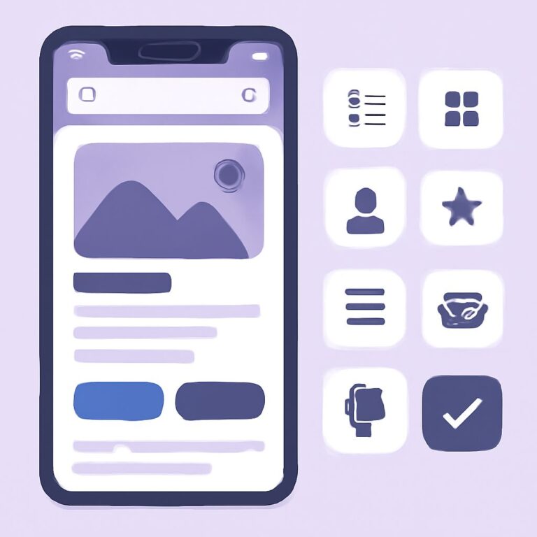
Mobile UX design focuses on creating a seamless and enjoyable experience for users interacting with mobile applications. It encompasses various elements, including layout, navigation, and responsiveness. The goal is to ensure that users can achieve their desired outcomes with minimal effort and frustration.
1. Prioritize User-Centric Design
Designing with the user in mind is paramount in mobile UI/UX. Understanding your target audience and their needs will guide your design decisions. Consider conducting user research to gather insights into their behaviors, preferences, and pain points.
Key Techniques for User Research:
- Surveys and Questionnaires
- User Interviews
- Usability Testing
- Analytics Review
2. Embrace Simplicity
Less is often more in mobile design. A cluttered interface can overwhelm users, leading to confusion and frustration. Prioritize essential elements and streamline content to create a clean, focused design.
Steps to Achieve Simplicity:
- Limit color palettes to 2-3 primary colors.
- Use ample white space for breathing room.
- Minimize text and use concise language.
- Focus on core functionalities and features.
3. Ensure Intuitive Navigation
Navigation is a vital component of mobile UX design. Users should be able to find what they need quickly and easily. Implement recognizable icons, clear labels, and a logical flow to guide users through the app.
Best Practices for Navigation:
| Element | Description |
|---|---|
| Hamburger Menu | Ideal for hiding secondary options without cluttering the screen. |
| Bottom Navigation Bar | Useful for primary navigation, allowing easy access to main sections. |
| Tab Bar | Great for categorizing content and enabling quick switching between views. |
4. Design for Touch
Mobile devices rely on touch interactions, so ensuring that your design accommodates these interactions is crucial. Buttons and interactive elements should be appropriately sized and spaced to prevent mis-taps.
Touch Target Guidelines:
- Minimum button size of 44×44 pixels.
- Provide adequate spacing between buttons to avoid accidental clicks.
- Use visual feedback for touch interactions.
5. Optimize for Different Screen Sizes
Mobile devices come in various screen sizes and resolutions. Responsive design is essential to ensure your application looks and functions well across all devices. Implement flexible layouts, scalable images, and adaptive text sizes.
Responsive Design Techniques:
- Use fluid grids and flexible images.
- Implement media queries to adjust styles based on screen size.
- Test on multiple devices to ensure compatibility.
6. Provide Clear Feedback
Users should always know what is happening within the app. Providing feedback for actions like button clicks, form submissions, and loading processes enhances user experience by confirming that their actions have been recognized.
Types of Feedback:
- Visual: Change in button color or animation.
- Audio: Sounds that indicate success or error.
- Textual: Messages indicating loading, success, or error.
7. Use Consistent Design Elements
Consistency in design helps users build familiarity with your app, which ultimately enhances usability. Maintain uniformity in colors, fonts, button styles, and iconography throughout the application.
Establishing Consistency:
- Create a style guide to document design elements.
- Use a limited set of fonts and colors.
- Maintain consistent terminology throughout the app.
8. High-Quality Visuals
High-quality images and graphics can significantly impact the aesthetic appeal of your mobile application. Ensure that all visual assets are optimized for mobile devices to reduce loading times and enhance performance.
Visual Quality Tips:
- Use vector graphics where possible for scalability.
- Optimize images for faster loading.
- Avoid excessive use of low-resolution graphics.
9. Accessibility Considerations
Designing for accessibility ensures that all users, regardless of abilities, can access and use your application. Incorporate features like text-to-speech, adjustable font sizes, and alternative text for images.
Accessibility Features:
- Color contrast for readability.
- Keyboard navigation and shortcuts.
- Screen reader compatibility.
10. Continuous Testing and Improvement
The design process doesn’t end with the launch of an app. Continuously gathering user feedback and conducting usability tests will help identify areas for improvement and ensure that the user experience remains optimal.
Methods for Testing and Improvement:
- Conduct A/B testing to compare design variations.
- Analyze user behavior through heatmaps and click tracking.
- Regularly update the app based on user feedback and trends.
Conclusion
In summary, by adhering to these essential mobile UI/UX design principles, developers can create applications that are not only visually appealing but also functional and user-friendly. Focusing on user needs, maintaining simplicity, and continuously improving the app will help deliver an exceptional mobile experience that keeps users coming back.
FAQ
What are the key principles of mobile UI UX design?
The key principles include simplicity, consistency, responsiveness, accessibility, user feedback, and intuitive navigation.
Why is simplicity important in mobile UI UX design?
Simplicity helps users easily understand and interact with the interface, reducing cognitive load and enhancing the overall user experience.
How can I ensure consistency in my mobile app design?
Use a cohesive color palette, consistent typography, and uniform button styles throughout your app to ensure a seamless user experience.
What does responsive design mean in mobile UI UX?
Responsive design refers to creating interfaces that adapt smoothly to various screen sizes and orientations, ensuring usability across all devices.
How can I improve accessibility in my mobile app?
Incorporate features such as screen reader compatibility, sufficient contrast ratios, and alternative text for images to enhance accessibility for all users.
What role does user feedback play in mobile UI UX design?
User feedback is crucial as it helps identify pain points, understand user needs, and make data-driven improvements to enhance the overall experience.