
Table of Contents
Mastering Mobile UI Design: A Beginner’s Guide
In today’s digital age, the ubiquity of mobile devices has made mobile user interface (UI) design a crucial aspect of the user experience (UX) landscape. As the world continues to go mobile, the demand for intuitive, aesthetically pleasing, and efficient UIs is ever-increasing. Whether you’re a budding designer or an entrepreneur looking to enhance your app’s appeal, understanding mobile UI fundamentals is essential. This guide will walk you through the key components and best practices for mastering mobile UI design.
Mastering mobile UI design is an essential skill for anyone looking to create engaging and user-friendly applications. This beginner’s guide will walk you through the fundamental principles of mobile design, helping you build a solid foundation for your projects. For further inspiration, check out poster design feedback resources in the realm of visual communication.
Understanding the Basics of Mobile UI
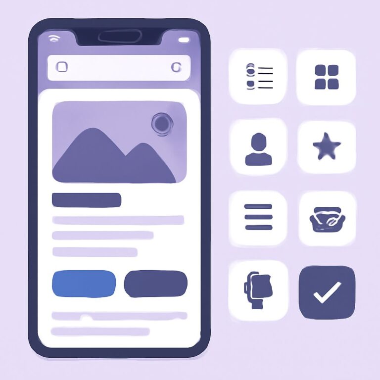
The primary objective of a mobile UI is to facilitate seamless interaction between the user and the application. To achieve this, the design must be intuitive and cater to the users’ needs and expectations. Mobile UI design encompasses visual elements, interaction design, and navigation.
- Visual Elements: These include color schemes, typography, and imagery. A consistent and appealing visual language can significantly enhance user engagement.
- Interaction Design: This focuses on how users interact with your app, including gestures, button functionality, and feedback mechanisms.
- Navigation: Effective navigation ensures users can easily find the information or features they seek without frustration.
The Importance of User-Centric Design
User-centric design places the user at the heart of the design process. It involves understanding the user’s needs, behaviors, and preferences to create an interface that provides a seamless experience.
- User Research: Conducting user research through surveys, interviews, and usability testing helps gather insights into user needs and preferences.
- Personas and Scenarios: Developing user personas and scenarios can help tailor the design to meet specific user expectations and improve overall satisfaction.
Mobile UI Design Principles
While there are numerous principles in mobile UI design, some stand out as particularly impactful:
- Simplicity: Keep interfaces straightforward and avoid clutter. Every element should have a purpose. Use whitespace effectively to enhance readability and focus.
- Consistency: Maintain consistency across your app in terms of design elements, terminology, and navigation. This builds familiarity and trust.
- Feedback: Provide users with immediate feedback on their actions to confirm that interactions are successful. This can be achieved through animations, sounds, or visual changes.
- Accessibility: Ensure your design accommodates users with disabilities. This includes providing text alternatives for images, ensuring contrast between text and background, and enabling keyboard navigation.
- Responsiveness: Design your UI to adapt to various screen sizes and orientations. This ensures a consistent experience across different devices.
Navigation and Information Architecture
Effective navigation and well-structured information architecture are critical to mobile UI success. Users should be able to effortlessly navigate through the app and find the information they need.
- Hierarchical Structure: Organize content in a hierarchical manner, with the most important information at the top.
- Intuitive Navigation: Use familiar patterns such as the hamburger menu or bottom navigation bar to create a seamless navigation experience.
- Breadcrumbs: Incorporating breadcrumbs can help users understand their current location within the app and easily move between sections.
Designing for Touch and Gestures
Mobile devices rely on touch interfaces, so it’s crucial to design with touch responsiveness and gestures in mind. Understanding the ergonomics and common gestures can enhance the user experience.
- Touch Targets: Ensure that touch targets are large enough for users to tap comfortably without errors. The minimum recommended size is 44 x 44 pixels.
- Gesture Recognition: Support common gestures such as swiping, pinching, and tapping to enhance interactions.
- Feedback for Gestures: Provide users with visual or haptic feedback when a gesture is recognized to confirm the action.
Prototyping and Testing
Prototyping allows you to test your design’s usability and functionality before full-scale development. It helps in identifying potential issues and improving the design based on user feedback.
- Wireframes: Create wireframes to outline the basic structure and flow of the app without focusing on design details.
- Interactive Prototypes: Use tools like InVision or Figma to develop interactive prototypes that simulate the app experience.
- User Testing: Conduct usability tests with real users to gather feedback and identify areas for improvement.
Conclusion
Mastering mobile UI design requires a balance between creativity and practicality. By focusing on user-centric design principles, intuitive navigation, and touch-friendly interactions, you can create an engaging and efficient mobile experience. Continuous testing and iteration based on user feedback will ensure your app remains relevant and user-friendly in the ever-evolving mobile landscape.
FAQ
What is mobile UI design?
Mobile UI design refers to the creation of user interfaces specifically for mobile devices, focusing on usability, accessibility, and overall user experience.
Why is mobile UI design important?
Mobile UI design is crucial because it directly impacts how users interact with an app, affecting user engagement, satisfaction, and retention rates.
What are key principles of mobile UI design?
Key principles include simplicity, consistency, intuitive navigation, visual hierarchy, and responsive design to ensure a seamless user experience.
How can I start learning mobile UI design?
Begin by studying design fundamentals, exploring UI design tools like Sketch or Figma, and analyzing successful mobile apps to understand effective design practices.
What are common mistakes to avoid in mobile UI design?
Avoid cluttered interfaces, inconsistent design elements, neglecting responsiveness, and overlooking user feedback during the design process.
How does mobile UI design differ from web design?
Mobile UI design focuses on smaller screens, touch interactions, and often requires more streamlined navigation compared to web design, which can leverage larger screens and different interaction models.