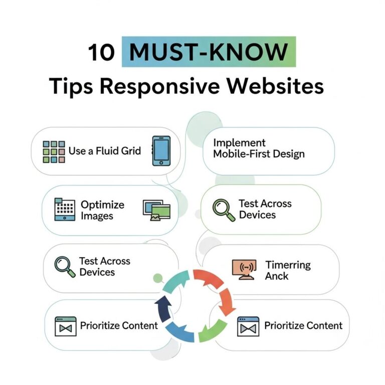
In a world where technology constantly evolves, the importance of minimal website design has gained immense popularity. Minimalism in design is about stripping away excess elements and focusing on what truly matters—content. This approach not only enhances user experience but also improves site performance. In this article, we will explore ten stunning examples of minimal website designs that highlight the beauty of simplicity while delivering excellent functionality.
Table of Contents
Understanding Minimal Design
Before we dive into specific examples, it’s essential to grasp the core principles of minimal design. Here are a few fundamental characteristics:
- Simplicity: A clean layout that avoids clutter.
- Focus on Content: Prioritizing the message or product over decorative elements.
- White Space: Effective use of white space to create a sense of balance.
- Limited Color Palette: Using a restrained color scheme to enhance aesthetic appeal.
1. Aesop
Aesop’s website is a perfect example of minimalism in action. The use of high-quality images combined with a monochrome color palette creates a sophisticated look. Here are some features that stand out:
- Simple navigation that allows users to explore easily.
- Large product images that draw attention.
- A focus on storytelling through imagery and text.
2. Apple
Apple is known for its sleek product designs and the same philosophy applies to its website. The Apple homepage features:
- A generous amount of white space.
- Clear and concise product descriptions.
- Easy navigation with a focus on the latest products.
3. Dropbox
Dropbox simplifies cloud storage with a minimal design that communicates its purpose effectively. Key design elements include:
| Element | Feature |
|---|---|
| Typography | Clean, readable fonts. |
| Imagery | Illustrations that clarify the service. |
| Layout | Intuitive and user-friendly. |
Why It Works
The straightforward approach helps users learn about file storage without distraction.
4. IKEA
IKEA’s website embodies minimalism through its user-friendly layout and organization. Key aspects include:
- Simple categories for easy browsing.
- High-quality product visuals.
- Clear calls to action that guide users.
5. Squarespace
As a website builder, Squarespace showcases its capabilities with a clean, modern design. The site features:
- A grid layout for showcasing templates.
- Strong use of imagery to demonstrate design potential.
- Smooth transitions that enhance user experience.
Template Variations
Squarespace also allows users to see the variety in templates while maintaining a cohesive, minimal look.
6. Google’s Homepage
Google’s homepage is the epitome of minimal design. It features:
- A central search bar as the main focus.
- No distractions or unnecessary links.
- Fast loading speeds due to the simple design.
7. Evernote
Evernote, a note-taking application, utilizes a clean design that emphasizes functionality. Notable features include:
- A straightforward navigation layout.
- Clear visuals for various features.
- Concise text that highlights benefits.
8. Zen Habits
Zen Habits embraces minimalism with a focus on content. The fundamental features are:
- As few distractions as possible to enhance reading.
- Simple text layout that prioritizes content.
- A calming color scheme that encourages focus.
9. Medium
Medium is a platform designed for writers and readers, featuring:
- A clean interface that emphasizes articles.
- Simple typography makes reading easy.
- A lack of clutter around the text.
10. Basecamp
Basecamp’s website effectively conveys its project management software’s benefits through minimal design. Key highlights include:
- Simple navigation structure.
- Use of large fonts for easy readability.
- Clear descriptions of features without excessive jargon.
Conclusion
Minimal website design is more than just a trend; it’s a necessity in delivering a seamless user experience. Each of the examples highlighted above illustrates how effective minimalism can enhance both aesthetics and functionality. By focusing on the essentials, these websites provide clarity and ease of use, making them exemplary models of minimal design. As web design continues to evolve, embracing minimalistic principles can lead to more engaging and user-friendly platforms.
FAQ
What is minimal website design?
Minimal website design focuses on simplicity, using fewer elements to create a clean and efficient user experience.
Why is minimalism popular in web design?
Minimalism is popular because it enhances usability, improves loading times, and allows for a more focused user experience.
What are the key elements of a minimal design?
Key elements of minimal design include ample white space, limited color palettes, simple typography, and essential functionality.
How can I achieve a minimal design for my website?
To achieve a minimal design, prioritize content, reduce clutter, and use a straightforward layout that guides users to key information.
Are there any disadvantages to minimal website design?
Disadvantages can include potential oversimplification, which may lead to a lack of visual interest or insufficient information for users.
Can minimal design work for all types of websites?
While minimal design can enhance many types of websites, it may not be suitable for content-heavy sites that require more visual elements to convey information.


