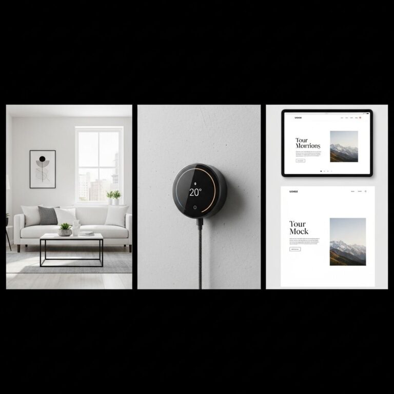
In a world where digital interfaces often overwhelm users with information and complexity, minimal UI design emerges as a refreshing alternative. Minimalism in UI design isn’t merely about reducing elements; it’s about enhancing functionality and user experience through simplicity and clarity. This article delves into ten inspiring examples of minimal UI design that captivate and wow users with their elegance and effectiveness.
Minimalist UI design focuses on simplicity and functionality, creating a user experience that is both intuitive and visually striking. In the world of beer branding, this approach can truly shine, as showcased in various examples that effectively balance aesthetics with brand identity. For inspiration, check out this collection of beer branding mockups, where less is often more.
Table of Contents
Understanding Minimal UI Design
Minimal UI design focuses on stripping away the unnecessary while keeping the essential. This approach not only improves aesthetics but also enhances usability. Here are some key principles of minimal UI design:
- Clarity: Ensuring that every element serves a clear purpose.
- Focus: Highlighting the most important actions and information.
- Whitespace: Utilizing negative space to improve readability and user interaction.
- Consistency: Maintaining a uniform look and feel throughout the interface.
1. Apple Music
Apple Music exemplifies minimal UI design with its clean layout and intuitive navigation. The use of vibrant album art against a simple white background draws users’ attention without overwhelming them with options.
Key Features:
- High-quality visuals
- Smooth transitions between screens
- Simple navigation bar with essential functionalities
2. Google Search
Google Search is often the first point of contact for millions of users. Its design is strikingly simple, featuring a search bar with minimal distractions. The beauty lies in its functionality, guiding users to find information seamlessly.
Key Features:
- Single text input box
- Minimalist logo and branding
- Quick loading times
3. Airbnb
Airbnb’s interface captures the essence of minimalism by emphasizing imagery and essential information. The design allows users to focus on listings without the clutter of unnecessary buttons or links.
Key Features:
- Full-screen images
- Streamlined booking process
- Clear call-to-action buttons
4. Dropbox
Dropbox utilizes minimal UI design principles effectively to create a user-friendly platform for file storage and sharing. Its clean aesthetic makes managing files an effortless task.
Key Features:
- Intuitive dashboard
- Simple file upload process
- Consistent iconography
5. Spotify
Spotify’s dark-themed interface is a perfect example of minimalism in music application design. It prioritizes user content with unobtrusive navigation that feels modern and sleek.
Key Features:
- Dynamic playlists
- Easy-to-use search functionality
- Seamless music playback controls
6. Medium
Medium places a strong emphasis on content creation and reading experience. The interface is devoid of distractions, allowing writers and readers to engage deeply with the material.
Key Features:
- Focus on typography
- Simple editing tools for authors
- Clean reading layout
7. Evernote
Evernote’s minimal UI design is centered around productivity and organization. The layout is designed to help users quickly jot down notes without unnecessary complexity.
Key Features:
- Organized notebooks
- Uncluttered note-taking interface
- Simplified tagging system
8. Slack
Slack’s interface demonstrates minimalism through a focus on communication and collaboration. It effectively organizes channels and direct messages while maintaining a sleek design.
Key Features:
- Color-coded channels
- Easy access to settings and preferences
- Clear notifications
9. Pinterest
Pinterest’s design revolves around visual discovery. The platform employs a grid layout that features minimal text alongside eye-catching images, making browsing a delightful experience.
Key Features:
- Image-centric layout
- Simple pinning process
- Easy navigation between boards
10. Todoist
Todoist excels in combining functionality with minimalism. Its task management interface is designed for users to manage their to-dos effortlessly, with a focus on productivity.
Key Features:
- Simple task creation
- Color-coded projects
- Minimalist design elements
Conclusion
Minimal UI design is not just a trend; it’s a powerful approach that enhances user experience by focusing on what truly matters. The examples showcased in this article highlight how effective minimalism can be in creating engaging and functional interfaces. As technology continues to evolve, embracing minimalist design principles will be essential for developers and designers aiming to create intuitive and delightful user experiences.
FAQ
What is minimal UI design?
Minimal UI design focuses on simplicity and usability, stripping away unnecessary elements to create a clean and efficient user experience.
Why is minimal UI design effective?
Minimal UI design is effective because it enhances user focus, reduces cognitive load, and allows for faster navigation and interaction.
What are some key principles of minimal UI design?
Key principles include using ample white space, limiting color palettes, employing simple typography, and prioritizing essential content.
Can minimal UI design be applied to all types of websites?
Yes, minimal UI design can be applied to various types of websites, although its effectiveness may vary depending on the target audience and content.
What are some examples of successful minimal UI design?
Successful examples include websites like Apple, Dropbox, and Google, which utilize clean layouts and intuitive navigation.
How can I achieve minimal UI design in my project?
To achieve minimal UI design, focus on simplifying your layout, selecting a limited color scheme, and ensuring that every element serves a clear purpose.

