Table of Contents
Mastering Print Design: Tips and Tricks for Stunning Results
Print design is an art that combines creativity and functionality. It requires an understanding of how to communicate a message effectively while considering the physical medium. Whether you’re designing a business card, poster, brochure, or magazine, mastering print design can lead to stunning results that capture attention and convey the intended message. In this article, we will explore essential tips and tricks to enhance your print design skills.
Mastering print design involves understanding the nuances of layout, color, and typography to create visually stunning pieces. Whether you’re working on a pamphlet or a business card, using the right resources can elevate your designs significantly. For those focusing on bi-fold designs, explore these bi-fold design resources to inspire your creativity.
Understanding the Basics of Print Design
Before diving into advanced techniques, it’s crucial to grasp the fundamentals of print design. Here are some key concepts:
- Resolution: The quality of an image in print is determined by its resolution, typically measured in dots per inch (DPI). A resolution of 300 DPI is standard for high-quality prints.
- Color Modes: Print design primarily uses CMYK (Cyan, Magenta, Yellow, and Black) color mode, whereas digital screens use RGB (Red, Green, Blue). Understanding these modes is vital for accurate color representation.
- Bleed and Trim: Bleed refers to the area of a design that extends beyond the trim edge. This extra space ensures that the design covers the entire area after trimming, preventing any unprinted edges.
- Paper Types: The choice of paper affects the final outcome of your design. Different textures, weights, and finishes can enhance or detract from the overall aesthetic.
Choosing the Right Tools
Equipping yourself with the right tools can streamline your print design process. Here are some popular design software options:
| Software | Features | Best For |
|---|---|---|
| Adobe InDesign | Professional layout design, typography control, and print preparation | Brochures, magazines, and multi-page documents |
| Adobe Illustrator | Vector graphics creation, logo design, and illustrations | Business cards, posters, and infographics |
| Canva | User-friendly interface, templates, and online collaboration | Beginner-friendly designs and social media graphics |
| Affinity Designer | Cost-effective vector design and illustration | Graphic design projects on a budget |
Design Principles for Print
To create stunning print designs, adhere to these essential design principles:
- Hierarchy: Establish a clear visual hierarchy to guide the viewer’s eye. Use varying font sizes, weights, and colors to emphasize important elements.
- Balance: Achieve visual balance by distributing elements evenly across your design. This can be symmetrical or asymmetrical, depending on the desired effect.
- Contrast: Utilize contrast to enhance readability and focus attention. Contrast can be achieved through color, size, and typography variations.
- Whitespace: Incorporate whitespace effectively to prevent clutter and improve the overall aesthetics. It helps in emphasizing key elements and creating a breathable layout.
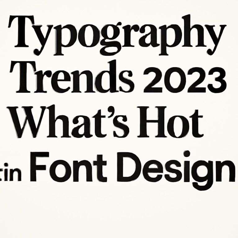
Typography in Print Design
Typography plays a pivotal role in print design. Here are some tips to master it:
- Font Selection: Choose fonts that align with your brand identity and the message you want to convey. A combination of a serif and sans-serif font often creates a visually appealing contrast.
- Readability: Prioritize readability by ensuring that text size and line spacing are appropriate. Aim for a minimum font size of 10 points for body text.
- Alignment: Properly align your text to create a clean and organized appearance. Common alignments include left, right, center, and justified.
- Consistent Styling: Maintain consistent font styles throughout your design to create a cohesive look. Use the same font family for headings, subheadings, and body text.
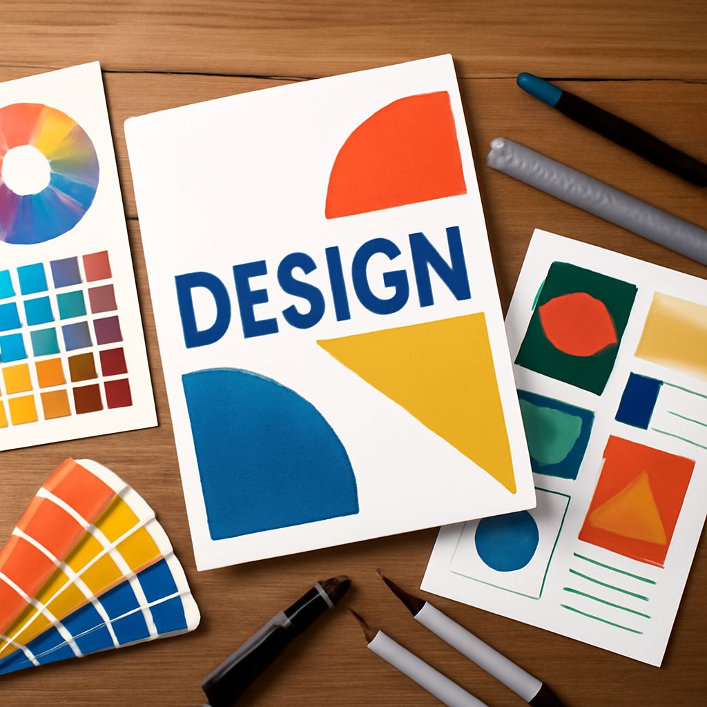
Color Theory in Print Design
Color selection can make or break your print design. Here’s how to effectively use color:
- Color Wheel: Familiarize yourself with the color wheel to understand primary, secondary, and tertiary colors. This will help you create harmonious color schemes.
- Color Psychology: Colors evoke emotions and can influence perceptions. Research the psychological effects of different colors to convey the right message. For instance, blue is often associated with trust, while red conveys excitement and urgency.
- Analogous and Complementary Colors: Use analogous colors (colors next to each other on the color wheel) for a harmonious design and complementary colors (colors opposite each other) for a striking visual effect.
- Test Colors: Print a color swatch before finalizing your design. Colors may appear different on screen versus paper, so it’s essential to see how they translate.
Creating Compelling Visuals
Visual elements are crucial in print design. Here are ways to create compelling visuals:
- High-Quality Images: Always use high-resolution images (300 DPI) to ensure clarity in print. Avoid pixelated or blurry images that can detract from your design.
- Custom Illustrations: Consider incorporating custom illustrations to give your design a unique touch. Hand-drawn elements can add character and personality.
- Consistent Style: Maintain a consistent visual style throughout your design. If using illustrations, ensure they share the same color palette and aesthetic.
- Infographics: Use infographics to present data visually. They help simplify complex information and make it more engaging for the reader.
Final Touches and Proofing
After creating your design, it’s essential to add finishing touches and proofread:
- Alignment and Spacing: Double-check the alignment and spacing of all elements. Small misalignments can be noticeable when printed.
- Proofreading: Carefully proofread all text for spelling, grammar, and punctuation errors. Typos can undermine the professionalism of your design.
- Print Mockups: Create physical mockups of your design to get a real sense of how it will look. This allows you to spot any potential issues before the final print.
- Feedback: Seek feedback from peers or clients. A fresh set of eyes can catch mistakes you may have overlooked and provide valuable insights.
Conclusion
Mastering print design requires a combination of creativity, technical skills, and attention to detail. By understanding the fundamentals, using the right tools, adhering to design principles, and paying attention to typography and color theory, you can create stunning print designs that effectively communicate your message. Remember to take your time during the final touches and always seek feedback to enhance your work. Happy designing!
FAQ
What are the essential elements of effective print design?
Effective print design includes a strong layout, appropriate typography, high-quality images, and a cohesive color scheme.
How can I choose the right colors for my print design?
Choosing the right colors involves understanding color theory, considering your brand’s identity, and ensuring readability and visual appeal.
What resolution should I use for print designs?
For print designs, a resolution of 300 DPI (dots per inch) is recommended to ensure high-quality images and sharp text.
How do I prepare my files for printing?
To prepare files for printing, ensure they are in the correct format (like PDF), use CMYK color mode, and include bleed and trim marks.
What are some common print design mistakes to avoid?
Common mistakes include using low-resolution images, neglecting margins, and not considering the final printed size of the design.
How can I make my print design stand out?
To make your print design stand out, focus on unique layouts, engaging visuals, and innovative materials or finishes that enhance the overall appeal.