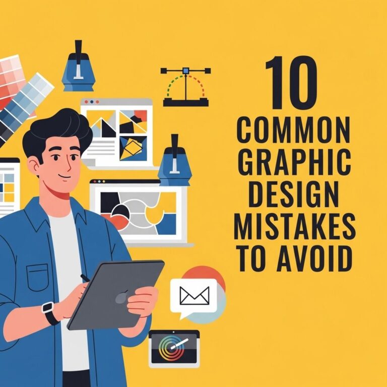
Table of Contents
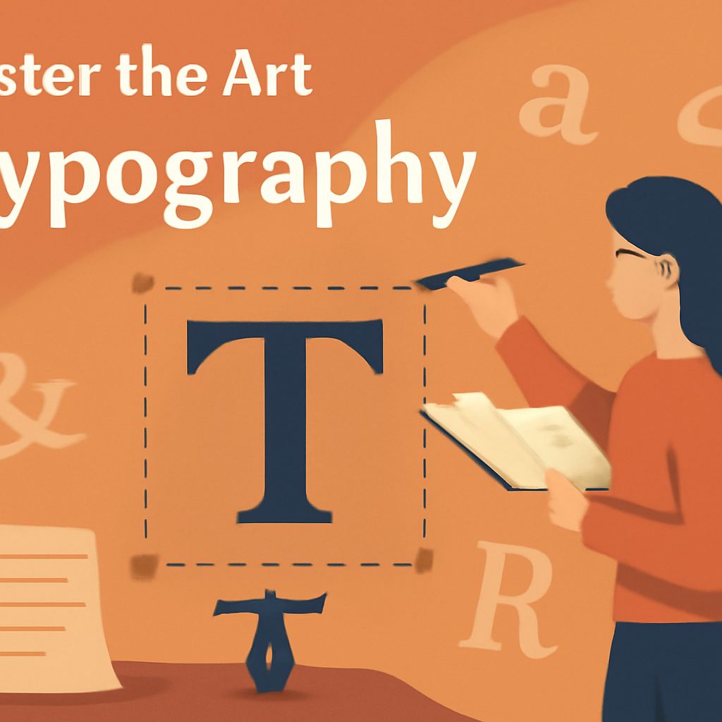
Understanding Typography
Typography is the craft of arranging type in a way that makes written language legible, readable, and visually appealing. It plays a pivotal role in both print and digital design. While the average person may not pay much attention to the fonts used in a website or a printed brochure, designers know that typography can make or break a project. Typography is not just about choosing fonts; it’s about utilizing type as a form of visual expression and communication.
Typography is an essential element of design that can transform the way your message is perceived. Mastering the art of fonts allows you to create visually stunning compositions that resonate with your audience. Explore your creativity with professional packaging mockups to see how typography can enhance your branding.
From logos and headers to body text, every aspect of typography can impact the overall perception of a design. Selecting the right font and skillfully combining them can significantly enhance a visual project, aiding in communication and branding. It is this attention to detail that transforms ordinary design work into compelling and engaging visual stories.
The Evolution of Typography
The history of typography is rich and dates back to the advent of the written word. With the invention of the printing press by Johannes Gutenberg in the 15th century, typography began to evolve into an art form. This revolutionary invention made the mass production of books possible, democratizing knowledge and information, and allowing typography to flourish and become more sophisticated over time.
Different cultures have infused their unique styles into typography, giving us the diverse array of fonts and styles to choose from today. From the intricate scripts of Arabic and East Asian calligraphy to the bold, block letters seen in Western design, typography reflects cultural diversity and historical context. Modern digital design has further expanded the boundaries of typography, allowing for an endless variety of styles and effects. Advanced technology provides tools that enable designers to create innovative typographic compositions that were previously unimaginable.
As we venture through the digital age, typography continues to evolve. Designers are increasingly focusing on readability across different devices, necessitating adaptive and responsive typography techniques. Whether viewed on a smartphone, tablet, or computer, typography must be flexible and versatile enough to maintain clarity and appeal. In the world of digital media, where user experience is paramount, understanding how typography contributes to usability and engagement is key to successful design.
Choosing the Right Font
Selecting the appropriate font is a critical decision in design. It is essential to understand the nature of the project and the audience it is targeted towards. Consider the following factors when choosing a font:
- Purpose: Identify whether the font is for a formal document, a brand logo, or an engaging advertisement. Different projects require different tones, and the font can set that tone immediately.
- Readability: Ensure that the font is legible, especially when used for body text or lengthy content. A font that is hard to read will deter your audience and hinder your message.
- Style: Match the font style with the tone and personality of the project. Serif fonts convey tradition and reliability, while sans-serif fonts often denote modernity and simplicity. Fonts can evoke emotion and influence perception, so choose wisely.
By understanding these factors, designers can select fonts that not only look good but also effectively convey the intended message. It involves a mix of creativity and strategic thinking, ensuring that the typographic choices resonate with the audience while serving the functional needs of the design.
Combining Fonts
Typography is not just about selecting a single font for a design; it’s about creating a harmonious combination of multiple fonts. Combining fonts can add visual interest and help structure content effectively. Here are some tips for combining fonts:
- Contrast: Use contrasting fonts to create visual interest. Pair a bold, expressive font with a more understated, simple typeface. This approach highlights specific content and draws attention to different areas within a design.
- Complementary Styles: Choose fonts that complement each other in style. A serif font paired with a sans-serif font often creates a balanced and appealing look, lending cohesion and dynamism to the design.
- Hierarchy: Establish a clear hierarchy by using different fonts for headers, subheaders, and body text. This guides the reader and creates an organized layout, emphasizing the most important information visually.
Creating combinations that work well together requires an understanding of visual proportions and textual balance. The goal is to ensure each font plays a role in reinforcing the message and maintaining a consistent look across the entire design.
Impact of Typography on Branding and Communication
Typography is a powerful branding tool. It communicates subtly yet powerfully, affecting how we perceive a brand’s message and identity. The typefaces used in branding materials—from public signage to websites, business cards to advertisements—convey distinct hues of the brand’s personality and its values.
Consider iconic brands recognized instantly by their unique typography. For instance, Coca-Cola’s classic script imbues a sense of nostalgia and timelessness, while Apple’s sleek sans-serif expresses modernity and innovation. Selecting fonts that align with a brand’s ethos can create consistent messaging that enhances brand recognition and trust.
In terms of communication, typography helps convey tone before the words are even read. A playful font can inject humor and friendliness into a message, whereas a stark, modern typeface can portray professionalism and authority. It becomes crucial in establishing connection and comprehension, allowing an audience to intuitively grasp the nature and mood of what is being communicated.
Conclusion
Mastering the art of typography requires a blend of creative intuition and technical understanding. It’s about experimenting with fonts, taking calculated risks, and fine-tuning every typographical element to fulfill both aesthetic and functional goals. Typography tells stories and brands identities, shapes perceptions, and improves user experiences.
As digital landscapes continue to evolve, the significance of typography will only proliferate. Whether you’re creating a corporate manifesto or a whimsical art piece, remember that good typography communicates far more than words can convey alone. By appreciating the nuances of font selection and combination, designers can harness the power of typography to craft compelling and effective visual communications.
FAQ
What is the importance of typography in design?
Typography significantly influences readability, user experience, and brand perception. It helps communicate the tone and message of a design effectively, impacting how audiences perceive and interact with a brand or content.
How can I choose the right font for my project?
Consider the purpose, readability, and style of your project. It is essential to match the font with the tone and audience of the design. Research your audience’s preferences and the emotional tone you want to convey to make informed font choices.
What are some common font pairing strategies?
Use contrast, complementary styles, and establish a hierarchy to create effective font combinations that enhance a design. Experimenting with different types can lead to discovering innovative pairings that enhance a project’s impact.
Can typography impact user engagement?
Yes, good typography improves readability and aesthetics, which can lead to better user engagement and interaction. Clear and compelling typography ensures that users can easily absorb information and enjoy a satisfying visual experience.