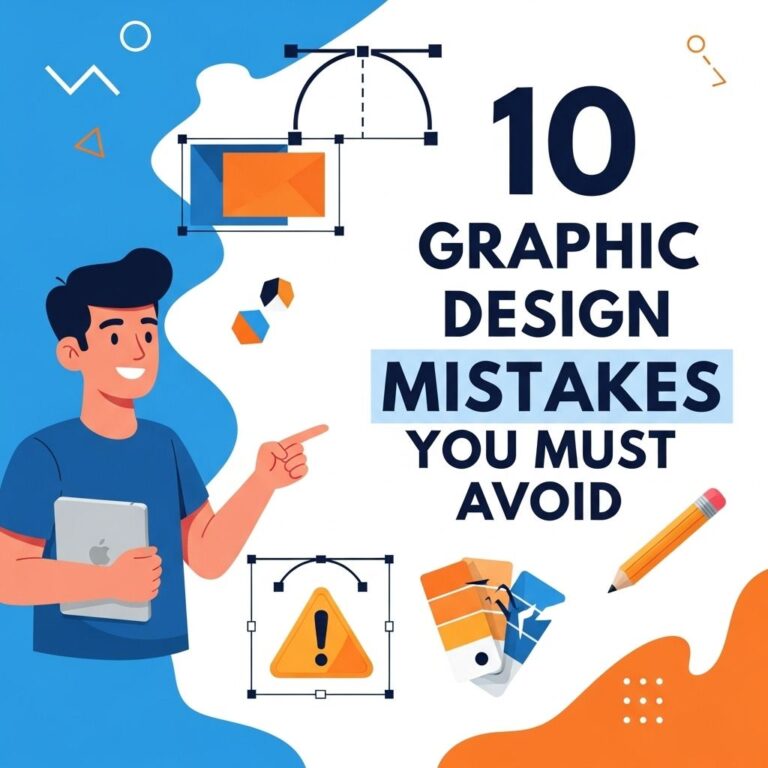
Creating a logo is one of the most critical steps in establishing a brand identity. A well-designed logo serves as the visual anchor for all your business communication, marketing materials, and online presence. However, many designers, whether experienced or just starting, often make common mistakes that can hinder the effectiveness of a logo. Understanding these pitfalls is crucial for creating a logo that not only represents your brand but also resonates with your audience. In this article, we will explore some of the most significant logo design mistakes you should avoid to ensure your logo stands out for all the right reasons.
Designing a logo is a critical step for any brand, as it encapsulates the essence of the business in a visual form. However, many designers fall into common pitfalls that can undermine their efforts. To help steer clear of these pitfalls, we’ve identified ten common logo design mistakes to avoid. For reference and inspiration, consider exploring resources such as vector logo templates.
Table of Contents
1. Ignoring Brand Identity
A logo should encapsulate the essence of your brand. Designers often overlook the brand’s core values, mission, and target audience when creating a logo. Here are factors to consider:
- Understand your brand’s personality (e.g., playful, professional, innovative).
- Identify your target audience and their preferences.
- Define the message your logo should convey.
2. Overcomplicating the Design
One of the most common mistakes in logo design is creating a logo that is too complex. A complicated logo can be difficult to reproduce, especially in smaller sizes. Here are some tips to simplify your design:
Tips for Simplifying
- Limit the number of colors to two or three.
- Avoid intricate details that may not scale well.
- Focus on a clear and simple shape or symbol.
3. Not Considering Scalability
Your logo will appear in various sizes—on business cards, billboards, and websites. A great logo must be scalable without losing its essence. Consider the following:
| Size | Considerations |
|---|---|
| Small (e.g., social media icons) | Must remain recognizable without losing detail. |
| Medium (e.g., brochures) | Should be clear and legible. |
| Large (e.g., banners) | Must maintain visual impact from a distance. |
4. Using Trendy Fonts
While staying current with design trends can be beneficial, relying too heavily on trendy fonts can date your logo quickly. Instead, opt for timeless typography that reflects your brand’s identity. Considerations include:
- Choose fonts that are legible at various sizes.
- Limit the use of decorative fonts.
- Ensure the font aligns with your brand’s tone.
5. Failing to Research Competitors
Not analyzing competitors can lead to a logo that is either too similar to others or completely off-base. Conducting competitor research can provide insights into what works and what doesn’t in your industry. Steps to take include:
Research Steps
- Identify your main competitors.
- Analyze their logos and branding.
- Take note of common themes and visual elements.
6. Overusing Effects
Effects like drop shadows, gradients, or 3D elements can be tempting but can easily overwhelm a design. Strive for a clean, flat design that conveys professionalism. Here are dos and don’ts:
Dos
- Utilize effects sparingly.
- Focus on a solid color palette.
- Prioritize clarity and simplicity.
Don’ts
- Don’t rely on effects to compensate for a weak design.
- Don’t use trendy effects that may fade quickly.
- Don’t combine too many effects in one logo.
7. Neglecting Color Psychology
Colors evoke emotions and play a crucial role in how a logo is perceived. Neglecting color psychology can lead to misinterpretation of your brand. Here’s how to choose the right colors:
Color Associations
- Red: Passion, energy, urgency.
- Blue: Trust, reliability, calmness.
- Green: Growth, health, nature.
- Yellow: Optimism, clarity, warmth.
8. Using Raster Images Instead of Vector
Raster images (like JPGs or PNGs) can lose quality when resized, while vector images maintain their resolution no matter the size. Always create logos in vector format using software like Adobe Illustrator or CorelDRAW.
9. Ignoring Feedback
The design process should involve feedback from others, especially from stakeholders or potential customers. Ignoring constructive criticism can lead to a logo that doesn’t resonate with the audience. Consider these ways to gather feedback:
Feedback Methods
- Conduct surveys or polls.
- Hold focus groups for detailed insights.
- Utilize social media for broader reach.
10. Failing to Test in Real-World Scenarios
Before finalizing a logo, it’s essential to see how it performs in various real-world applications—on products, digital platforms, and print materials. Testing can reveal issues that may not be evident on the design software. Key areas to test include:
Testing Areas
- Visibility on different backgrounds.
- Impact on different mediums (e.g., digital vs. print).
- Reactions from target audiences.
Conclusion
A successful logo is a blend of creativity and strategy, reflecting your brand’s identity while maintaining simplicity and versatility. By avoiding the common mistakes outlined in this article, you can create a logo that effectively communicates your brand’s message and stands the test of time. Remember, a logo is often the first impression of your business—it’s worth taking the time to get it right.
FAQ
What are common logo design mistakes to avoid?
Common logo design mistakes include using too many colors, choosing overly complex designs, neglecting scalability, using generic fonts, and failing to consider the target audience.
Why is scalability important in logo design?
Scalability is important because a logo should look good at any size, whether on a business card or a billboard. If a logo is too intricate, it may lose clarity when resized.
How can I ensure my logo is unique?
To ensure your logo is unique, conduct thorough research on competitors and industry trends, and consider working with a professional designer who can create a custom design that reflects your brand’s identity.
Should I use trendy designs for my logo?
While it’s tempting to use trendy designs, it’s better to focus on timeless elements that will remain relevant over the years. Trends can become outdated quickly, making your logo less effective.
What role does color play in logo design?
Color plays a crucial role in logo design as it evokes emotions and communicates brand values. It’s important to choose colors that align with your brand’s message and resonate with your target audience.
How can I test my logo design before finalizing it?
You can test your logo design by gathering feedback from potential customers, conducting surveys, and evaluating how it performs across various applications, such as digital and print formats.