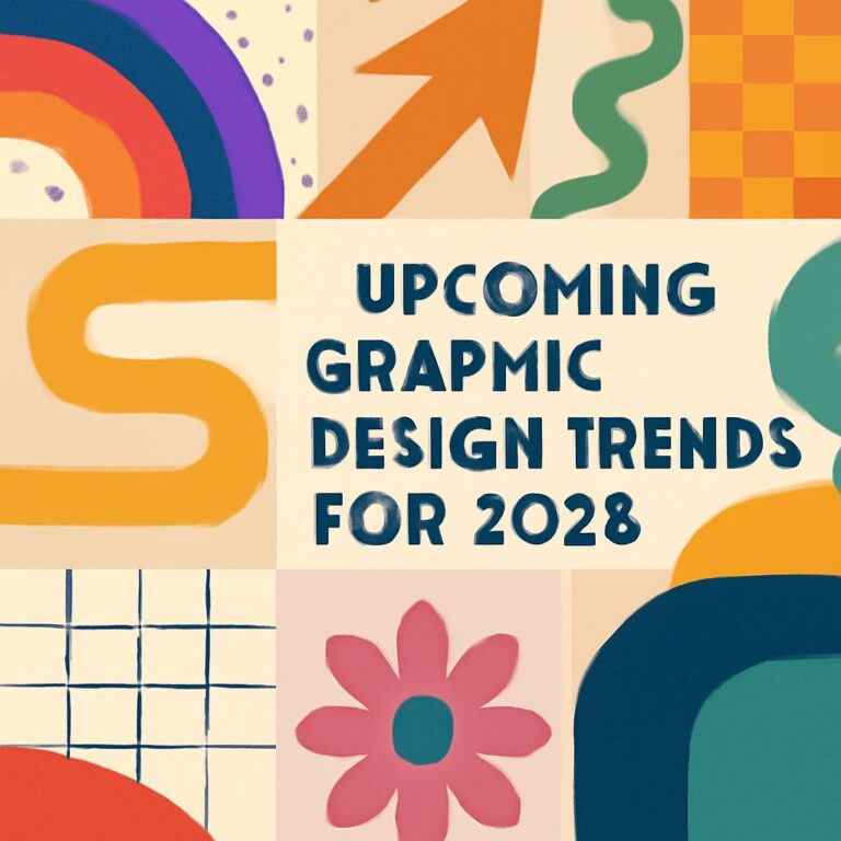
In the fast-paced world of graphic design, the difference between a stunning project and a catastrophic failure often lies in the details. Designers constantly strive for creativity and innovation, but it’s easy to overlook fundamental principles that can lead to glaring mistakes. Whether you’re a seasoned professional or a novice looking to refine your skills, understanding common pitfalls can help you elevate your work and ensure your designs resonate with your audience.
Table of Contents
Understanding Graphic Design Fundamentals
Graphic design isn’t just about making things look pretty; it’s about effectively communicating a message through visuals. To create impactful designs, one must grasp the core principles that govern the craft:
- Balance: The distribution of visual weight in a design.
- Contrast: The difference between elements to highlight important information.
- Alignment: The placement of elements in relation to one another.
- Repetition: Consistency in design elements to create cohesiveness.
- Proximity: The relationship between elements that affects perception.
Top Graphic Design Mistakes
Below are ten common mistakes designers make, along with tips on how to avoid them:
1. Ignoring the Target Audience
Designing without considering your audience is a recipe for failure. Always keep your target demographic in mind. Ask yourself:
- What are their interests?
- What problems are they trying to solve?
- What style resonates with them?
2. Poor Typography Choices
Typography is more than just text; it conveys tone and emotion. Avoid these typography blunders:
- Using too many fonts (ideally stick to 2-3).
- Choosing hard-to-read fonts.
- Neglecting font sizes and hierarchy.
3. Overcrowded Designs
Less is often more in graphic design. An overcrowded layout can confuse viewers and dilute your message. To simplify your designs:
- Use white space effectively.
- Limit the number of elements on each page or screen.
- Focus on a single message or call to action.
4. Lack of Visual Hierarchy
Visual hierarchy guides the viewer’s eye and helps them navigate your design. To establish hierarchy:
| Method | Description |
|---|---|
| Size | Larger elements attract more attention. |
| Color | Use contrasting colors to highlight key information. |
| Position | Place important elements at the top or center. |
5. Neglecting Color Theory
Color can evoke emotions and set the tone for your design. Avoid these color-related mistakes:
- Using clashing colors that distract rather than complement.
- Forgetting color accessibility; ensure sufficient contrast.
- Ignoring cultural implications of colors.
6. Inconsistent Branding
Brand identity is crucial for recognition and trust. Make sure to:
- Follow brand guidelines consistently.
- Use the same logo, colors, and fonts across all materials.
- Avoid stylistic changes that could confuse your audience.
7. Failing to Use the Right Tools
The right tools can significantly enhance your design process. Common tools include:
- Adobe Creative Suite (Photoshop, Illustrator, InDesign).
- Sketch for web and mobile design.
- Canva for quick mockups and social media graphics.
8. Skipping the Feedback Loop
Constructive criticism is essential for growth. Always seek feedback from:
- Colleagues or peers in the industry.
- Your target audience through surveys or tests.
- Mentors who can provide insights based on experience.
9. Ignoring File Formats
Choosing the wrong file format can result in quality loss or compatibility issues. Know the difference:
| File Format | Use Case |
|---|---|
| JPEG | Best for photographs and web images. |
| PNG | Supports transparency; ideal for graphics. |
| Best for print designs and documents. |
10. Not Staying Updated with Design Trends
Graphic design is constantly evolving. Staying informed about trends can help keep your work fresh. Consider:
- Following design blogs and websites.
- Joining graphic design communities on social media.
- Participating in workshops and seminars.
Conclusion
Avoiding common graphic design mistakes is vital for effective communication through visuals. By understanding the principles of design and recognizing these pitfalls, you can create work that not only looks impressive but also serves its intended purpose. Whether you’re working on personal projects or client work, these insights will help you refine your skills and produce outstanding designs that resonate with your audience.
FAQ
What are the most common graphic design mistakes to avoid?
Common graphic design mistakes include poor typography, lack of contrast, cluttered layouts, inconsistent branding, and ignoring the target audience.
How can I improve my typography in graphic design?
To improve typography, choose fonts that are legible, limit the number of typefaces, and ensure there is a clear hierarchy in text sizes and styles.
Why is contrast important in graphic design?
Contrast is crucial in graphic design as it enhances readability, draws attention to key elements, and helps create a visual hierarchy.
What does a cluttered layout do to my design?
A cluttered layout can overwhelm viewers, distract from the main message, and make it difficult for the audience to navigate the design.
How can I ensure my branding is consistent across designs?
To maintain consistent branding, establish a style guide that includes color schemes, fonts, and logo usage, and apply these elements uniformly across all materials.
What should I consider about my target audience when designing?
When designing, consider the demographics, preferences, and behaviors of your target audience to create designs that resonate with them and meet their needs.