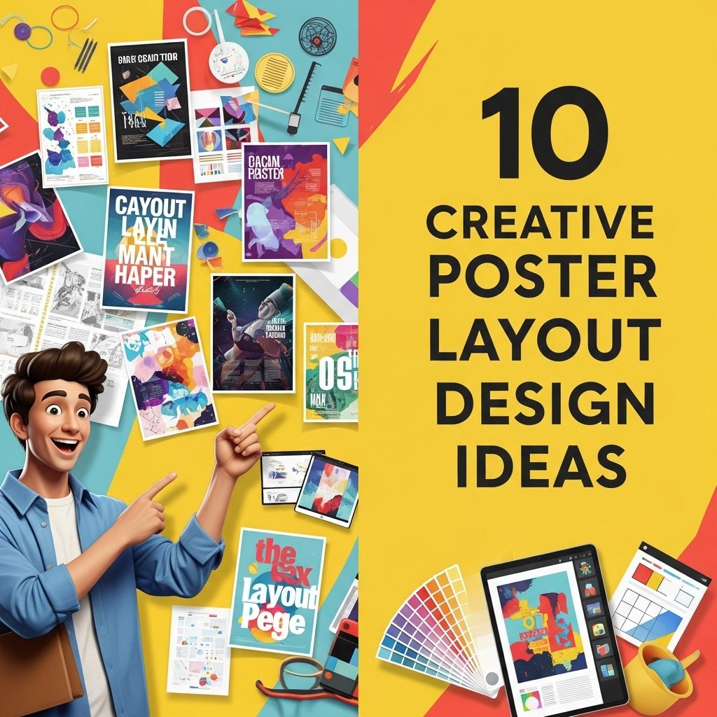
In the world of design, creativity isn’t just a skill; it’s a necessity. Whether it’s for marketing, events, or personal projects, crafting an engaging poster can capture attention and convey messages effectively. With various layouts available, the right choice can elevate a simple design into a visually stunning piece. This article explores ten creative poster layout design ideas that will ignite your imagination and help you create standout visuals.
Creating eye-catching posters requires innovative layouts that captivate the audience’s attention. Here are 10 creative poster layout design ideas that can elevate your project’s visual appeal and effectively communicate your message. For additional inspiration, you can explore a variety of poster mockup templates to refine your design.
Table of Contents
1. The Grid Layout
A classic approach to poster design that brings organization and clarity. The grid layout employs a structured system that divides the poster into sections, making it easy for viewers to digest the information.
Benefits:
- Provides uniformity and consistency.
- Facilitates clear hierarchy in information presentation.
- Great for combining text and images seamlessly.
Tips:
- Use contrasting colors to separate sections.
- Incorporate images that align with the grid for a cohesive look.
2. The Asymmetrical Layout
Asymmetry in design often breaks conventional rules and adds a modern touch. By using uneven elements, the viewer’s eye is naturally drawn to focal points, making this layout dynamic and engaging.
Characteristics:
- Unbalanced placement of elements.
- Vivid colors and bold typography can enhance impact.
- Creates movement throughout the design.
3. The Minimalist Approach
Sometimes less is more. A minimalist poster layout strips away unnecessary elements, focusing on essential information and visuals. This technique can create a powerful message using simple design.
Key Elements:
- Ample white space.
- Simple and legible font styles.
- Limited color palette, often using monochromes or pastels.
4. The Z-Pattern Layout
The Z-pattern layout mimics the natural movement of the human eye. When viewers scan a poster, they tend to move in a Z-shape, making this layout effective for guiding them through the content.
Implementing the Z-Pattern:
- Place key visuals and text along the Z path.
- Incorporate elements that catch attention, such as bold images or catchy headlines, at the diagonal ends.
5. The Centered Layout
Centered layouts are traditional but can be incredibly versatile. This design style emphasizes a central image or message, surrounded by supporting text or visuals, creating a balanced and harmonious look.
When to Use:
- For events that need a clear focal point.
- For designs with a strong central message or image.
6. The Collage Style
A collage layout combines multiple images, textures, and typography to create a vibrant and eclectic design. This approach reflects creativity and can be a fantastic way to showcase diverse elements together.
Tips for Creating a Collage:
- Mix different media types (photography, illustrations).
- Layer elements for depth and interest.
- Utilize borders or frames to define sections.
7. The Infographic Poster
Infographics are not just for reports; they can make engaging posters! This layout focuses on data visualization, summarizing complex information into digestible visuals.
Essential Components:
- Clear, concise data points.
- Graphs, charts, and icons to illustrate information.
- Bold headings to guide the flow of information.
| Infographic Element | Purpose |
|---|---|
| Graphs | Visual representation of data trends. |
| Icons | Simple representations to convey ideas quickly. |
| Color Coding | Helps differentiate between data sets. |
8. The Typographic Layout
This design focuses primarily on typography. By using different font styles, sizes, and arrangements, you can create a visually striking poster that communicates through text alone.
Best Practices:
- Combine serif and sans-serif fonts for contrast.
- Experiment with letter spacing and line height for emphasis.
- Utilize quotes or phrases as focal points.
9. The Split Layout
The split layout divides the poster into two equal parts, allowing for contrasting visuals or messages. This approach can effectively compare two ideas or highlight different aspects of a topic.
Use Cases:
- Product comparisons.
- Before-and-after scenarios.
- Dual themes or concepts.
10. The Flowing Layout
Flowing layouts create a sense of movement across the poster. By using curved lines or organic shapes, the viewer’s eye is guided smoothly from one element to another, giving a dynamic feel.
Strategies:
- Incorporate waves or lines that lead the eye.
- Use layered elements that overlap to create depth.
- Choose colors that harmonize to maintain flow.
Conclusion
Creating a compelling poster requires not just artistic skills but also an understanding of layout principles. By experimenting with various layouts, designers can find creative solutions that resonate with their audience while effectively conveying their message. Whether you choose the classic grid layout or the dynamic flowing design, each method has its unique strengths. Embrace these design ideas to elevate your poster projects and capture the attention they deserve!
FAQ
What are some popular poster layout design ideas?
Some popular poster layout design ideas include asymmetrical designs, grid layouts, minimalistic styles, typographic focus, and illustrative compositions.
How can color theory enhance my poster design?
Color theory can enhance your poster design by creating visual harmony, drawing attention to key elements, and evoking specific emotions that resonate with your audience.
What are the best fonts to use for poster layouts?
The best fonts for poster layouts typically include bold sans-serif fonts for headlines, readable serif fonts for body text, and decorative fonts for accents, depending on the theme.
How do I choose the right images for my poster?
Choose images that are high-quality, relevant to the message, and evoke the desired response from your audience. Consider using illustrations or graphics to enhance originality.
What is the importance of white space in poster design?
White space is important in poster design as it helps to create balance, improves readability, and allows key elements to stand out, making the overall design more effective.
Are there any tools recommended for creating poster designs?
Yes, popular tools for creating poster designs include Adobe Illustrator, Canva, and Photoshop, as they offer various features for layout customization and graphic design.