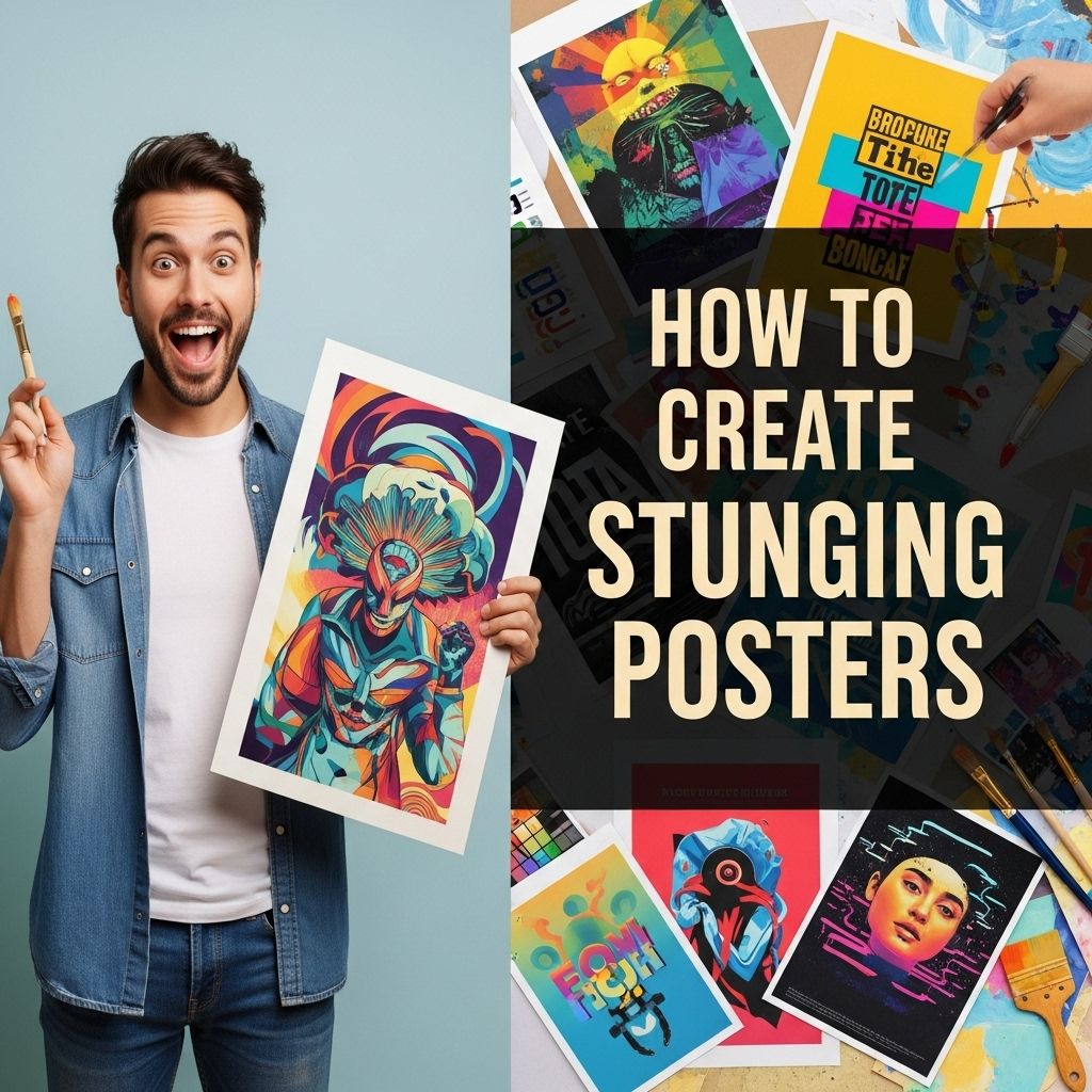
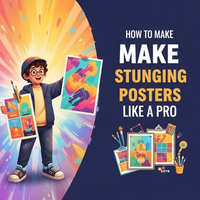
Creating stunning posters is not just an art; it’s a skill that combines creativity, vision, and technical know-how. Whether you’re promoting an event, a product, or simply showcasing a piece of art, a well-designed poster can make a lasting impression. In this guide, we’ll explore the essential components of poster design, tips for using color and typography effectively, and tools to help you bring your vision to life.
Table of Contents
Understanding the Basics of Poster Design
Before diving into the technical aspects, it’s crucial to understand what makes a poster effective. A great poster should be:
- Eye-catching: It should grab attention quickly.
- Informative: It should convey key information clearly.
- Balanced: The layout should be harmonious and not cluttered.
To achieve these qualities, consider the following foundational elements:
1. Purpose and Audience
Begin by defining the purpose of your poster. Ask yourself:
- What message do I want to convey?
- Who is my target audience?
Identifying these factors will guide your design choices.
2. Size and Layout
The size of your poster can significantly impact its design. Common sizes include:
| Size | Dimensions (inches) |
|---|---|
| Small | 11 x 17 |
| Medium | 18 x 24 |
| Large | 24 x 36 |
Choose a size that aligns with your distribution method—whether it’s for print or digital use. Ensure your layout supports the flow of information, guiding the viewer’s eye through the content seamlessly.
Color Theory in Poster Design
Color is one of the most powerful tools in design, and understanding color theory can elevate your posters. Here are some key concepts to consider:
1. Color Wheel Basics
The color wheel is divided into primary, secondary, and tertiary colors. Effective poster designs often use:
- Complementary colors (opposite on the wheel) for contrast
- Analogous colors (next to each other) for harmony
2. Psychological Effects of Colors
Colors can evoke emotions and influence perceptions. For example:
- Red: Excitement, passion
- Blue: Trust, calmness
- Yellow: Happiness, energy
Choose colors that align with the mood you want to create in your poster.
Typography: Choosing the Right Fonts
Typography plays a crucial role in the readability and aesthetic appeal of your poster. Here are some tips for selecting fonts:
1. Font Pairing
Using two or three complementary fonts can create visual interest. Consider:
- One font for the headline
- A second for the body text
- A third for accents or calls-to-action
2. Size and Hierarchy
Establish a clear hierarchy through size and weight:
- Headlines should be the largest and boldest.
- Subheadings should be smaller but still prominent.
- Body text should be readable from a distance.
Maintain consistency in font usage throughout the poster to avoid a chaotic appearance.
Incorporating Images and Graphics
Visual elements can significantly enhance your poster’s appeal. Here are some best practices:
1. High-Quality Images
Always use high-resolution images to prevent pixelation when printed or displayed. Sources for high-quality images include:
- Stock photo websites (e.g., Unsplash, Pixabay)
- Your own photography
- Illustrations created in graphic design software
2. Graphics and Icons
Graphics and icons can simplify complex information and make your poster more engaging. Consider using:
- Icons to represent ideas or themes
- Infographics to convey statistics
Tools for Creating Stunning Posters
With the right tools, creating visually appealing posters can be an enjoyable process. Here are some popular design tools:
1. Canva
Canva is user-friendly and offers numerous templates, making it perfect for beginners. Features include:
- Drag-and-drop design interface
- Access to a vast library of images and elements
2. Adobe Illustrator
For those with more experience, Adobe Illustrator provides advanced design capabilities. Key features include:
- Vector graphics creation
- Customizable typography
3. Affinity Designer
A cost-effective alternative to Adobe products, Affinity Designer offers robust tools for creating posters. Benefits include:
- No subscription fees
- Powerful vector and raster design options
Final Touches: Reviewing Your Design
After designing your poster, it’s vital to review and revise. Here are some steps to ensure your design is polished:
1. Get Feedback
Share your design with peers or mentors to gather constructive criticism. Look for:
- Readability
- Visual impact
- Overall effectiveness in conveying the message
2. Proofread
Ensure that all text is free from typos and grammatical errors. A poster with mistakes can diminish credibility.
3. Test Print
If printing, conduct a test print to check colors and sizing. This step can help catch any issues before the final print.
Conclusion
Designing stunning posters is a blend of art and strategy. By understanding the fundamentals of design, using color and typography effectively, and leveraging the right tools, you can create posters that not only captivate but also communicate your message clearly. Remember that practice is key; the more you experiment with design, the more your skills will grow. So, unleash your creativity and start designing!
FAQ
What are the key elements of a stunning poster?
A stunning poster typically includes a strong visual focal point, clear typography, a balanced layout, and a cohesive color scheme to attract attention and convey the message effectively.
What tools can I use to design a poster?
You can use graphic design software like Adobe Photoshop, Illustrator, or free online tools like Canva and PosterMyWall to create eye-catching posters.
How important is color choice in poster design?
Color choice is crucial in poster design as it sets the mood, attracts attention, and helps convey the message. Use contrasting colors for text and background to enhance readability.
What tips can help improve poster readability?
To improve readability, use large fonts, limit the amount of text, choose high-contrast color combinations, and ensure there is enough white space around elements.
How do I choose the right images for my poster?
Choose high-quality, relevant images that complement your message and align with your theme. Ensure they are not overly busy to maintain focus on the main content.
What formats should I consider when printing my poster?
Consider printing your poster in common sizes like A3 or A2, and choose the right paper type (glossy or matte) depending on where it will be displayed and the desired finish.

