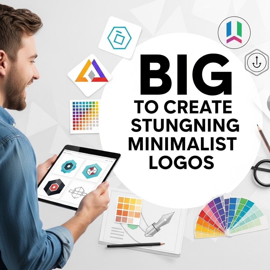
In a world where brands are constantly vying for attention, minimalist logos have emerged as a powerful design trend. These logos resonate with audiences by conveying messages in a straightforward and elegant manner. The minimalistic approach strips away unnecessary details to focus on the core essence of a brand. In this article, we will explore the key principles of creating stunning minimalist logos, the tools you can use, and some inspirational examples that can guide your design process.
Table of Contents
Understanding Minimalism in Logo Design
Minimalism in logo design emphasizes simplicity, clarity, and functionality. A well-executed minimalist logo should encapsulate the brand’s identity while being memorable and versatile. Here are some fundamental principles:
- Simplicity: Avoid clutter and focus on core shapes and colors.
- Relevance: Ensure the design aligns with the brand’s values and message.
- Memorability: Create a logo that is easy to recall and recognize.
- Versatility: Design with scalability in mind, so the logo looks good in all sizes and applications.
- Timelessness: Aim for a design that will not look outdated in a few years.
Steps to Create a Minimalist Logo
Creating a minimalist logo involves a series of deliberate steps. Let’s break down the process:
1. Research and Define Your Brand
Before diving into the design, take time to understand the brand’s identity. Consider the following:
- Target Audience: Who are you designing for?
- Brand Values: What messages should the logo convey?
- Market Trends: What logos are successful in your market?
2. Brainstorm Ideas
Begin sketching your ideas. Focus on symbols, initials, and simple shapes that represent the brand. You can use:
- Pencil and paper for quick sketches.
- Digital tools like Adobe Illustrator or Sketch for more refined designs.
3. Choose Your Color Palette
Minimalist logos often utilize a limited color palette. Here are some tips:
- Limit to 2-3 Colors: Stick to a couple of complementary colors.
- Understand Color Psychology: Choose colors that reflect the brand’s personality.
- Consider Black and White: A monochromatic logo can be striking and timeless.
4. Select the Right Typography
The font you choose can significantly impact the overall feel of your logo. Consider these factors:
- Legibility: Ensure your text is easy to read at various sizes.
- Font Style: Choose a font that communicates the brand’s voice—modern, classic, playful, etc.
- Limit Font Use: Stick to one or two font types for a cleaner look.
5. Iterate and Refine Your Design
Once you have a few options, gather feedback from peers or potential customers. Iterate on your designs, focusing on:
- Removing unnecessary elements.
- Enhancing visual balance.
- Ensuring scalability for various applications.
6. Test Your Logo
Before finalizing your logo, test it across different mediums:
- Digital formats (websites, social media).
- Print formats (business cards, flyers).
- Merchandise (t-shirts, mugs).
Tools for Creating Minimalist Logos
The right tools can make a significant difference in your design process. Here are some recommended tools:
| Tool | Description |
|---|---|
| Adobe Illustrator | A vector graphic design software that’s industry-standard for logo creation. |
| Canva | An accessible online design tool with pre-made templates suitable for beginners. |
| Affinity Designer | A cost-effective alternative to Illustrator, offering powerful design features. |
| Sketch | A design tool focused on UI/UX, great for creating logos and other graphics. |
| Inkscape | A free, open-source vector graphics editor with robust capabilities. |
Inspirational Examples of Minimalist Logos
Sometimes, looking at the work of others can spark inspiration. Here are a few iconic minimalist logos:
- Nike: The simple swoosh symbolizes motion and speed.
- Apple: The iconic apple with a bite taken out is both recognizable and elegant.
- FedEx: The hidden arrow in the negative space represents speed and precision.
- McDonald’s: The golden arches create instant recognition without needing the brand name.
- Twitter: The bird silhouette conveys freedom and communication.
Conclusion
Creating a stunning minimalist logo requires patience, creativity, and a deep understanding of the brand you are designing for. By following the outlined steps and utilizing the recommended tools, you can craft a logo that not only stands out but also embodies the core values of the brand. Remember, the essence of a minimalist logo lies in its ability to communicate effectively with simplicity. As you embark on your design journey, draw inspiration from successful logos and continuously refine your work until you achieve a design that resonates with both the brand and its audience.
FAQ
What are the key elements of a minimalist logo?
The key elements of a minimalist logo include simplicity, clean lines, limited color palettes, and the use of negative space to create a memorable design.
How can I choose the right colors for my minimalist logo?
Choosing the right colors for your minimalist logo involves selecting a limited color palette that reflects your brand’s personality and values while ensuring good contrast for visibility.
What software tools can I use to design a minimalist logo?
Popular software tools for designing minimalist logos include Adobe Illustrator, CorelDRAW, and free options like Canva and Inkscape, which offer user-friendly interfaces.
How do I ensure my minimalist logo is versatile?
To ensure your minimalist logo is versatile, design it in vector format, test its appearance in different sizes and formats, and make sure it looks good in both color and monochrome.
What are some common mistakes to avoid when creating a minimalist logo?
Common mistakes to avoid include overcomplicating the design, using too many colors, neglecting scalability, and failing to consider the target audience’s perception.