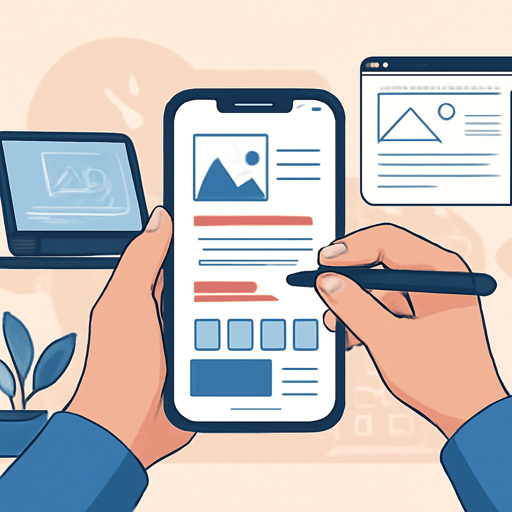
Table of Contents
Introduction
As mobile devices become the primary mode of accessing online content, mastering mobile UI design is imperative for crafting seamless user experiences. Mobile UI design focuses on crafting intuitive and responsive interfaces that cater to the needs of the user while being visually pleasing and functional.
Crafting seamless experiences in mobile UI design requires a keen understanding of user needs and aesthetic appeal. By prioritizing intuitive navigation and responsive layouts, designers can elevate user engagement. For those looking to visualize their concepts, there are resources like editable can mockup files to enhance the design process.
Understanding the Basics of Mobile UI Design
Mobile UI design involves creating user interfaces for handheld devices with smaller screens, which requires a different approach than for desktops. Designers must consider touch interactions, adaptive layouts, and screen flow to ensure a smooth navigation experience. Here are some essential principles:
- Design with a mobile-first approach to prioritize essential features and functionalities.
- Ensure that all interactive elements are easily tappable with fingers.
- Keep screen clutter to a minimum, using whitespace effectively.
Key Components of Effective Mobile UI Design
Creating effective mobile UI involves several components that work together to ensure usability and accessibility. The key elements include:
- Navigation: Simplified navigation aids user journey through intuitive menus and a logical flow.
- Layout: Responsively design layouts that fit various screens, maintaining consistency in visual design.
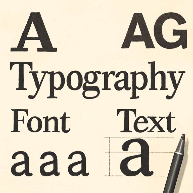
- Typography: Select legible font sizes and styles to make reading comfortable across devices.
Tools Used in Mobile UI Design
Several tools assist designers in crafting and testing mobile UI concepts. The most popular tools include:
- Sketch: Known for its powerful vector editing and prototyping capabilities.
- Figma: Offers real-time collaboration features and a comprehensive design interface.
- Adobe XD: Provides seamless integration with other Adobe Creative Cloud tools.
Challenges in Mobile UI Design
Designing for mobile comes with its own unique set of challenges that designers need to navigate to ensure an optimal user experience:
| Challenge | Solution |
|---|---|
| Screen size | Responsive and adaptive design techniques |
| Touch targets | Ensuring all interactive elements are appropriately sized |
| Performance limitations | Optimizing images and assets for faster load times |
| Battery and data usage | Minimalistic design to enhance efficiency |
Best Practices for Mobile UI Design
By adhering to best practices, designers can create more effective and user-friendly mobile interfaces:
- Prioritize content that is most relevant to user needs and goals.
- Implement intuitive gestures and shortcuts to enhance user interactions.
- Test designs thoroughly across different devices and operating systems to ensure consistency.
FAQ
What is the mobile-first design principle?
Mobile-first design involves designing the mobile version of a site or application first, ensuring that the core functionality and features best fit mobile users’ needs.
How important is user testing in mobile UI design?
User testing is crucial as it helps identify usability issues from real user interactions, leading to improvements and refinements of the interface.
Can I use web design knowledge for mobile UI design?
Yes, but understanding mobile-specific constraints like touch interactions and smaller screen sizes is key to effective mobile UI design.
How do animations enhance mobile UI experience?
Animations can guide users, provide feedback, and add a layer of interactivity, enhancing the overall user experience if used judiciously.
Is responsive design the same as adaptive design?
No, responsive design is fluid, adjusting as screen sizes change, while adaptive design uses fixed layouts tailored for specific screen sizes.
Conclusion
Mastering mobile UI design involves understanding the nuances of how users interact with mobile devices, applying best practices to create responsive and intuitive interfaces. As technology evolves, staying updated with emerging trends and tools will empower designers to craft seamless mobile experiences. Whether you’re a seasoned designer or new to the field, embracing these principles will help design mobile interfaces that engage and delight users.