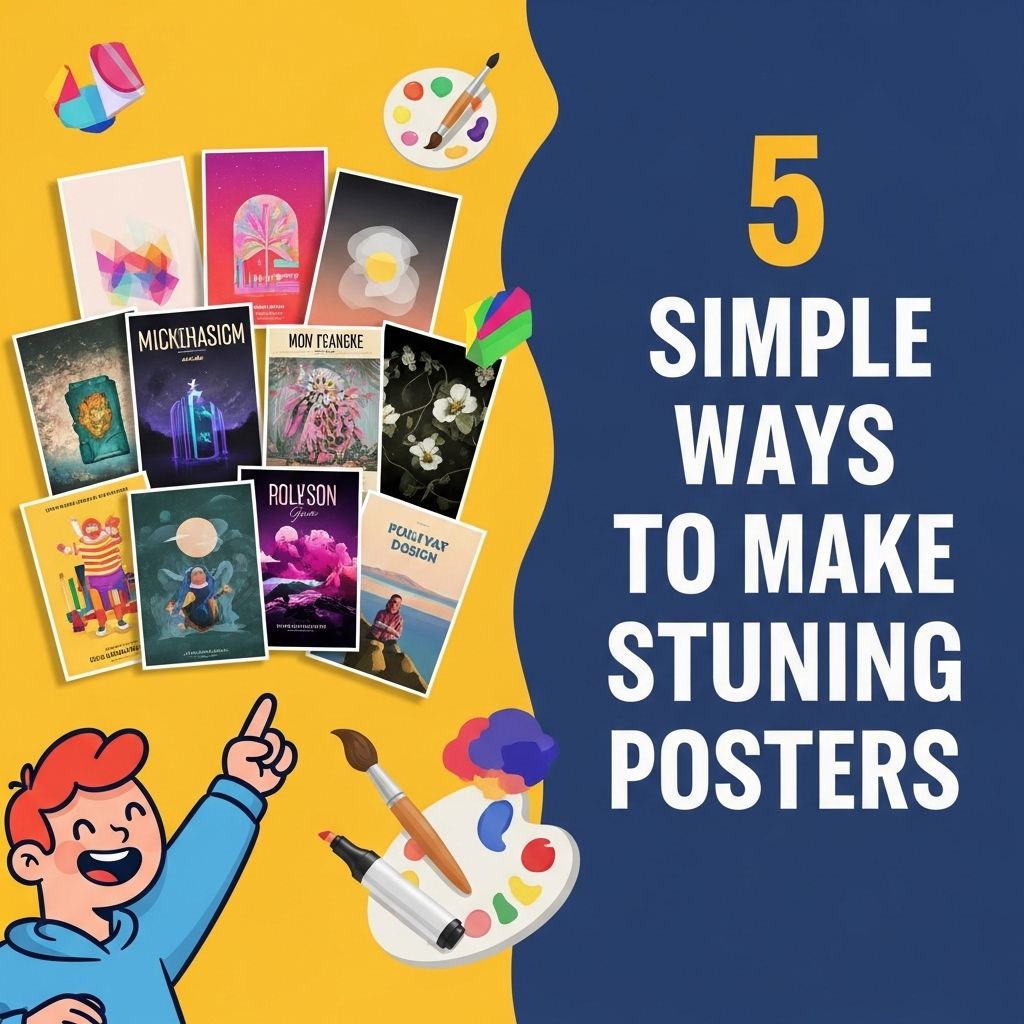
Creating stunning posters is an art that combines creativity, design principles, and a bit of technical knowledge. With the right tools and techniques, anyone can create eye-catching posters that effectively communicate their message. In this article, we will explore five simple yet effective ways to enhance your poster-making skills, ensuring your creations stand out.
Creating eye-catching posters doesn’t have to be a daunting task. With a few simple techniques, you can elevate your design to grab attention and convey your message effectively. Explore these five straightforward ways to transform your projects, and consider using poster mockup templates for an added professional touch.
Table of Contents
Understanding Your Audience
The first step in creating a stunning poster is to know your audience. Understanding who you are designing for can significantly influence the style, color scheme, and content of your poster. Here are some tips to help you define your audience:
- Demographics: Identify age, gender, and location.
- Interests: Consider what your audience is passionate about.
- Purpose: Understand why they would engage with your poster.
Choosing the Right Design Software
In today’s digital age, various design tools can help you create stunning posters. Selecting the right software can make a significant difference in the quality of your designs. Here’s a list of popular tools:
| Software | Best For | Price |
|---|---|---|
| Adobe Photoshop | Professional designers | Subscription-based |
| Canva | Beginners | Free/Premium |
| GIMP | Open-source users | Free |
| Inkscape | Vector graphics | Free |
How to Choose the Right Tool
When selecting design software, consider the following:
- Skill level: Choose a tool that matches your experience.
- Features: Ensure it has all the functionalities you need.
- Cost: Compare different pricing options to find what fits your budget.
Mastering Color Theory
Colors can evoke emotions, attract attention, and communicate messages. Understanding basic color theory can enhance your design significantly. Here are some fundamentals:
Color Wheel Basics
The color wheel consists of primary, secondary, and tertiary colors:
- Primary Colors: Red, Blue, Yellow
- Secondary Colors: Green, Orange, Purple (formed by mixing primary colors)
- Tertiary Colors: Result from mixing primary and secondary colors.
Color Schemes
Experiment with different color schemes to find the right palette for your poster:
- Monochromatic: Variations of a single color.
- Analogous: Colors next to each other on the color wheel.
- Complementary: Opposite colors on the wheel.
Utilizing Typography Effectively
Typography plays a crucial role in poster design. Choosing the right fonts can enhance readability and convey the right mood. Here are a few tips:
Font Selection
When selecting fonts for your poster, consider:
- Readability: Ensure text is easy to read from a distance.
- Hierarchy: Use different sizes and weights to create a visual hierarchy.
- Contrast: Pair different font styles to create interest.
Combining Fonts
A good rule of thumb is to limit your poster to two or three complementary fonts. Here’s how to combine:
- Choose a bold font for headings.
- Pick a sans-serif font for body text.
- Use a decorative font sparingly for emphasis.
Incorporating Visual Elements
Images and graphics can add depth to your poster, making it more appealing. Here’s how to effectively incorporate them:
Image Quality
Always use high-resolution images to avoid pixelation when printed. Here are some sources for high-quality images:
- Stock Photo Websites: Unsplash, Pexels, Shutterstock
- Illustration Platforms: Freepik, Vecteezy
Design Consistency
Ensure your visual elements align with your overall design. Consider the following:
- Use a consistent style across images and graphics.
- Maintain a balanced layout with equal spacing.
- Align elements to create a cohesive look.
Finalizing Your Design
Once you have designed your poster, it’s time to finalize it. Here’s a checklist to ensure everything is in order:
- Review for spelling and grammatical errors.
- Check for color consistency across different screens.
- Print a test copy to evaluate the final output.
Exporting Your Poster
When exporting your final design, choose the right format for your requirements:
- PDF: Best for printing.
- JPEG/PNG: Suitable for online sharing.
By following these simple yet effective tips, you can create stunning posters that not only look great but also effectively communicate your message. Whether for an event, promotion, or personal project, mastering these techniques will elevate your design skills and enable you to create impactful visual art.
FAQ
What are the key elements of a stunning poster?
A stunning poster typically includes a captivating headline, eye-catching visuals, a clear message, balanced composition, and effective use of colors.
How can I choose the right colors for my poster?
Select colors that complement each other and align with your message. Consider using color theory principles, like contrasting colors for emphasis and harmonious colors for a cohesive look.
What software or tools are best for designing posters?
Popular tools for poster design include Adobe Illustrator, Canva, and Microsoft PowerPoint. These platforms offer user-friendly interfaces and various templates.
How important is typography in poster design?
Typography is crucial in poster design as it affects readability and the overall aesthetic. Choose fonts that are clear and reflect the tone of your message.
What size should my poster be?
The size of your poster depends on its intended use. Common sizes include 24×36 inches for large displays and 11×17 inches for smaller prints. Always factor in where you will display it.
How can I effectively use images in my poster?
Use high-resolution images that are relevant to your message. Ensure they are well-placed to draw attention without overwhelming the text or overall design.