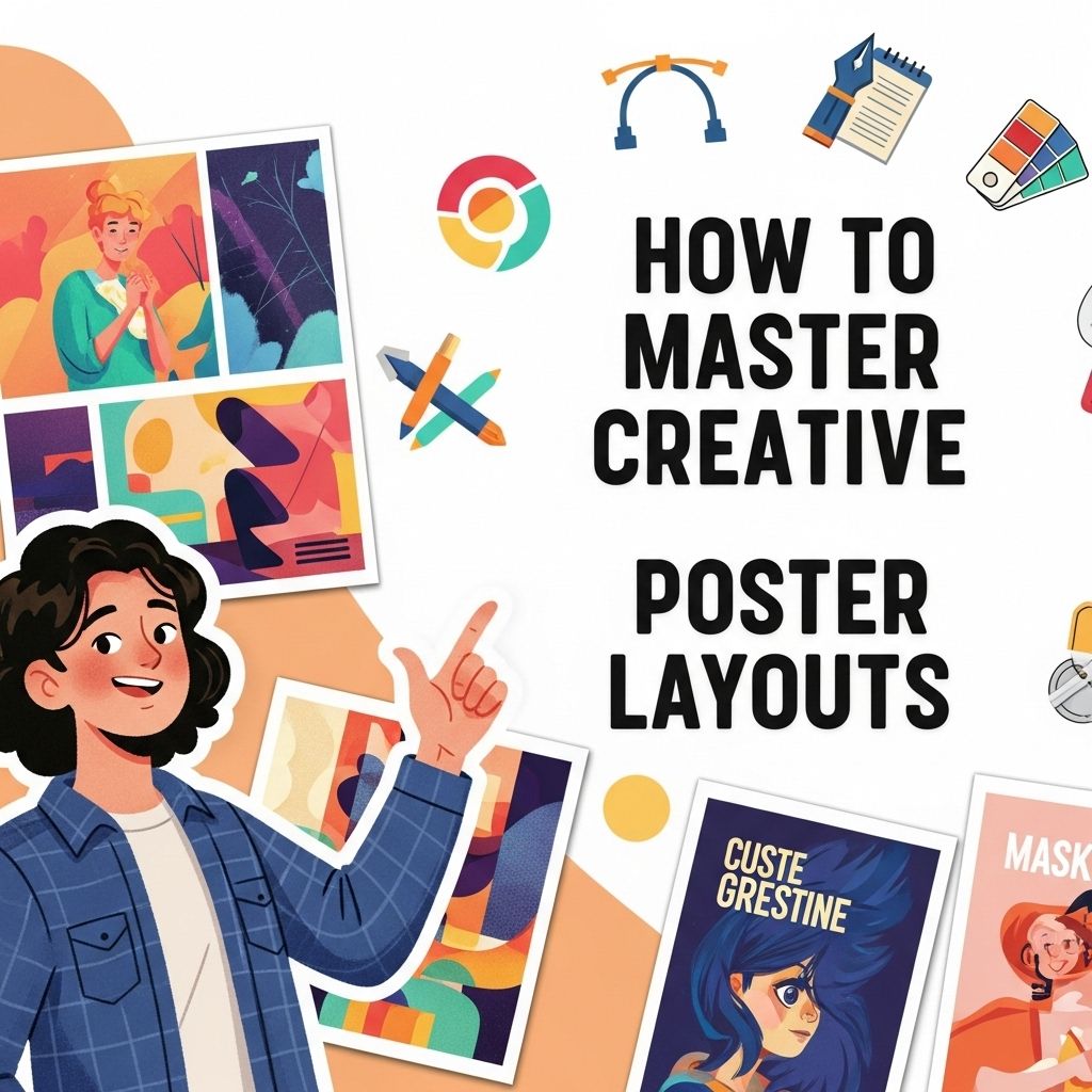
Creating visually appealing posters is both an art and a science. With the rapid evolution of digital tools, mastering creative poster layouts has become an essential skill for designers, marketers, and anyone looking to convey information effectively. Whether you’re promoting an event, launching a new product, or simply expressing your creativity, understanding how to build an effective layout can make all the difference in catching the eye of your audience. In this article, we’ll explore key principles, techniques, and tools to help you design posters that not only look great but also communicate your message clearly.
Mastering creative poster layouts is essential for effective visual communication. By understanding key design principles and exploring various techniques, you can elevate your projects and engage your audience more effectively. For inspiration and resources on non-commercial poster designs, check out non-commercial poster designs.
Table of Contents
Understanding the Basics of Poster Design
Before diving into creative layouts, it’s important to grasp the fundamental principles of poster design. Here are a few core concepts to consider:
- Hierarchy: Establish a clear visual hierarchy by varying font sizes, colors, and weights to guide the viewer’s eyes through the content.
- Balance: Achieve a sense of balance by distributing visual elements evenly throughout the layout, whether symmetrical or asymmetrical.
- Contrast: Use contrasting colors and shapes to differentiate between elements, making your poster more engaging and readable.
- Alignment: Align text and images neatly to create a cohesive and professional look.
- White Space: Don’t underestimate the power of white space; it helps to avoid clutter and can enhance the overall design.
Choosing the Right Layout for Your Poster
The layout you choose can significantly impact how your message is received. Here are some popular layout styles:
1. Grid Layout
A grid layout divides the poster into sections, making it easier to align elements. This structured approach is ideal for posters with a lot of information.
| Advantages | Disadvantages |
|---|---|
| Organized appearance | Can feel rigid |
| Easy to follow | Less flexibility for creativity |
2. Asymmetrical Layout
This layout breaks traditional grid rules, allowing for a more dynamic and creative design. It’s perfect for drawing attention to specific elements.
- Best for artistic or promotional posters.
- Can create a sense of movement.
3. Focal Point Layout
In this style, one element is emphasized to capture attention immediately. This is often used for event announcements or product launches.
Tips for Enhancing Your Poster Design
Once you’ve selected a layout, consider these tips to enhance your design:
1. Color Theory
Understanding color theory can drastically improve your design. Use colors that complement each other and evoke the desired emotions. Here’s a quick overview:
- Warm Colors: Red, orange, yellow – evoke energy.
- Cool Colors: Blue, green, purple – evoke calmness.
- Neutral Colors: Black, white, gray – good for backgrounds.
2. Typography
Typography is a crucial aspect of poster design. Here are a few tips:
- Limit yourself to two or three fonts.
- Use contrasting font pairings: a bold option for headlines and a simpler one for body text.
- Consider readability from a distance; avoid overly decorative fonts.
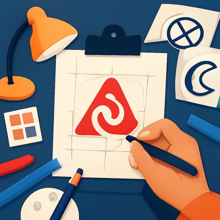
3. Images and Graphics
Images can elevate your poster, but ensure they are high quality and relevant. Here’s how to effectively use images:
- Choose images that resonate with your message.
- Ensure images are high resolution (300 DPI is recommended for print).
- Consider using vector graphics for scalability.
Utilizing Tools for Poster Design
With technology at our fingertips, there are numerous tools available to help you create stunning posters. Here are some noteworthy options:
1. Adobe Illustrator
A professional vector graphics editor that gives you complete control over your design.
2. Canva
An online design tool that’s user-friendly and comes with a plethora of templates.
3. Affinity Designer
A budget-friendly alternative to Adobe that offers robust features for creating graphics.
Iterating Your Design
No design is perfect on the first try. Here are steps to improve your poster:
- Seek Feedback: Share your design with peers for constructive criticism.
- Revise: Implement changes based on feedback.
- Test: Print a draft and check for clarity and aesthetics.
Conclusion
Mastering creative poster layouts is not just about understanding design principles but also about continuous practice and iteration. By leveraging the right tools and techniques, you can create posters that captivate your audience and effectively communicate your message. Embrace the creative process, experiment with different styles, and most importantly, have fun while designing!
FAQ
What are the key elements of a creative poster layout?
The key elements of a creative poster layout include a strong focal point, balanced composition, effective use of typography, color schemes, and images that resonate with the theme.
How can I choose the right color scheme for my poster?
Choosing the right color scheme involves understanding color theory, considering the emotions you want to evoke, and ensuring the colors align with your brand or message.
What typography tips should I follow for an effective poster?
Use a maximum of two to three fonts, ensure readability at various distances, and choose fonts that complement your poster’s theme and message.
How do I create a strong focal point in my poster layout?
To create a strong focal point, use contrasting colors, larger sizes, or unique shapes to draw attention to the most important information.
What tools can I use to design creative poster layouts?
Popular tools for designing creative poster layouts include Adobe Illustrator, Canva, and Photoshop, which offer templates and design elements to streamline the process.
How can I ensure my poster is visually appealing and informative?
Balance visuals with text, maintain alignment, and use white space effectively to avoid clutter, ensuring that your poster is both eye-catching and easy to read.