Creating a visually appealing poster is essential for conveying your message effectively, whether for a conference, event, or promotional purpose. In a world inundated with information, making your poster stand out can capture attention and convey your ideas succinctly. This article delves into various strategies, design tips, and tools to help you craft a poster that resonates with your audience.
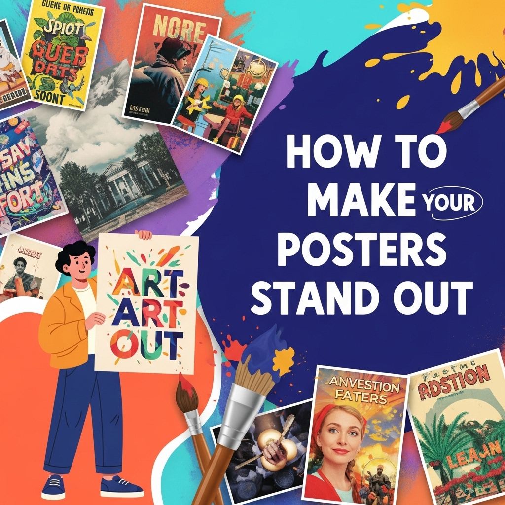
Creating eye-catching posters is essential for grabbing attention and conveying messages effectively. In this guide, we present 10 tips to make your posters stand out in a crowded space. For those seeking inspiration, check out these downloadable poster designs that can elevate your creative process.
Table of Contents
Understanding Your Audience
Before diving into the design process, it’s crucial to understand who your audience is. Tailoring your poster’s content and design based on your target demographic can significantly enhance its impact.
Key Audience Considerations
- Age Group: Different age groups respond to various styles and themes.
- Interests: Align your content with the interests of your audience to enhance engagement.
- Purpose: Understanding the purpose will inform the design, whether it’s educational, promotional, or informative.
Essential Elements of a Standout Poster
There are several essential elements that contribute to the effectiveness of a poster. These include:
1. Compelling Title
Your title should be bold and concise, capturing the essence of your message at a glance. Consider using the following tips:
- Use a larger font size compared to the rest of the text.
- Choose a clear, readable typeface.
- Incorporate a subtitle for additional context if necessary.
2. Striking Visuals
Visuals can be powerful in conveying messages quickly. Here are some pointers:
- Use high-resolution images or graphics that are relevant to your topic.
- Incorporate infographics to illustrate complex data simply.
- Utilize charts and diagrams for clarity in presenting statistics or processes.
3. Color Scheme
The color palette of your poster can evoke emotions and set the tone. Consider the following:
- Choose colors that contrast well for readability.
- Limit your color palette to 2-4 main colors to maintain consistency.
- Use colors that align with your brand or message.
Design Layout Strategies
Applying effective design layout strategies can significantly enhance the readability and appeal of your poster.
Grid System
Utilizing a grid system can help maintain alignment and organization. This approach ensures that elements are placed strategically:
- Establish a baseline grid for text alignment.
- Use columns to separate different sections of your poster.
Hierarchy of Information
Establishing a clear hierarchy guides the viewer’s eye through the content:
- Start with the title at the top.
- Follow with headings and subheadings.
- Present body text in a readable size with ample spacing.
Whitespace Utilization
Whitespace, or negative space, is crucial for creating breathing room in your design:
- Avoid clutter by leaving empty spaces between elements.
- Use whitespace to highlight important information.
Typography Choices
The choice of typography can make or break your poster. Follow these guidelines to select the right fonts:
Font Pairing
Combining different fonts can add visual interest. Consider:
- Pair a serif font for headings with a sans-serif font for body text.
- Ensure fonts complement each other in style and weight.
Readability
Choose fonts that are easy to read from a distance:
- Avoid overly decorative fonts.
- Limit the number of different fonts to two or three.
Gathering Feedback
Before printing your poster, gather feedback to identify areas for improvement. Here are ways to do this effectively:
- Share with colleagues or friends for their input.
- Use online platforms or forums to reach a wider audience.
Tools for Creating Stunning Posters
Several design tools can assist in creating professional-quality posters:
1. Adobe Creative Suite
Programs like Adobe Illustrator and Photoshop offer robust tools for advanced users.
2. Canva
An excellent option for beginners, Canva provides templates and easy-to-use design features.
3. Piktochart
Great for infographics, Piktochart allows for easy creation of visually appealing posters.
Printing Considerations
Once your design is complete, consider the following when printing:
Paper Type
The type of paper can affect the poster’s look and durability:
- Glossy Paper: Enhances color vibrancy but may reflect light.
- Matte Paper: Reduces glare and provides a more sophisticated finish.
Size Dimensions
Common poster sizes include:
| Size | Dimensions (inches) |
|---|---|
| Small | 11 x 17 |
| Medium | 18 x 24 |
| Large | 24 x 36 |
Final Touches
As a final step, ensure your poster is polished and ready for presentation:
- Proofread for any spelling or grammatical errors.
- Check alignment and spacing for consistency.
- Ensure all images are properly credited if necessary.
Conclusion
Creating a standout poster involves a thoughtful approach to design, audience engagement, and feedback. By applying the principles outlined in this article, you can develop a poster that not only captures attention but also effectively communicates your message. Remember, the goal is to create a visual experience that resonates with your audience and leaves a lasting impression. So, get creative, experiment with different elements, and let your design skills shine!
FAQ
How can I make my posters visually appealing?
Use bold colors, striking images, and a clear layout to capture attention.
What font styles work best for posters?
Choose bold and easy-to-read fonts; limit yourself to two or three font styles for clarity.
Should I include a call-to-action on my poster?
Yes, a clear call-to-action encourages viewers to take the next step, whether it’s visiting a website or attending an event.
What size should my poster be for maximum impact?
Larger posters (24×36 inches) are often more impactful for visibility, especially in crowded spaces.
How important is the use of images in poster design?
Images are crucial as they draw attention and can convey your message quickly; choose high-quality visuals.
What are some tips for effective poster placement?
Place posters in high-traffic areas and at eye level to ensure maximum visibility and engagement.