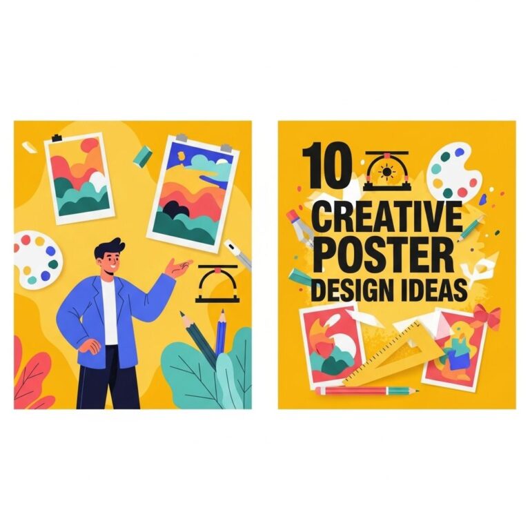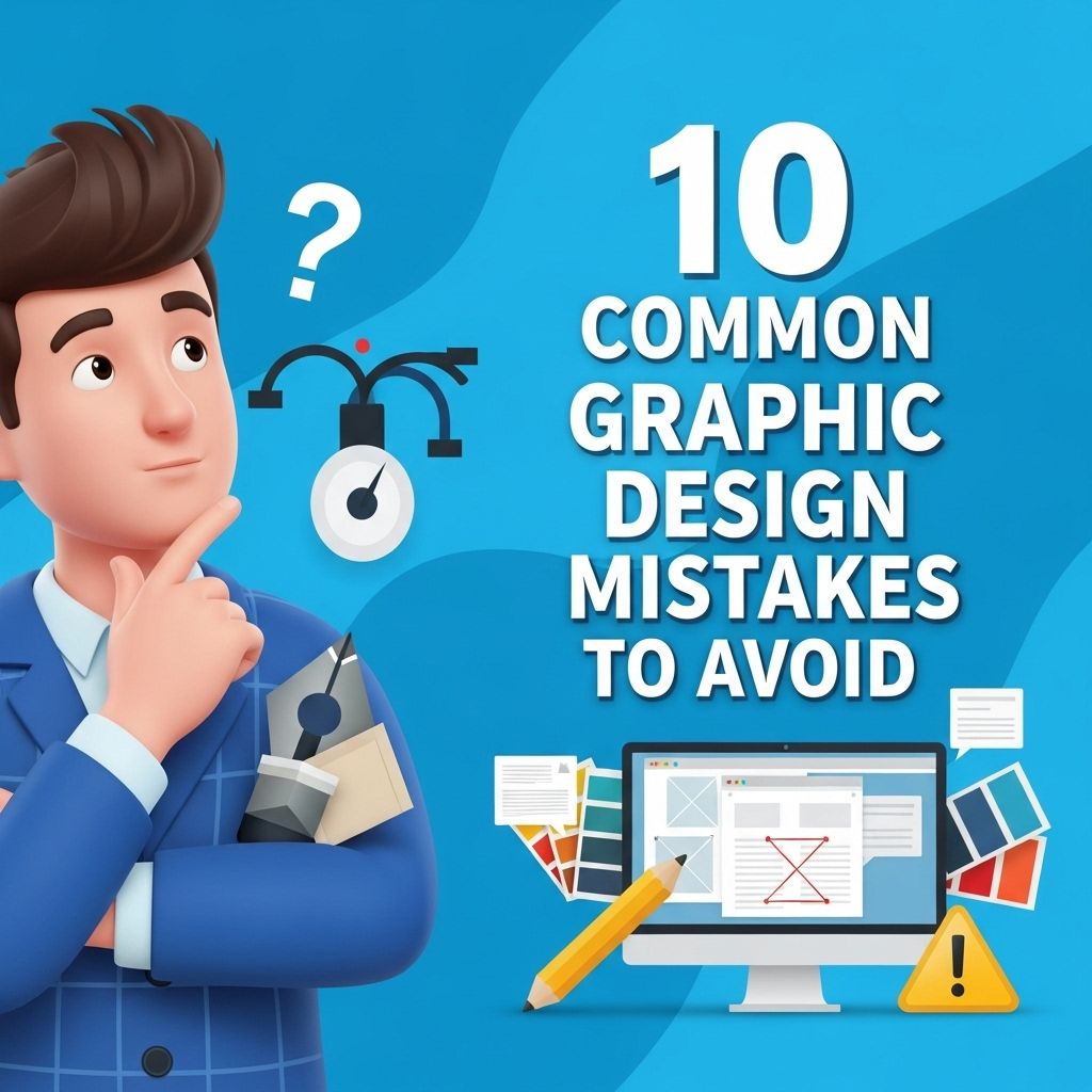
Graphic design is an essential part of branding, marketing, and communication. However, even seasoned designers can fall victim to common pitfalls that can undermine the quality of their work. Understanding these mistakes is crucial for creating effective and visually appealing designs. In this article, we will explore ten common graphic design errors and how to avoid them, ensuring that your designs are polished, professional, and impactful.
In the world of graphic design, even the smallest oversight can undermine an entire project. Understanding the common missteps can save you time and enhance your creativity. For example, using high-quality mockups, like varieties of bag mockups, can help you present your designs more effectively.
Table of Contents
1. Lack of Consistency
One of the most critical aspects of graphic design is maintaining consistency throughout your work. This includes the use of colors, fonts, and layout styles. A lack of consistency can confuse the audience and dilute the brand message.
How to Ensure Consistency:
- Establish a style guide that outlines fonts, colors, and design elements.
- Use templates to maintain a uniform look across all materials.
- Review designs for coherence before finalizing them.
2. Overuse of Fonts
Using too many different fonts can make a design feel chaotic and unprofessional. While typography is a vital tool in graphic design, moderation is key.
Best Practices for Font Usage:
- Limit yourself to two or three different fonts in any given project.
- Choose fonts that complement each other.
- Establish a hierarchy with font sizes and weights for clarity.
3. Ignoring Color Theory
Color plays a significant role in conveying messages and evoking emotions. Misusing colors can lead to misinterpretation or a lack of visual appeal.
Tips for Effective Color Usage:
- Understand the color wheel and the relationships between colors.
- Use tools like Adobe Color to create harmonious palettes.
- Consider cultural meanings of colors in your target audience.
4. Cluttered Layouts
A cluttered design can overwhelm viewers and detract from the message you want to communicate. It’s essential to embrace white space to create balance and focus.
Strategies for Reducing Clutter:
| Tip | Description |
|---|---|
| Prioritize Content | Only include elements that serve a purpose. |
| Group Related Items | Organize information into sections for better flow. |
| Use Grids | Implement grid systems for aligned and orderly designs. |
5. Neglecting the Audience
Design decisions should always be informed by the target audience. Failing to consider who will view your work can lead to ineffective communication.
Researching Your Audience:
- Conduct surveys to gather insights about preferences.
- Create user personas to visualize different audience segments.
- Test designs with focus groups to gain feedback.
6. Poor Use of Imagery
Choosing the wrong images or using low-quality graphics can severely impact the overall design. Images should enhance the work, not detract from it.
Guidelines for Selecting Imagery:
- Opt for high-resolution images to maintain clarity.
- Choose visuals that align with the brand message.
- Consider licensing and copyright issues with images.
7. Inconsistent Branding
Branding is vital for creating recognition and loyalty. Inconsistencies in branding can confuse customers and weaken their connection to the brand.
Establishing Brand Cohesion:
- Ensure all designs are aligned with brand values and messaging.
- Utilize the same logo variations across platforms.
- Regularly update your brand guidelines as needed.
8. Overcomplication
Complicated designs can be visually appealing but may confuse the audience. Simplicity often leads to a more effective outcome.
Simplifying Your Designs:
- Focus on the core message to avoid unnecessary elements.
- Limit the use of effects like shadows and gradients.
- Test designs for readability and clarity.
9. Not Seeking Feedback
Designers often work in isolation, which can lead to a narrow vision. Feedback is essential for improvement and can provide new perspectives on your work.
Encouraging Constructive Criticism:
- Share designs with colleagues for diverse opinions.
- Utilize online forums or design communities for feedback.
- Be open to criticism and ready to make adjustments.
10. Failing to Keep Learning
The design industry is constantly evolving, and staying updated with trends and technologies is essential for any graphic designer. Complacency can lead to outdated designs.
Ways to Stay Informed:
- Follow industry leaders and design blogs to gain insights.
- Attend workshops and webinars to enhance your skills.
- Experiment with new tools and software regularly.
In conclusion, avoiding these common graphic design mistakes can significantly improve the quality and effectiveness of your work. By maintaining consistency, understanding your audience, and seeking feedback, you can create designs that resonate and engage successfully. Remember, great design is not just about aesthetics; it’s about effective communication and solving problems creatively.
FAQ
What are the most common graphic design mistakes to avoid?
Some common graphic design mistakes include poor typography, cluttered layouts, inappropriate color choices, lack of contrast, overuse of effects, and ignoring brand consistency.
How can I improve my typography in graphic design?
To improve typography, choose fonts that are legible, limit the number of different fonts used, ensure proper spacing, and maintain a clear hierarchy.
Why is color choice important in graphic design?
Color choice is crucial as it affects the mood, perception, and brand identity. Using contrasting colors can enhance readability and visual appeal.
What is the impact of a cluttered layout in graphic design?
A cluttered layout can overwhelm viewers, making it difficult to understand the message. Clean, organized designs improve user experience and communication.
How can I ensure my designs are brand consistent?
To maintain brand consistency, use the same color palette, fonts, logos, and imagery style across all designs to reinforce brand identity.