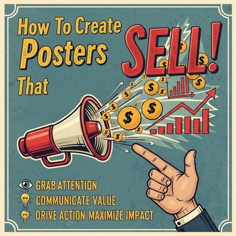
Creating a visually striking poster can be the difference between capturing attention and being overlooked in a sea of competing visuals. Whether it’s for a conference, event, product launch, or art exhibit, the design choices you make can significantly impact how your message resonates with your audience. Let’s dive into techniques and strategies that can help you craft a poster that not only grabs attention but also effectively communicates your message.
Creating an eye-catching poster is crucial for effectively communicating your message. To help you achieve this, consider these 10 tips that will enhance your design and presentation. For those looking to get started with templates, check out these free poster templates.
Table of Contents
Understanding Your Audience
Your poster’s design should cater to the preferences and needs of your target audience. Knowing who you are trying to reach is crucial in determining the style, colors, and messaging you will employ. Here are some considerations:
- Demographics: Consider age, gender, and cultural background.
- Interests: Tailor your design to the hobbies and passions of your audience.
- Expectations: Analyze what your audience typically expects from a poster in your niche.
Elements of Effective Poster Design
There are several key elements that contribute to a compelling poster design. Understanding and effectively integrating these components will elevate the overall aesthetic and functionality of your poster.
1. Color Scheme
Colors evoke emotions and set the tone for your message. When choosing a color palette, consider the following:
- Contrast: Utilize contrasting colors to make your text pop against the background.
- Consistency: Stick to 2-3 main colors to foster cohesion.
- Color Psychology: Leverage colors that align with the emotions you want to evoke (e.g., blue for trust, red for excitement).
2. Typography
Typography plays a crucial role in readability and aesthetic appeal. Here are some tips:
- Font Choices: Use no more than two different fonts. One for headings and one for body text.
- Size Hierarchy: Create a hierarchy of information through font sizes; the most important message should be the largest.
- Legibility: Ensure that your fonts are easy to read from a distance.
Using Visual Elements
Visuals can strengthen your message and attract viewers. Consider these strategies:
1. High-Quality Images
Incorporate striking, high-resolution images that are relevant to your topic. Invest in professional photography or utilize stock images that fit your theme.
2. Infographics
Present data and information through infographics to make complex information more digestible. Use:
- Charts and graphs
- Icons and illustrations
3. White Space
Don’t overcrowd your poster. Ample white space enhances readability and directs focus to key elements.
Crafting Your Message
The content of your poster should be concise yet informative. Follow these guidelines:
1. Headings and Subheadings
Use clear headings and subheadings to guide the viewer through your message. This organization helps in quickly conveying main points.
2. Bullet Points
Instead of large paragraphs, use bullet points for presenting critical information. This format increases scannability, making it easier for viewers to digest content quickly.
Incorporating Call-to-Actions
Every effective poster should include a clear call-to-action (CTA). Here are some common types:
- Visit our Website: Encourage viewers to learn more online.
- Join Us: Invite them to participate in an event or to sign up for a newsletter.
- Follow Us: Connect on social media to foster ongoing engagement.
Printing and Display Considerations
The quality of your print can affect how your poster is perceived. Pay attention to the following:
1. Material Choice
Select durable materials that suit the environment where the poster will be displayed (e.g., vinyl for outdoor use).
2. Print Quality
Choose a printing service that offers high-quality output. Poor print quality can diminish even the best designs.
Final Tips for Success
To ensure your poster achieves the desired impact, remember these final tips:
- Test Different Designs: Create multiple drafts and gather feedback to refine your approach.
- Stay Updated: Keep an eye on design trends to ensure your poster feels contemporary.
- Utilize Templates: Leverage design software or online tools that offer templates to jumpstart your project.
Creating an attractive and effective poster requires thoughtful consideration of various elements from design to execution. By following these strategies, you can create a poster that not only stands out visually but also communicates your message powerfully. Remember, the goal is not just to create something aesthetically pleasing, but to ensure that your poster resonates with your audience and inspires action.
FAQ
What are the best colors to use for a standout poster?
Using vibrant and contrasting colors can attract attention. Consider using a color palette that complements your theme and ensures readability.
How can typography enhance my poster’s visibility?
Choosing bold and clear fonts can significantly improve visibility. Use a mix of font sizes to create a hierarchy and emphasize key information.
What design elements should I include to make my poster unique?
Incorporate unique graphics, illustrations, or images that relate to your message. Using shapes and borders can also add interest.
How important is white space in poster design?
White space is crucial as it helps to avoid clutter, enhances readability, and allows important elements to stand out.
What is the ideal size for a poster to ensure it stands out?
The ideal size depends on where you plan to display it, but larger posters (such as 24×36 inches) generally attract more attention.
How can I use a call to action effectively on my poster?
Make your call to action clear and compelling. Use actionable language and ensure it stands out visually, so viewers know what to do next.