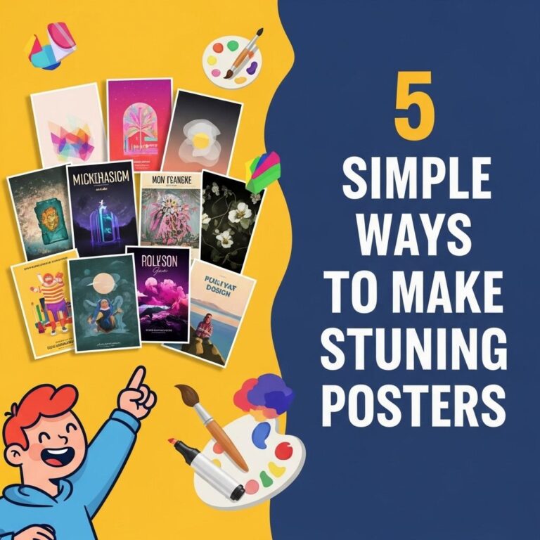
Creating a poster that captures attention and communicates your message effectively is both an art and a science. Whether you’re designing a poster for an academic conference, a marketing campaign, or an event, several critical elements can make your poster stand out. In this article, we will explore these elements and provide actionable tips to elevate your poster-making skills, ensuring it not only attracts attention but also effectively conveys your intended message.
Table of Contents
Understanding the Purpose of Your Poster
Before diving into the design process, it is essential to define the purpose of your poster. This clarity will guide your choices regarding content, layout, and visuals. Ask yourself:
- What is the main message I want to convey?
- Who is my target audience?
- What action do I want viewers to take after seeing my poster?
Elements of Design
1. Color Scheme
Your choice of colors can significantly affect the attractiveness of your poster. Here are some tips for selecting an effective color scheme:
- Choose a limited color palette (2-4 colors) for a harmonious look.
- Use contrasting colors for text and background to enhance readability.
- Consider the psychology of colors; for example, blue conveys trust, while red evokes excitement.
2. Typography
Fonts play a crucial role in how your message is perceived. Here are some best practices:
- Select fonts that are easy to read from a distance; sans-serif fonts are often preferred for posters.
- Limit the number of different fonts to 2 or 3 to maintain consistency.
- Use hierarchy in font sizes to guide the viewer’s eye; the title should be the largest, followed by subheadings and body text.
3. Visuals
Images and graphics can enhance your poster’s message. Consider the following:
- Incorporate high-quality images relevant to your content.
- Use infographics or charts to present data visually and make complex information more digestible.
- Ensure visuals complement the text rather than overwhelm it.
Layout and Composition
1. The Rule of Thirds
Applying the rule of thirds can help create a visually appealing layout. Divide your poster into a grid of nine equal sections. Align key elements along these lines or at their intersections to create balance and interest.
2. White Space
Don’t underestimate the power of white space. It helps to:
- Prevent clutter and allow the viewer’s eye to rest.
- Highlight important elements of your poster.
- Improve overall readability.
3. Flow and Navigation
Guide viewers through your poster with a logical flow. Arrange elements in a way that naturally leads the audience from the title through the body to the conclusion. Use arrows or numbered sections if necessary to enhance navigation.
Content Considerations
1. Crafting a Compelling Message
Your poster’s message should be clear and concise. Here are some guidelines:
- Start with a strong headline that captures attention.
- Use bullet points to break down complex information into digestible pieces.
- Include a call-to-action if applicable, urging viewers to take the next step.
2. Importance of Brevity
Posters are not meant for lengthy text. Aim for precision and succinctness:
- Use short sentences and active voice.
- Avoid jargon unless it is familiar to your target audience.
- Limit the total word count; ideally, no more than 300-500 words.
Printing and Finishing Touches
1. Choosing the Right Material
Consider the context in which your poster will be displayed. Common materials include:
| Material | Best Use | Advantages |
|---|---|---|
| Paper | Indoor displays | Cost-effective and easy to print |
| Vinyl | Outdoor displays | Durable and weather-resistant |
| Canvas | Artistic presentations | High-quality feel and look |
2. Print Quality
Ensure your poster is printed in high resolution. For best results:
- Use at least 300 DPI (dots per inch) for images.
- Check that colors are calibrated correctly to ensure they appear as intended.
- Consider a test print to verify layout and color accuracy before printing the final version.
Utilizing Feedback
Before finalizing your poster, gather feedback from peers or mentors. They can provide valuable insights on clarity, visual appeal, and overall effectiveness. Be open to suggestions and willing to make adjustments based on constructive criticism.
Conclusion
Creating a standout poster requires careful consideration of design, content, and presentation. By understanding your audience, employing effective design principles, and thoroughly testing your final product, you can create a compelling and attractive poster that resonates with viewers. Remember, the goal is not just to capture attention but to communicate your message clearly and effectively.
FAQ
What are some effective design tips to make my poster stand out?
To make your poster stand out, use bold colors, clear fonts, and high-quality images. Incorporate white space to avoid clutter and ensure your message is easily readable.
How important is the layout in creating an eye-catching poster?
The layout is crucial for an eye-catching poster. A well-structured layout guides the viewer’s eye and emphasizes key information, making it easier for your audience to absorb your message.
Should I use graphics or illustrations on my poster?
Yes, using graphics or illustrations can enhance visual appeal and help convey your message more effectively. Just ensure they are relevant and complement the overall design.
How can I use typography to enhance my poster’s impact?
Choose fonts that are easy to read from a distance and limit your use to two or three complementary fonts. Use size and weight variations to highlight important information.
What role does color play in making a poster stand out?
Color plays a significant role as it can evoke emotions and attract attention. Use contrasting colors to highlight important elements and maintain a cohesive color scheme for a professional look.
Are there any printing tips to consider for a striking poster?
When printing your poster, choose high-quality paper and consider finishes like gloss or matte to enhance visual appeal. Ensure your images are high resolution to avoid pixelation.

