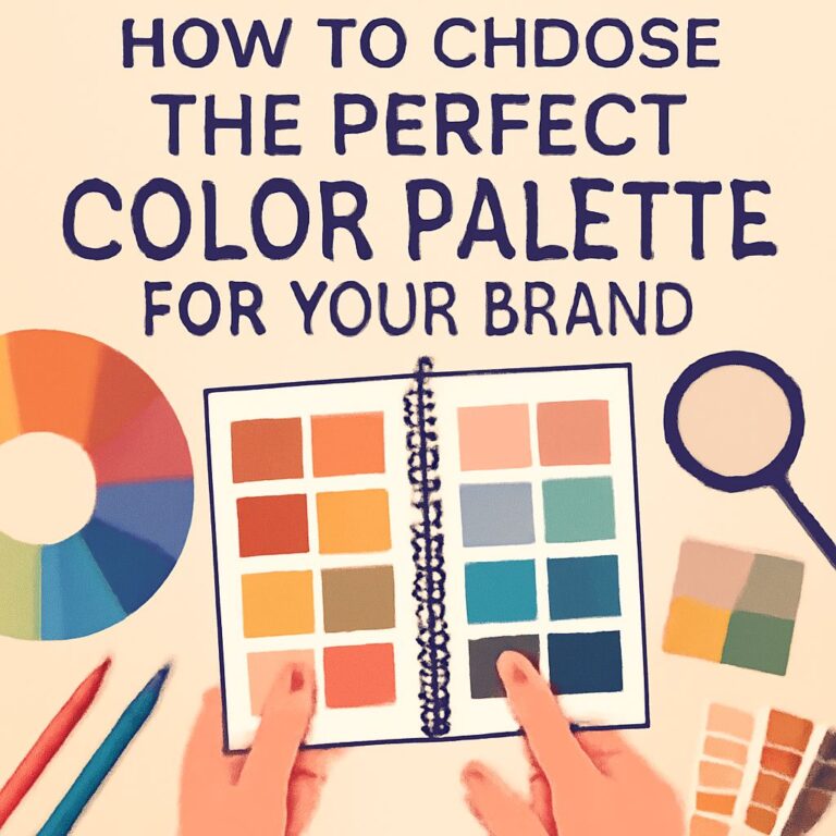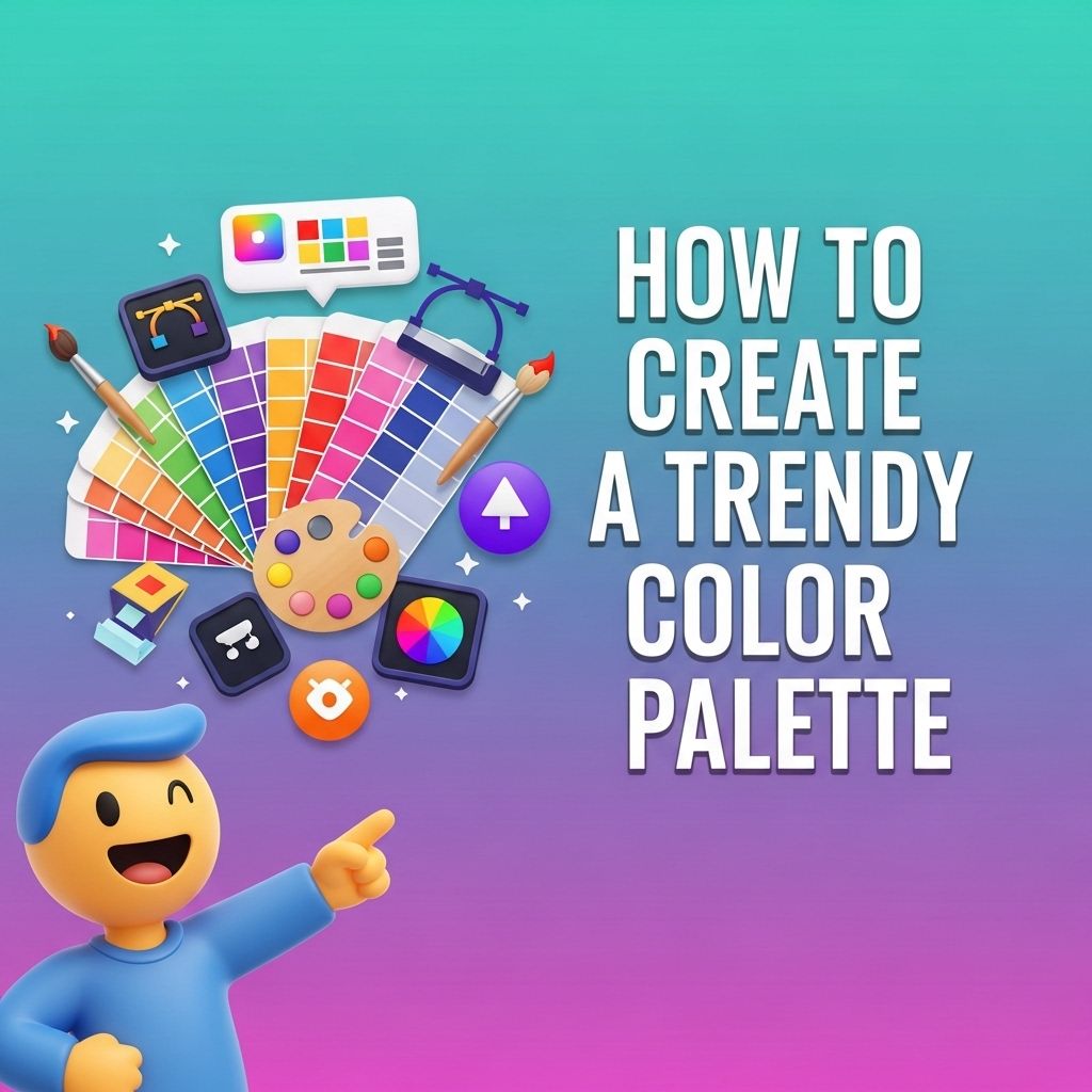
In today’s design landscape, choosing the right color palette is crucial for creating visually appealing and effective compositions. Whether you’re working on graphics, web design, or interior decor, understanding how to create a trendy color palette can elevate your project. This article will guide you through the process, providing you with insights and practical tips to develop a modern color palette that resonates with your audience.
Creating a trendy color palette is essential for achieving a cohesive and modern look in your designs. By selecting the right colors that evoke the desired emotions and align with current trends, you can elevate your branding and overall aesthetic. For practical application, consider using bag mockups for branding to visualize how your palette performs in real-world contexts.
Table of Contents
Understanding Color Theory
To create a trendy color palette, it’s essential to familiarize yourself with the basics of color theory. Colors can be categorized in various ways, and each category conveys different emotions and messages:
- Primary Colors: Red, blue, and yellow. These colors cannot be created by mixing other colors.
- Secondary Colors: Green, orange, and purple. These are created by mixing primary colors.
- Tertiary Colors: These are made by mixing a primary color with a secondary color.
Additionally, colors can be described using their temperature:
- Warm Colors: Reds, oranges, and yellows. They evoke warmth and energy.
- Cool Colors: Blues, greens, and purples. They convey serenity and calmness.
The Basics of Creating a Color Palette
Creating a color palette involves selecting colors that harmonize well together. Here are some foundational steps to help you get started:
1. Start with a Base Color
Your base color will serve as the anchor for your palette. This color should reflect the mood or theme of your project. Consider what emotions you want to evoke:
| Color | Emotion |
|---|---|
| Blue | Trust, Calmness |
| Red | Passion, Energy |
| Green | Growth, Freshness |
2. Add Complementary Colors
Complementary colors are located opposite each other on the color wheel and create contrast. Including these colors can add dynamism to your palette. Here’s how you can choose:
- Select your base color.
- Identify its complementary color on the color wheel.
- Incorporate these two colors into your palette.
3. Explore Analogous Colors
Analogous colors are adjacent to your base color on the color wheel. These colors create a pleasing harmony and are visually appealing when used together. For example:
- If your base color is blue, you might choose teal and green as your analogous colors.
- If red is your base color, go for orange and purple.
Tools for Creating a Trendy Color Palette
Numerous tools can assist you in creating a trendy color palette. Here are some popular options:
Online Color Palette Generators
These tools allow you to experiment with colors and visualize your palette:
- Adobe Color: A powerful tool that lets you create color themes and explore existing ones.
- Coolors: A user-friendly color scheme generator that offers a wide range of styles.
- Color Hunt: A curated collection of trendy color palettes created by designers.
Mobile Applications
Some mobile apps provide on-the-go palette creation capabilities:
- Paletton: A versatile app for generating color combinations.
- ColorSnap: An app by Sherwin-Williams for capturing colors from your environment.
Current Color Trends
Understanding current color trends can guide you in selecting a modern palette. Here are some of the most popular trends as of 2023:
1. Earthy Tones
Earthy colors like terracotta, olive green, and muted browns reflect a connection to nature and sustainability. These colors are often used in interior design and branding.
2. Pastel Shades
Soft, pastel colors such as lavender, mint green, and baby blue are gaining popularity, especially in fashion and digital branding. They convey a sense of calm and refinement.
3. Bold and Vibrant
Bright colors like hot pink, electric blue, and vibrant yellow are used in graphic design to create eye-catching visuals. These colors are often favored for events and campaigns aimed at younger audiences.
Considerations for Different Contexts
When creating a color palette, the context of your project plays a significant role. Here are some factors to consider based on different applications:
Web Design
For web design, ensure your palette is accessible:
- Use high-contrast colors for readability.
- Consider color blindness and choose colors that are distinguishable for all users.
Branding
In branding, consistency is key:
- Limit your palette to three to five colors.
- Ensure that your colors reflect your brand’s values and target audience.
Print Design
When designing for print:
- Be mindful of how colors will appear in print versus on-screen.
- Use CMYK values when finalizing colors for print projects.
Testing Your Color Palette
Once you have created your color palette, it’s crucial to test it in different contexts:
- Apply your palette to a sample project or mockup.
- Seek feedback from peers or your target audience.
- Adjust colors as necessary based on feedback and usability.
Conclusion
Creating a trendy color palette involves understanding color theory, utilizing the right tools, and being aware of current trends. By following the steps laid out in this article and considering the context of your project, you can develop a visually stunning color palette that enhances your designs and resonates with your audience. Embrace the power of color, and watch how it transforms your work!
FAQ
What are the steps to create a trendy color palette?
To create a trendy color palette, start by researching current design trends, select a color wheel or tool for inspiration, choose a base color, and then add complementary and accent colors that enhance your base choice.
What tools can I use to generate a color palette?
You can use online tools like Adobe Color, Coolors, or Canva’s color palette generator to help create and visualize your color palette.
How do I ensure my color palette is harmonious?
To ensure harmony in your color palette, use color theory principles such as analogous, complementary, or triadic color schemes, and test your palette in different applications or contexts.
What are some popular color trends for 2023?
Popular color trends for 2023 include earthy tones, vibrant pastels, and bold jewel colors, often paired with neutral shades for balance.
How can I test my color palette on different mediums?
You can test your color palette by applying it to various mediums like digital designs, print materials, or even home decor to see how the colors interact in different settings.