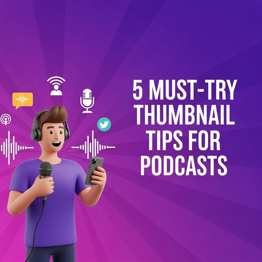
Creating an eye-catching thumbnail for your podcast is more than just a design choice; it’s a fundamental component that can significantly impact your listener engagement. In a crowded digital landscape, your thumbnail serves as the first impression of your content, and making it visually appealing can help attract a larger audience. Here are five must-try tips that can elevate your podcast thumbnail game and improve your overall branding.
Creating an eye-catching thumbnail is essential for attracting listeners to your podcast. Here are five must-try tips that can help you design engaging thumbnails that stand out in a crowded market. For inspiration, check out various beer label design ideas that showcase the power of visual appeal.
Table of Contents
1. Understand Your Brand Identity
Your podcast’s thumbnail should reflect the essence of your brand. Before diving into design elements, it’s crucial to define what your podcast represents.
Key Elements to Consider:
- Color Scheme: Choose colors that resonate with your podcast’s theme and genre.
- Typography: Select fonts that are legible yet distinctive.
- Imagery: Use images that align with the podcast’s subject matter.
By aligning your thumbnail with your brand identity, you create a coherent image that listeners can identify instantly.
2. Simplify Your Design
In the world of digital media, less is often more. Overly complex designs tend to lose clarity, especially when viewed on smaller screens. A simple, clean design can help convey your message more effectively.
Tips for Simplifying Your Design:
- Limit Text: Use minimal text to convey the essence of the episode.
- Focus on One Image: Choose a single, strong image that effectively represents your podcast.
- Utilize Negative Space: Give the elements breathing room to enhance visual appeal.
3. Optimize for Different Platforms
Your thumbnail will be displayed across various platforms, from Apple Podcasts to Spotify. Each platform may have different requirements regarding dimensions and layouts, so it’s essential to tailor your design accordingly.
Standard Thumbnail Sizes:
| Platform | Recommended Size |
|---|---|
| Apple Podcasts | 3000 x 3000 pixels |
| Spotify | 3000 x 3000 pixels |
| Google Podcasts | 1400 x 1400 pixels |
| Stitcher | 1400 x 1400 pixels |
Creating a high-resolution image ensures that it looks professional, regardless of where it’s displayed.
4. Incorporate Visual Hierarchy
Visual hierarchy refers to the arrangement of elements to show their order of importance. By using size, color, and positioning, you can direct the viewer’s attention to the most crucial parts of your thumbnail.
Ways to Implement Visual Hierarchy:
- Size Matters: Make your podcast title or episode number the largest text on the thumbnail.
- Color Contrast: Use contrasting colors to make key elements stand out.
- Positioning: Place essential details at eye level or in the center.
By establishing a clear visual hierarchy, you enhance the chances that viewers will grasp the essential information at a glance.
5. Test and Iterate
Steps to Effectively Test Your Thumbnails:
- Create Variations: Develop several versions of your thumbnail with slight variations.
- Analyze Performance: Use analytics tools to monitor which design leads to higher engagement.
- Gather Feedback: Ask your existing listeners for their opinions on your designs.
Iterating based on feedback and data will enable you to fine-tune your designs to better fit your audience’s preferences.
In conclusion, designing an effective podcast thumbnail requires a blend of creativity, strategic thinking, and a deep understanding of your brand and audience. By implementing these five must-try tips, you’ll be well on your way to creating thumbnails that not only attract attention but also represent the quality content of your podcast. Start experimenting with these strategies today and watch your listener base grow!
FAQ
What are the key elements of an effective podcast thumbnail?
An effective podcast thumbnail should include bold text, captivating imagery, and a consistent color scheme to attract listeners and convey the theme of the podcast.
How can I make my podcast thumbnail stand out in a crowded market?
To make your podcast thumbnail stand out, use unique graphics or illustrations, incorporate contrasting colors, and ensure your title is legible even at smaller sizes.
What size should my podcast thumbnail be for optimal display?
The recommended size for a podcast thumbnail is 3000 x 3000 pixels, which ensures high-quality display across various platforms.
Should I include my podcast logo in the thumbnail?
Yes, including your podcast logo in the thumbnail can help with brand recognition, but ensure it does not overpower the main title or imagery.
How often should I update my podcast thumbnail?
It’s a good practice to update your podcast thumbnail when you rebrand or launch a new season, but also consider refreshing it periodically to keep it looking fresh and relevant.