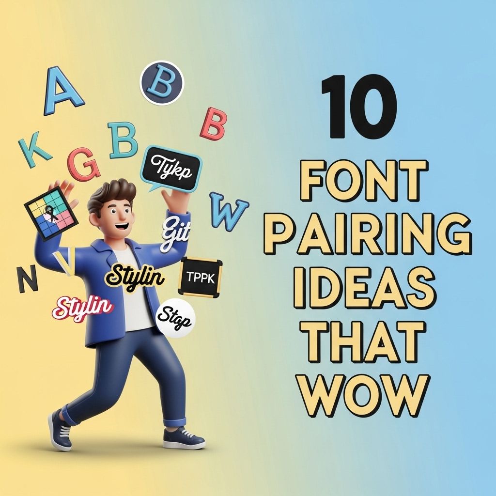
When it comes to web design, typography plays a crucial role in enhancing user experience and conveying the right message. Choosing the right font pairings can elevate your design from ordinary to extraordinary, capturing the attention of your audience and providing clarity and readability. Below are ten exciting font pairing ideas that can help you create stunning visuals for your projects.
Creating visually appealing designs often hinges on the right font pairs. In this article, we’ll explore 10 stunning font pairing ideas that not only enhance readability but also elevate the overall aesthetic of your beer branding projects. Discover how these combinations can make your labels and advertising materials pop with creativity, much like the diverse beer mockup resources available to bring your concepts to life.
Table of Contents
1. Montserrat and Merriweather
This pairing combines a modern sans-serif font with a classic serif font, offering a balanced look that works well for both headlines and body text.
- Montserrat: Bold, geometric shapes make this font perfect for titles.
- Merriweather: Designed for readability on screens, ideal for body copy.
Usage Tips
Use Montserrat for headings and Merriweather for paragraphs to create a clear visual hierarchy.
2. Open Sans and Lora
Open Sans is a versatile sans-serif font that pairs beautifully with the elegant Lora serif font, making it perfect for both digital and print media.
- Open Sans: Clean and neutral, works well for user interfaces.
- Lora: A contemporary serif font, excellent for storytelling.
Usage Tips
Use Open Sans for navigation menus and Lora for blog posts or articles.
3. Raleway and Roboto Slab
This pairing features Raleway, a stylish sans-serif, alongside Roboto Slab, a solid serif font, creating a modern and professional look.
- Raleway: Light and airy, great for headlines.
- Roboto Slab: Strong and sturdy, enhances readability in body text.
Usage Tips
Utilize Raleway for titles and subtitles, while reserving Roboto Slab for body content.
4. Poppins and Crimson Text
Poppins is a geometric sans-serif font, and Crimson Text is an old-style serif, together offering a stunning contrast for creative designs.
- Poppins: Fun, rounded letterforms are engaging.
- Crimson Text: Elegance and sophistication for longer reads.
Usage Tips
Poppins works well for headers, while Crimson Text is perfect for articles or essays.
5. Source Sans Pro and PT Serif
A modern sans-serif font paired with a traditional serif font, this combination is perfect for a clean and professional aesthetic.
- Source Sans Pro: Designed for user interfaces, it’s highly legible.
- PT Serif: Offers a touch of classic design.
Usage Tips
Use Source Sans Pro for labeling and PT Serif for detailed content.
6. Nunito and Georgia
Nunito is a rounded sans-serif font which provides a contemporary feel that pairs well with the time-honored Georgia serif font.
- Nunito: Friendly and approachable, great for headers.
- Georgia: A classic serif font, ensures readability.
Usage Tips
Nunito can be used for call-to-action buttons and Georgia for formal documents.
7. Avenir and Baskerville
Avenir is a geometric sans-serif font that offers a sleek look, while Baskerville provides a traditional feel, perfect for adding elegance to your design.
- Avenir: Minimalist and sophisticated, ideal for modern brands.
- Baskerville: Known for its curves and contrast.
Usage Tips
Avenir should be used for large headings, while Baskerville is perfect for subheadings or quotes.
8. Futura and Times New Roman
A classic pairing with a twist, Futura’s clean lines and geometric shapes contrast nicely with Times New Roman’s traditional serifs.
- Futura: Modern and distinctive, perfect for contemporary branding.
- Times New Roman: Reliable and familiar, great for formal settings.
Usage Tips
Use Futura for promotional materials and Times New Roman for academic papers.
9. Bitter and Overpass
This pairing uses Bitter, a slab serif, and Overpass, a sans-serif, merging traditional and modern typography styles for a unique look.
- Bitter: Bold and impactful, great for headlines.
- Overpass: Clean and versatile, excellent for body text.
Usage Tips
Apply Bitter for strong statements and Overpass for details and information.
10. Playfair Display and Work Sans
Playfair Display is a high-contrast serif font that pairs wonderfully with Work Sans, a modern sans-serif, offering a stylish and elegant aesthetic.
- Playfair Display: Perfect for headlines, adds a touch of luxury.
- Work Sans: Designed for legibility and versatility.
Usage Tips
Use Playfair Display for impactful titles and Work Sans for informative sections.
Conclusion
In the world of typography, the right combinations can create stunning visuals that enhance your designs. Experimenting with these font pairings can help you achieve the perfect balance of aesthetics and functionality, ensuring your message resonates with your audience. Remember to consider the context of your design and the emotions you wish to evoke when selecting your fonts. Happy designing!
FAQ
What are some popular font pairing ideas for websites?
Some popular font pairings include ‘Montserrat and Merriweather’, ‘Lora and Open Sans’, and ‘Playfair Display and Source Sans Pro’. These combinations create a harmonious balance between headings and body text.
How do I choose the right font pairings for my project?
When choosing font pairings, consider the mood and tone of your project. Pair a bold display font with a clean sans-serif for contrast, or combine two serif fonts for a classic look.
Can I use Google Fonts for font pairing?
Yes, Google Fonts offers a wide variety of fonts that can be easily paired together. You can explore their library and use tools like ‘Font Pair’ to find complementary options.
What is the significance of font pairing in design?
Font pairing enhances readability and visual appeal. It helps create a hierarchy in the text and can evoke specific emotions, making your design more effective.
Are there any rules for font pairing?
Yes, some basic rules include using contrasting styles (like serif with sans-serif), limiting the number of fonts to two or three, and ensuring they complement each other in size and weight.
How can I test my font pairings before finalizing?
You can test font pairings by creating mock-ups in design software or using online tools that allow you to see how different fonts look together in real-time.