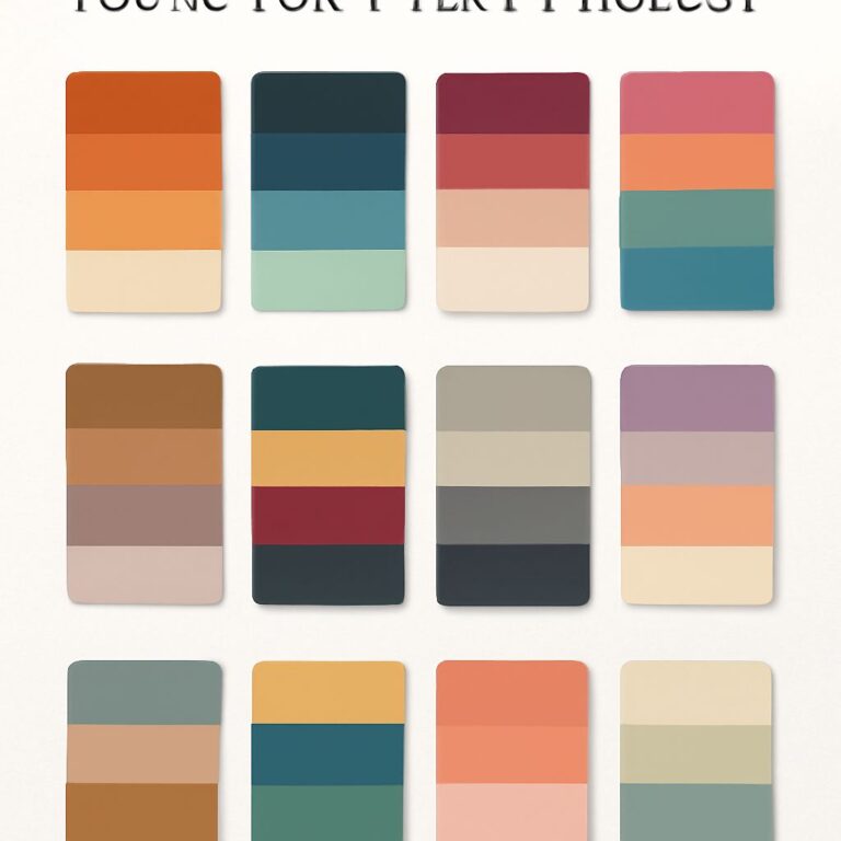
Choosing the right color palette is an essential part of design, whether you’re working on a website, a logo, or even interior decor. Colors evoke emotions, influence perceptions, and can significantly impact the effectiveness of your design. For tech-savvy individuals, understanding color theory, the psychological effects of colors, and the practicality of color combinations is crucial. In this article, we will explore how to effectively choose your color palette, providing you with guidance and examples to help steer your creative process.
Choosing the perfect color palette for your brand is crucial, as colors evoke emotions and communicate your brand identity. A well-selected palette can enhance recognition and influence consumer perception, making it essential to align your choices with your brand values. Explore our design collection for inspiration on creating a visually cohesive look.
Table of Contents
Understanding Color Theory
Color theory is the foundation of any design project. It encompasses the rules and guidelines for mixing colors and the visual effects of specific color combinations. Here are some basic concepts:
Primary, Secondary, and Tertiary Colors
- Primary Colors: Red, Blue, Yellow. These colors cannot be made by mixing other colors.
- Secondary Colors: Green, Orange, Purple. These are created by mixing two primary colors.
- Tertiary Colors: These are made by mixing a primary color with a secondary color.
Color Wheel and Harmonies
The color wheel is a circular diagram that represents the relationships between colors. It helps in understanding how colors work together. Key color harmonies include:
- Complementary: Colors that are opposite each other on the color wheel (e.g., blue and orange).
- Analogous: Colors that are next to each other (e.g., green, blue-green, and blue).
- Triadic: Three colors that are evenly spaced (e.g., red, yellow, blue).
- Tetradic: Four colors that form a rectangle on the color wheel.
The Psychology of Color
Colors have the power to influence emotions and behaviors. Understanding the psychology behind colors can help you select a palette that resonates with your target audience. Here’s a brief overview of common colors and their meanings:
| Color | Meaning |
|---|---|
| Red | Passion, Energy, Urgency |
| Blue | Trust, Dependability, Calmness |
| Green | Growth, Health, Nature |
| Yellow | Optimism, Happiness, Caution |
| Purple | Luxury, Creativity, Wisdom |
| Orange | Warmth, Enthusiasm, Fun |
Identifying Your Target Audience
Before selecting a color palette, consider your target audience. Different demographics may respond uniquely to colors. Here are some factors to consider:
- Age: Younger audiences may prefer vibrant colors, while older groups might lean towards muted tones.
- Gender: Research indicates that certain colors can be more appealing to specific genders.
- Culture: Colors may have different meanings in various cultures.
Creating Your Color Palette
Now that you understand the basics, it’s time to create your color palette. Follow these steps to ensure your choices are effective and cohesive:
Step 1: Choose a Base Color
Your base color should align with your brand identity and the emotions you want to convey. Consider using a color that will be prominently featured in your design.
Step 2: Add Complementary Colors
Complementary colors enhance your base color. Select one or two colors that complement your base choice. They should provide contrast and balance to the overall palette.
Step 3: Consider Neutral Colors
Neutral colors (like white, gray, or beige) are important for creating balance. Use them to break up vibrant colors and to provide breathing room in your design.
Step 4: Test Your Palette
Before finalizing, test your palette on different backgrounds and in various applications. Ensure it remains harmonious and appealing across different mediums.
Tools for Choosing a Color Palette
Several online tools can help you create and refine your color palette. Here are some popular options:
- Adobe Color: A web app that lets you create color schemes based on various rules and themes.
- Coolors: Generate color palettes quickly and explore trending schemes.
- Canva: Offers a palette generator based on images you upload.
Conclusion
Choosing the right color palette is a vital part of creating impactful designs. By understanding color theory, the psychology of color, and the needs of your target audience, you can make informed decisions that elevate your work. Remember to start with a strong base color, add complementary and neutral colors, and utilize available tools to bring your vision to life. With these guidelines, you’ll be well on your way to mastering the art of color selection in your design projects.
FAQ
How do I choose a color palette for my home?
Start by considering the mood you want to create, then choose a base color and complement it with 2-3 accent colors that harmonize.
What are the best tools for selecting a color palette?
Online tools like Adobe Color, Coolors, or color wheel apps can help you visualize and create a cohesive color palette.
Should I consider lighting when choosing a color palette?
Yes, lighting can significantly affect how colors appear, so test your colors in different lighting conditions before finalizing your palette.
How can I ensure my color palette is cohesive?
Use a color harmony rule, such as complementary, analogous, or triadic colors, to create a balanced and visually appealing palette.
Can I mix warm and cool colors in my palette?
Yes, mixing warm and cool colors can create dynamic contrast, but be sure to maintain a balance to avoid overwhelming the space.
What is the 60-30-10 rule in color palettes?
The 60-30-10 rule suggests using 60% of a dominant color, 30% of a secondary color, and 10% of an accent color for a well-balanced look.


