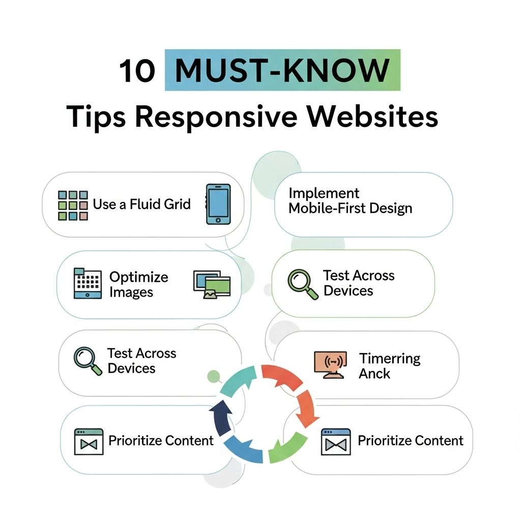
In today’s digital age, having a responsive website is no longer optional; it’s essential. With an ever-growing number of users accessing the internet through various devices, a website that adapts seamlessly to different screen sizes is crucial for enhancing user experience and optimizing for search engines. Here we delve into key tips that every web developer should know when creating a responsive website.
Responsive web design is crucial in today’s digital landscape, ensuring your website looks great on all devices. In this guide, we’ll explore 10 essential tips that will help you create a user-friendly experience, from flexible grids to adaptable images. For those in need of design tools, you can download free bag mockups to enhance your projects.
Table of Contents
Understanding Responsive Design
Responsive design is an approach to web development that allows the layout and elements of a website to change based on the size of the screen. This practice ensures that users have a consistent experience, regardless of whether they are on a desktop, tablet, or smartphone.
Key Principles of Responsive Design
- Fluid Grids: Design layouts that use relative units instead of fixed units.
- Flexible Images: Ensure images resize within their containing elements.
- Media Queries: Apply CSS rules based on the screen size.
1. Mobile-First Approach
Designing for mobile devices first can significantly impact how your website performs on larger screens. By considering the constraints of mobile devices, developers are encouraged to prioritize essential content and features.
Why Mobile-First?
- Improved Performance: Mobile sites generally load faster.
- Focus on Content: Forces prioritization of important information.
- Better User Experience: Enhances navigation and usability on smaller screens.
2. Use Fluid Layouts
Fluid layouts allow web elements to resize and adjust dynamically. This is typically achieved by using percentages rather than fixed pixel values in CSS, enabling a more flexible design that adjusts as the window size changes.
Implementation Example
body { margin: 0; padding: 0; }
container { width: 100%; max-width: 1200px; margin: 0 auto; }
img { max-width: 100%; height: auto; }
3. Optimize Media
Images and videos can significantly slow down page loading times if not optimized. Using the correct file formats and sizes, as well as employing lazy loading techniques, can ensure that media does not hinder performance.
Image Optimization Techniques
| Format | Best Use | Pros | Cons |
|---|---|---|---|
| JPEG | Photographs | Good compression | Loss of quality |
| PNG | Graphics with transparency | High quality | Larger file sizes |
| SVG | Logos and icons | Scalable | Complex graphics can be heavy |
4. CSS Flexbox and Grid
CSS Flexbox and Grid are powerful layout modules that make it easier to design responsive web layouts. They help organize content in a way that’s not only intuitive but also adaptable to changes in screen size.
Benefits of Flexbox and Grid
- Flexibility in aligning and distributing space among items.
- Control over the size and space of grid items.
- Reduced need for media queries in many layouts.
5. Breakpoints and Media Queries
Media queries are essential for applying different styles depending on the device’s characteristics. They are used to set breakpoints where the layout should change based on the screen width.
Common Breakpoints
@media only screen and (max-width: 600px) { /* Styles for mobile */ }
@media only screen and (min-width: 601px) and (max-width: 1200px) { /* Styles for tablets */ }
@media only screen and (min-width: 1201px) { /* Styles for desktops */ }
6. Test Across Devices
It is essential to test your website on multiple devices and browsers to ensure compatibility and performance. Tools like BrowserStack or physical devices can provide insights into how users will experience your site.
Testing Checklist
- Check responsiveness on mobile, tablet, and desktop.
- Test across different browsers (Chrome, Firefox, Safari).
- Ensure interactive elements function correctly.
7. Leverage Frameworks
Utilizing responsive design frameworks can accelerate development time and ensure best practices. Frameworks like Bootstrap and Foundation come with built-in grid systems and components that simplify the responsive design process.
Popular Frameworks
- Bootstrap: Responsive grid system and components.
- Foundation: Advanced responsiveness features.
- Tailwind CSS: Utility-first CSS framework.
8. Prioritize Loading Speed
Loading speed is a critical factor for user retention and SEO. A responsive website should be optimized to load quickly, minimizing the use of heavy scripts and large images.
Strategies for Speed Optimization
- Minimize HTTP requests by combining files.
- Use Gzip compression for assets.
- Implement caching strategies.
9. Accessibility Considerations
Responsive design must also encompass accessibility. Ensure that all users, including those with disabilities, can navigate and interact with your website effectively.
Accessibility Tips
- Use ARIA roles and properties.
- Ensure contrast ratios are sufficient for text and background.
- Provide keyboard navigation options.
10. Stay Updated with Trends
The web is constantly evolving, and so are design trends. Staying informed about the latest advancements in web technologies and design practices will help you maintain an edge in creating responsive websites.
Resources for Trends
- Web Design Blogs: Smashing Magazine, A List Apart.
- Conferences: Attend or follow the latest web design conferences.
- Online Courses: Platforms like Coursera or Udemy offer courses on current trends.
In summary, creating a responsive website requires not only technical proficiency but also a keen understanding of user experience. By implementing these ten essential tips, developers can ensure their websites are not just functional but also engaging and accessible for all users.
FAQ
What is a responsive website?
A responsive website is designed to adapt its layout and content to different screen sizes and devices, ensuring an optimal viewing experience for users.
Why is responsive design important for SEO?
Responsive design improves SEO by providing a single URL for both mobile and desktop versions, which enhances user experience and reduces bounce rates.
How can I test if my website is responsive?
You can test your website’s responsiveness using tools like Google’s Mobile-Friendly Test or by manually resizing your browser window to see how the layout adjusts.
What are the key components of responsive web design?
Key components include flexible grid layouts, responsive images, and media queries to adjust styles based on device characteristics.
How does responsive design affect loading speed?
Responsive design can enhance loading speed by serving optimized images and content specific to the user’s device, reducing unnecessary data usage.
Can I implement responsive design on an existing website?
Yes, you can implement responsive design on an existing website by gradually updating the CSS and HTML to use flexible layouts and media queries.