Table of Contents
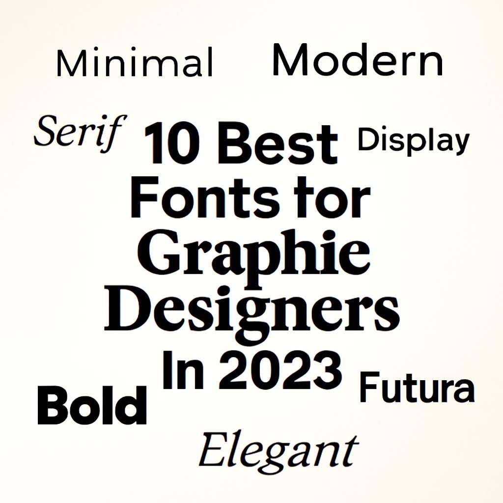
The Importance of Choosing the Right Font for Graphic Design
Typography is one of the most crucial elements in graphic design. The right font can elevate a design, convey a specific mood or emotion, and significantly affect how a message is perceived. In 2023, graphic designers have a plethora of font choices at their disposal, each offering unique attributes that can enhance their projects. This article will explore ten of the best fonts for graphic designers in 2023, highlighting why they stand out in the world of typography.
In the ever-evolving world of graphic design, choosing the right font can make all the difference in conveying your message effectively. This year, we’ve compiled the top 10 fonts that every graphic designer should explore for their projects in 2023. Discover new design mockups to see how these fonts can elevate your work.
1. Helvetica Now
Helvetica is a classic, and the 2023 version, Helvetica Now, brings this timeless appeal into the modern age. It includes new weights and sizes, offering more flexibility than ever. Helvetica Now is prized for its clean and neutral appearance, making it suitable for corporate branding, editorial design, and web content. The font’s legibility and versatility ensure it remains a favorite among designers.
2. Gotham
Originally designed for GQ magazine, Gotham has become a staple for many graphic designers. Its geometric structure and clean lines make it highly readable, perfect for both print and digital media. In 2023, designers appreciate its boldness and ability to stand out in branding and advertising materials.
3. Futura
Futura is a geometric sans-serif font that has been popular since the 1920s. Its modernist and minimalist appeal continue to captivate designers, particularly in the fields of advertising, logo design, and publishing. Futura’s uniformity and symmetry make it an excellent choice for projects that require a sleek and professional look.
4. Avenir Next
Avenir Next is a revival of the classic Avenir font, offering enhanced versatility and functionality. It’s known for its harmonious design and is widely used in branding and user interface design. The font’s large family of weights supports extensive versatility, allowing designers to use it across various mediums while maintaining a cohesive aesthetic.
5. Proxima Nova
Proxima Nova bridges the gap between typefaces like Futura and Akzidenz Grotesk, offering a modern take on the sans-serif style. In 2023, it remains popular for its broad range of weights and widths, providing designers with the flexibility needed for both headlines and body text. Proxima Nova is particularly favored in web design due to its readability on screens.
6. Garamond
Garamond is a classic serif font known for its elegance and readability. Often used in the publishing industry for books, its timeless appeal also makes it suitable for high-end brands and academic publications. In 2023, graphic designers appreciate Garamond’s ability to lend a touch of sophistication and tradition to their projects.
7. Montserrat
Montserrat is a relatively new font that has quickly gained popularity among designers. Inspired by the signage of Buenos Aires, it offers a blend of traditional and modern appeal. Montserrat’s wide range of styles and strong geometric shapes make it ideal for logos, social media graphics, and website headings.
8. Times New Roman
A staple of typography, Times New Roman is cherished for its readability and classic look. Although it may not be seen as trendy, its formal and authoritative presence is indispensable for certain designs, particularly in academic and formal contexts. Its enduring popularity in 2023 is a testament to its functionality and design simplicity.
9. Roboto
Roboto is Google’s signature font for Android and has become a favorite for both web and mobile interfaces. Its clean, modern design offers great readability and scalability, making it perfect for responsive design. Roboto’s comprehensive family supports extensive typographic hierarchies, crucial for complex digital products.
10. Lora
In 2023, Lora is celebrated for its artistic flair combined with excellent readability. This serif typeface is well-suited for both body text and headlines, making it adaptable for a range of design projects. Lora’s contemporary twist on a classic serif form provides a unique blend of traditional and modern aesthetics, appealing to designers looking for something distinctive yet familiar.
Comparison of Font Features
| Font | Type | Best Used For | Key Features |
|---|---|---|---|
| Helvetica Now | Sans-serif | Branding, Editorial | Neutral, Versatile |
| Gotham | Sans-serif | Advertising | Geometric, Bold |
| Futura | Sans-serif | Publishing, Logos | Modernist, Minimalist |
| Avenir Next | Sans-serif | UI Design | Harmonious, Versatile |
| Proxima Nova | Sans-serif | Web Design | Readable, Flexible |
| Garamond | Serif | Books, Academic | Elegant, Readable |
| Montserrat | Sans-serif | Logos, Social Media | Geometric, Modern |
| Times New Roman | Serif | Formal Documents | Classic, Authoritative |
| Roboto | Sans-serif | Mobile, Web | Modern, Scalable |
| Lora | Serif | Headlines, Body Text | Artistic, Readable |
Conclusion
In the realm of graphic design, the choice of font can significantly impact the effectiveness and appeal of a project. The ten fonts highlighted in this article represent a diverse range of styles and functionalities that cater to various design needs. Whether you are looking for the classic elegance of Garamond or the modern versatility of Proxima Nova, these fonts provide a solid foundation for any creative endeavor in 2023. By understanding the unique attributes of these fonts, designers can make informed decisions that enhance their work and resonate with their audience.
FAQ
What are the top fonts for graphic designers in 2023?
Some of the top fonts for graphic designers in 2023 include Helvetica Now, Futura PT, Proxima Nova, Avenir Next, and Gotham.
Why is Helvetica Now popular among designers?
Helvetica Now is popular for its clean and modern design, making it versatile for various projects and easy to read.
Is Futura PT a good choice for branding?
Yes, Futura PT is a great choice for branding due to its geometric shapes and timeless appeal, which helps create a strong visual identity.
What makes Proxima Nova a preferred font?
Proxima Nova is preferred for its balanced and contemporary design, offering readability and flexibility across digital and print media.
How does Avenir Next enhance design projects?
Avenir Next enhances design projects with its modern aesthetic and variety of weights, providing designers with versatile options for different applications.
What characteristics make Gotham a top font choice?
Gotham is a top choice for its bold and authoritative appearance, making it ideal for impactful headlines and branding materials.