Table of Contents
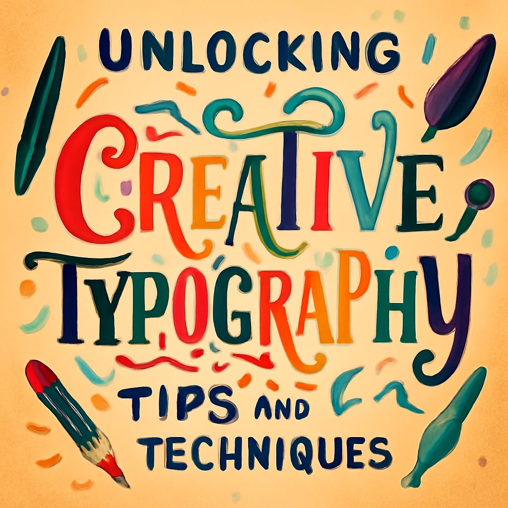
Unlocking the Art of Creative Typography: Tips and Techniques
Typography is more than just selecting a font; it’s an art form that can transform the way audiences perceive and interact with text. At its core, typography is about making written language legible, readable, and visually appealing when displayed. In the digital age, where content consumption is primarily visual, mastering the art of creative typography is a powerful tool for any designer, marketer, or communicator.
The Importance of Typography in Design
Typography is crucial because it sets the tone of the message before the words themselves are read. A well-chosen typeface can convey elegance, playfulness, seriousness, or any number of moods and emotions. Typography contributes significantly to the overall user experience, influencing readability, accessibility, and even the reader’s emotional response. Good typography ensures that the message is delivered effectively and memorably.
Basic Principles of Typography
To unlock the art of creative typography, one must first understand its basic principles:
- Contrast: This involves varying the font size, weight, and style to distinguish between different levels of information, such as headings and body text.
- Hierarchy: Establishing a clear hierarchy helps guide the reader through the content, emphasizing the most important elements.
- Alignment: Proper alignment ensures that text is structured and easy to follow, providing a clean and organized look.
- Consistency: Maintaining consistency in font usage across a project ensures a coherent and unified design.
- Space: Proper use of space, including line spacing (leading) and letter spacing (kerning), enhances readability and aesthetic appeal.
Techniques for Enhancing Creative Typography
Once the basic principles are mastered, it’s time to explore techniques that can elevate your typography to a form of art:
- Pairing Fonts: Combining fonts that complement each other can create visual interest. For instance, pairing a serif font with a sans-serif font often results in a pleasing contrast.
- Using Decorative Fonts Sparingly: While decorative fonts can add personality, they should be used sparingly to avoid overwhelming the reader. Use them for headings or specific highlights rather than body text.
- Exploring Typography Layouts: Breaking away from traditional layouts can create dynamic and engaging designs. Consider diagonal or grid-based layouts to experiment with how text is perceived.
- Incorporating Color: Color can greatly influence the mood of typography. Be mindful of color contrast and accessibility to ensure readability is not compromised.
- Custom Typography: Designing custom typography can add a unique touch to your work. This is particularly popular in branding, where a custom font can become synonymous with a brand’s identity.
| Technique | Description | When to Use |
|---|---|---|
| Font Pairing | Combining two or more fonts in a pleasing manner | When you need contrast and variety |
| Decorative Fonts | Using ornate or unusual fonts | Sparingly, for emphasis |
| Color Incorporation | Using color to enhance typography | To evoke specific emotions and highlight text |
| Custom Typography | Creating unique font designs | For branding and unique identity |
Typography and User Experience
In web and app design, typography is a critical component of the overall user experience. It directly affects how users process and engage with information. Responsive typography, which adjusts to different screen sizes and devices, is essential for ensuring that content remains accessible and readable across platforms. Additionally, attention to detail in typography can significantly reduce cognitive load, making it easier for users to navigate and absorb information.
Future Trends in Typography
As technology and design trends evolve, so too does typography. One emerging trend is variable fonts, which allow designers to make adjustments to font weight, width, and slant on the fly, offering greater flexibility and creativity. Another trend is the integration of animation and interactivity, where typography becomes a dynamic part of the digital landscape, reacting to user inputs and enhancing engagement.
Moreover, the increased focus on accessibility in design means typography must be inclusive, catering to diverse audiences with varying abilities. This involves optimizing contrast, size, and readability to ensure everyone can access and enjoy content.
Conclusion
Unlocking the art of creative typography requires a blend of understanding foundational principles, staying updated with current trends, and continuously experimenting with new techniques. The power of typography lies in its ability to communicate beyond words, capturing attention, evoking emotion, and creating lasting impressions. By mastering typography, designers and communicators can enhance the effectiveness of their messages and craft memorable, engaging experiences for their audiences.
FAQ
What is creative typography?
Creative typography involves using typefaces and fonts in innovative ways to convey messages, evoke emotions, and enhance design aesthetics.
How can I choose the right font for my project?
Consider the tone and purpose of your project, the readability of the font, and how it complements other design elements.
What are some popular techniques in creative typography?
Popular techniques include using custom lettering, playing with scale and spacing, incorporating textures, and combining multiple fonts.
How does color impact creative typography?
Color can influence the mood and readability of typography, highlight important text, and create visual interest.
What tools can help in creating creative typography?
Tools like Adobe Illustrator, Photoshop, and online platforms such as Canva and Figma offer extensive features for designing creative typography.
Why is whitespace important in typography design?
Whitespace enhances readability, allows text to breathe, and helps focus the viewer’s attention on key elements.

