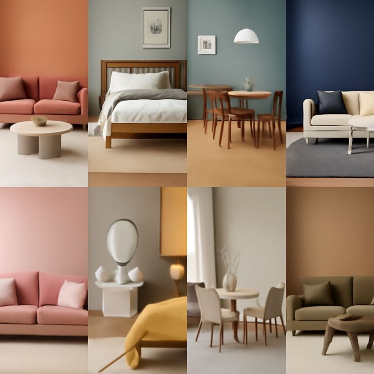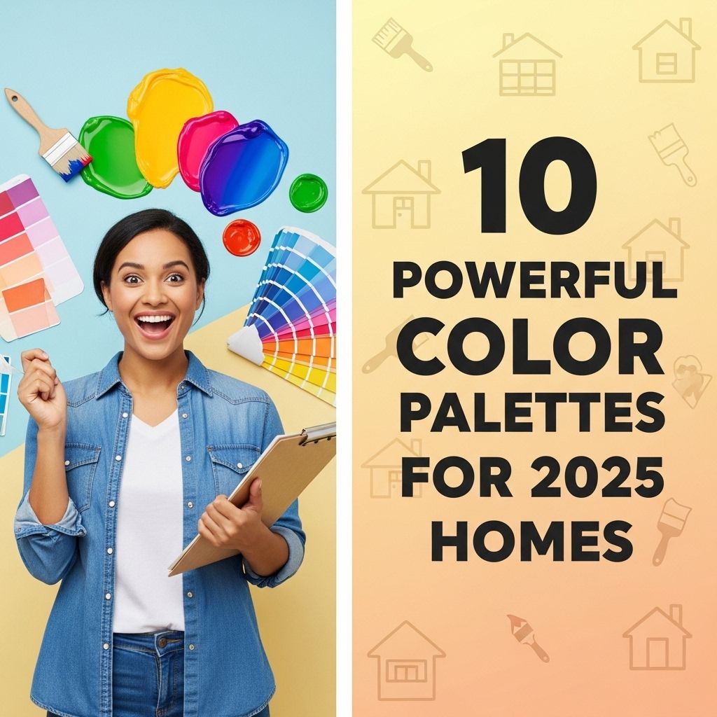
As we step into 2025, the trends in home design are evolving rapidly, reflecting a shift towards more vibrant, sustainable, and personalized spaces. Color plays a pivotal role in this transformation, influencing mood, ambiance, and even the overall perception of a home. In this article, we will explore ten powerful color palettes that are set to dominate the residential landscape this year.
As we embrace the fresh aesthetics of 2025, selecting the right color palette can transform your home into a tranquil retreat. Explore these 10 powerful color palettes to find inspiration for stunning interiors that reflect both modern design trends and your personal style. For those looking to enhance their creativity, Download water graphics to incorporate soothing elements into your color schemes.
Table of Contents
1. Earthy Tones with a Modern Twist
Inspired by nature, earthy tones evoke warmth and comfort. This palette includes shades like terracotta, olive green, and sandy beige, complemented by modern accents of charcoal or deep navy.
Key Colors:
- Terracotta
- Olive Green
- Sandy Beige
- Deep Navy
These colors work beautifully in living rooms and kitchens, creating a cozy yet stylish atmosphere. Consider pairing these colors with natural materials such as wood and stone for a cohesive look.
2. Bold Jewel Tones
For those looking to make a statement, jewel tones are making a grand comeback. Rich hues like emerald green, sapphire blue, and ruby red add a touch of luxury to any room.
Application:
- Accent walls
- Furniture upholstery
- Artwork and decor
These colors are particularly effective in spaces like dining rooms or libraries, where a sense of sophistication is desired.
3. Soft Pastels for Serenity
If you prefer a more tranquil environment, soft pastels are the way to go. Shades such as blush pink, pale lavender, and mint green promote relaxation and calmness.
Combination Suggestions:
| Pastel Color | Complementary Shade |
|---|---|
| Blush Pink | Soft Gray |
| Pale Lavender | White |
| Mint Green | Beige |
These combinations work well in bedrooms and bathrooms, creating serene retreats from the outside world.
4. Monochromatic Schemes
Monochromatic color schemes are all about creating depth and interest using varying shades of a single color. For 2025, consider shades of blue or green, ranging from the lightest sky to the deepest navy.
Advantages:
- Creates a cohesive look
- Easy to accessorize
- Timeless and elegant
This palette is particularly effective in minimalist designs, where every shade contributes to a larger visual story.
5. Contrasting Black and White
Timeless and classic, the stark contrast of black and white never goes out of style. This palette can be modernized with the addition of metallics or bold color pops.
Using Accents:
- Gold or brass fixtures
- Colored throw pillows
- Artwork with bright accents
Black and white is perfect for achieving a sophisticated and chic aesthetic in living areas and kitchens.
6. Vibrant Neons
For those who want to push boundaries, neon colors are emerging as a bold choice in 2025. Bright shades of pink, green, and yellow can energize a space and create a fun atmosphere.
Best Uses:
- Game rooms
- Home offices
- Creative spaces
When using neon colors, it’s best to balance them with neutral backgrounds to avoid overwhelming the senses.
7. Coastal Inspirations
Soft blues, sandy beiges, and seafoam greens come together to create a palette inspired by the coastal lifestyle. This palette evokes feelings of tranquility and relaxation.
Incorporating Nature:
- Natural fabrics like linen and cotton
- Wooden accents
- Ocean-themed decor
Coastal colors are ideal for homes near the water or in areas where a beachy vibe is desired, like sunrooms and patios.
8. Industrial Chic
Industrial style blends raw materials with a sleek aesthetic. Colors like slate gray, rusty orange, and deep browns create a bold and inviting environment.
Perfect Spaces:
- Lofts
- Modern homes
- Open-concept designs
This palette pairs well with metal accents and exposed brick, creating a unique urban feel.
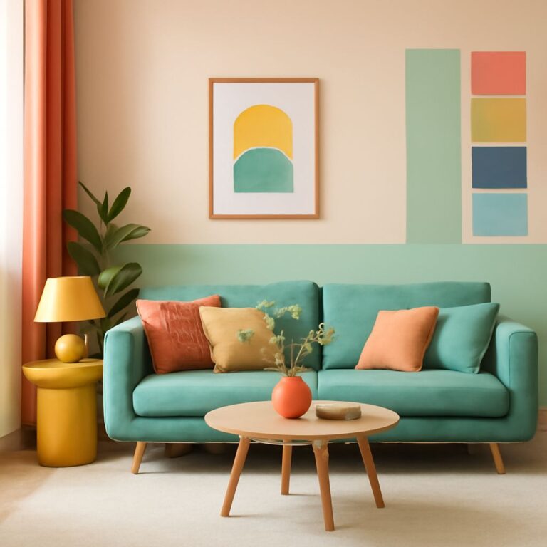
9. Warm Neutrals
As we move towards 2025, warm neutrals like taupe, cream, and soft browns are taking center stage. These colors create a welcoming environment and serve as the perfect backdrop for bold accent colors.
Combining Warm Neutrals:
| Warm Neutral | Accent Color |
|---|---|
| Taupe | Aqua |
| Cream | Coral |
| Soft Brown | Mustard Yellow |
Warm neutrals are ideal for living rooms and family spaces, promoting a sense of comfort and togetherness.
10. Retro Revival
Finally, the retro revival palette is a playful approach to color, featuring vibrant colors from the past like avocado green, burnt orange, and mustard yellow.
How to Incorporate:
- Use in kitchen designs
- Finish with vintage decor
- Mix with modern elements for a balanced look
This bold palette is particularly effective in creating eclectic spaces that tell a story and spark nostalgia.
In conclusion, the colors we choose for our homes play a significant role in the overall atmosphere and design. Whether you prefer earthy tones, bold jewel hues, or soothing pastels, the palettes for 2025 offer something for every taste and style. Now is the time to explore these color combinations and find the perfect fit for your home, ensuring that your space is not only beautiful but also a true reflection of your personality.
FAQ
What are the top color palettes for homes in 2025?
The top color palettes for homes in 2025 include earthy tones, vibrant jewel colors, and calming pastels that create a harmonious living environment.
How can I choose the right color palette for my home?
Choosing the right color palette involves considering your personal style, the mood you want to create, and how colors complement your existing decor.
What colors are trending for home interiors in 2025?
Trending colors for home interiors in 2025 feature deep greens, warm terracotta, soft blues, and neutral beiges that reflect nature and promote tranquility.
Are bold colors suitable for small spaces?
Yes, bold colors can be suitable for small spaces when used strategically, such as on an accent wall or in accessories, to create depth and visual interest.
How do I create a cohesive color scheme in my home?
To create a cohesive color scheme, select a primary color for larger areas, then choose complementary colors for accents and furnishings that tie the look together.
What is the impact of color on home aesthetics?
Color significantly impacts home aesthetics by influencing mood, enhancing architectural features, and creating a sense of space and harmony throughout the home.