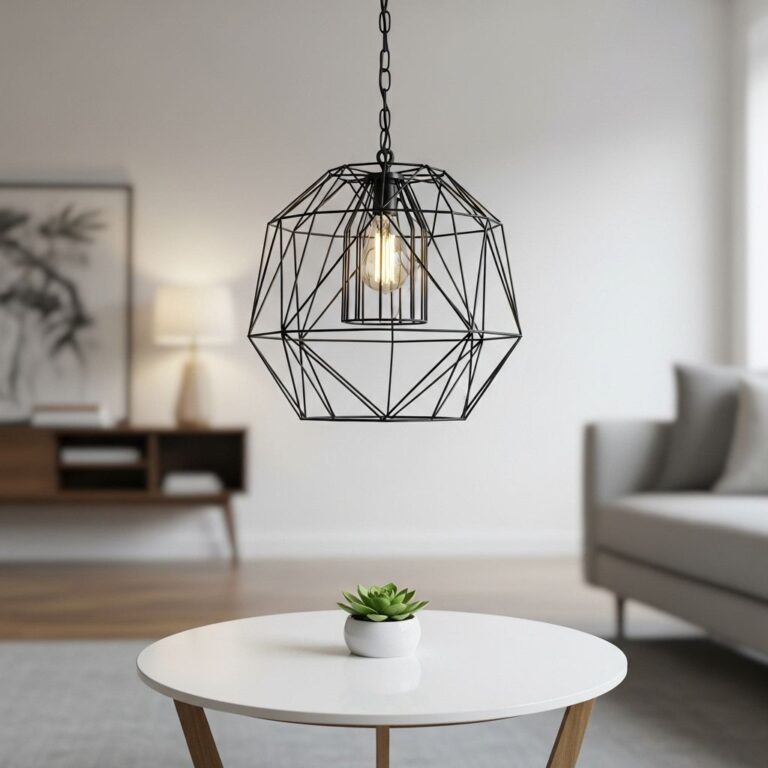
Choosing the right color palette for your home can completely transform your living space, affecting not just the aesthetics but also the mood and ambiance. With the overwhelming range of colors available, it can be challenging to pick the perfect palettes that reflect your style while ensuring harmony throughout your home. This article delves into ten stunning color palette ideas that can inspire your next interior design project.
Transforming your space begins with the right color palette, and choosing the perfect scheme can breathe new life into your home. In this article, we explore 10 stunning color palette ideas that will inspire your next design project. For those interested in branding with a creative twist, consider using bag mockups for branding to complement your home’s aesthetic.
Table of Contents
1. Monochromatic Magic
Monochromatic color schemes utilize variations of a single color across walls, furniture, and decor. This approach creates a cohesive and sophisticated look.
How to Achieve This Look:
- Select a base color.
- Choose various shades and tints of that color.
- Use textures and materials to add depth.
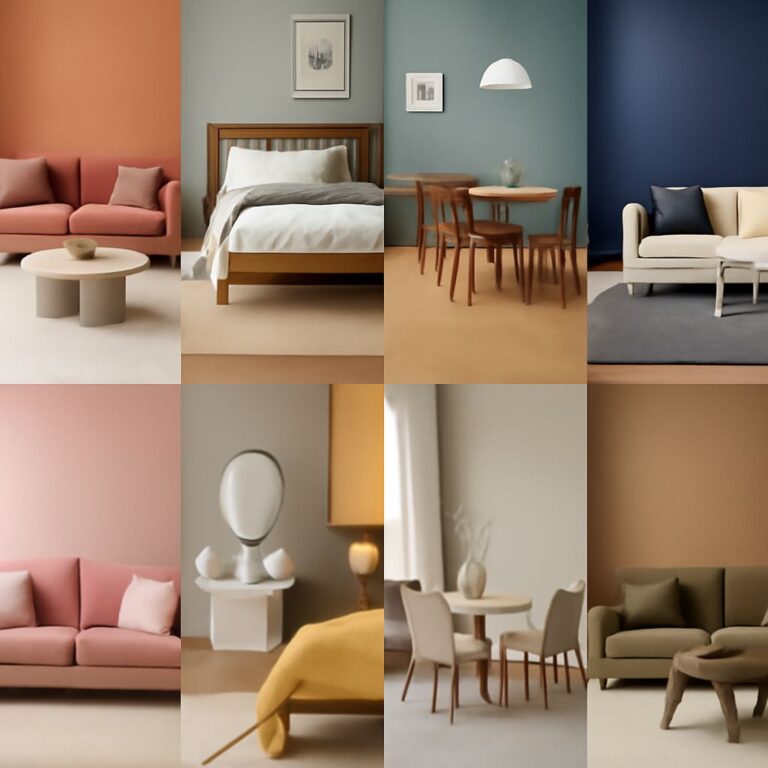
2. Soft Neutrals
Soft neutral palettes composed of whites, beiges, and grays are timeless and versatile. They provide a warm and inviting atmosphere, making small spaces feel larger.
Suggested Combinations:
| Base Color | Accent Colors | Suggested Materials |
|---|---|---|
| Warm White | Soft Taupe, Light Gray | Wood, Linen |
| Cool Gray | Soft Blue, Cream | Metal, Cotton |
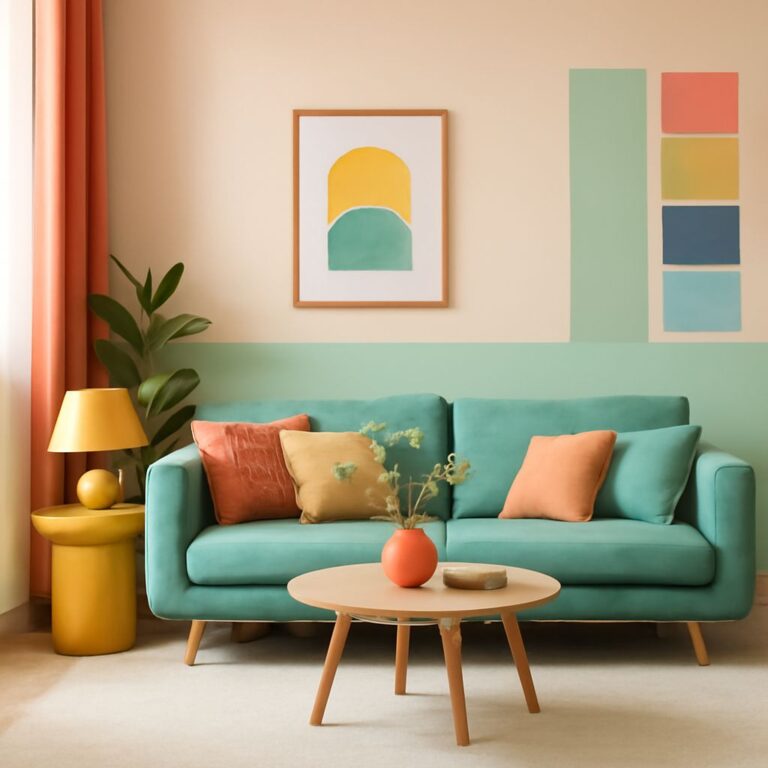
3. Bold and Bright
If you’re looking to inject energy into your home, consider a bold and bright color palette. Vivid shades like turquoise, magenta, and bright yellow can add personality.
Tips for Implementation:
- Start with a neutral base to balance bold colors.
- Consider using bold colors in smaller accents.
- Incorporate artwork that resonates with the color scheme.
4. Earthy Tones
Incorporating earth tones like browns, greens, and terracotta can create a grounded and organic feel in your home.
Why Choose Earthy Tones?
- They promote relaxation and comfort.
- They blend well with natural materials like wood and stone.
- They can easily transition between seasons.
5. Pastel Shades
Pastel color palettes bring a soft and soothing feel that works beautifully in bedrooms and nurseries. These colors include soft pinks, light blues, and pale yellows.
Combining Pastels:
- Pair pastels with white for a clean look.
- Layer different pastels for a dreamy atmosphere.
- Use pastel accent pieces against darker furniture.
6. Jewel Tones
Rich jewel tones such as emerald green, sapphire blue, and ruby red create a luxurious and dramatic environment, perfect for creating a statement.
Tips for Using Jewel Tones:
- Limit the use to focal walls or statement pieces.
- Combine with gold or brass accents for a touch of elegance.
- Use lighter tones to balance the richness.
7. Coastal Inspired
A coastal inspired palette combines shades of blue, sandy beige, and crisp white, reflecting the tranquility of the seaside.
How to Create a Coastal Feel:
- Opt for light, airy fabrics and textures.
- Incorporate natural elements like driftwood and seashells.
- Use plenty of natural light to enhance the colors.
8. Industrial Chic
Industrial color palettes typically involve grays, blacks, and metals, creating a modern and urban feel.
Key Elements:
- Exposed brick and concrete.
- Metal fixtures and furniture.
- Warm wood tones to soften the look.
9. Vintage Vibes
Vintage color palettes embrace softer, faded colors reminiscent of retro styles. Think soft greens, dusty pinks, and muted yellows.
Incorporating Vintage Colors:
- Mix vintage furniture with contemporary pieces.
- Incorporate patterns like florals and stripes.
- Use vintage accessories to enhance the nostalgic feel.
10. Black and White
A classic black and white palette offers a timeless and sophisticated look. It can be both modern and traditional, depending on the execution.
Benefits of Black and White:
- Highly versatile and easy to accessorize.
- Creates dramatic contrasts that can enhance design.
- Timeless appeal that never goes out of style.
Conclusion
Choosing the right color palette for your home is a vital part of the design process. Each of the palettes discussed above offers unique benefits and can help you create a space that is not only beautiful but also reflective of your personal style. Whether you prefer the soothing nature of soft neutrals or the vibrant energy of bold colors, there is a palette that can bring your vision to life. Remember, the key is to embrace your creativity and experiment with different combinations until you find the perfect fit for your home.
FAQ
What are some popular color palette ideas for home interiors?
Popular color palette ideas include neutral tones with pops of color, monochromatic schemes, earthy tones inspired by nature, bold contrasts like black and white, and pastel palettes for a soft look.
How can I choose the right color palette for my home?
Consider the mood you want to create, the size of the room, the amount of natural light, and how the colors will complement your furniture and decor.
What are the benefits of using a color palette in home design?
Using a color palette helps create a cohesive look throughout your home, enhances the aesthetic appeal, and can even influence the mood and atmosphere of your living space.
Can I mix different color palettes in my home?
Yes, you can mix different color palettes, but it’s essential to maintain a level of harmony by ensuring that the colors complement each other and are consistent in tone.
What are some trending color palettes for 2023?
Trending color palettes for 2023 include warm earth tones, soft pastels, rich jewel tones, and vibrant, bold colors, reflecting a mix of comfort and creativity.
How do I create a color palette for a small room?
For small rooms, opt for lighter shades to make the space feel larger, and consider using a monochromatic or analogous color scheme to create a seamless flow.